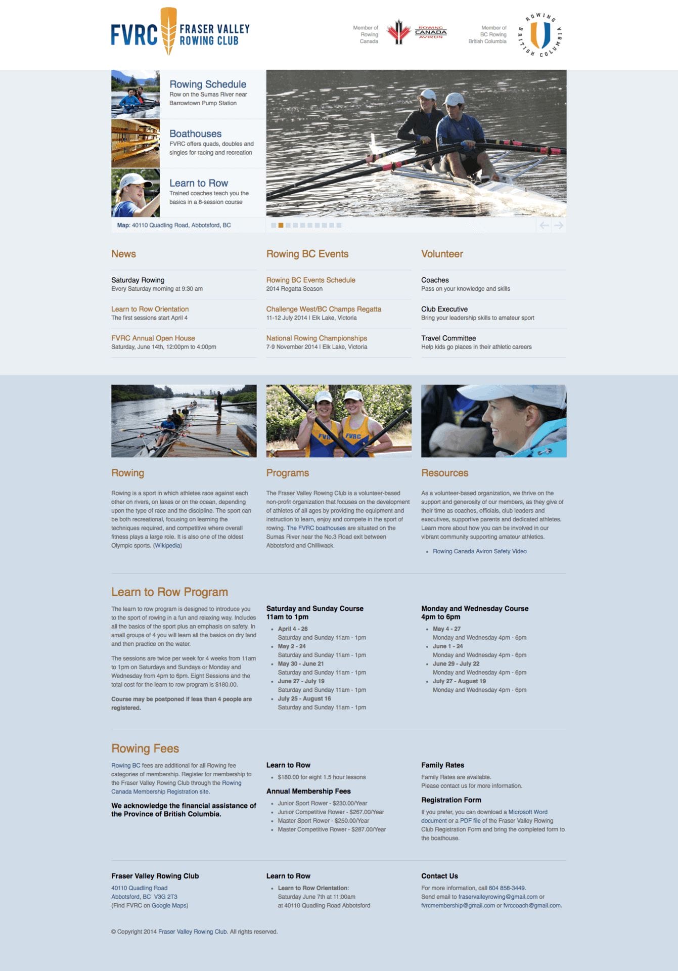
Fraser Valley Rowing Club

The Fraser Valley Rowing Club project is a small recreational club that rows on the Sumas River at the base of Sumas Canal in Abbotsford, British Columbia. The two boathouses accommodate single, double and quad rowing shells. The logo design is an overhead silhouette of a quad rowing shell with scullers in the finish position. As the rowing shell cuts through the water, it forms a wake in the shape of an oar blade.
![]()
![]()
The Fraser Valley Rowing Club project is a story about how our family joined a local sports club. It is a small recreational club that rows on the Sumas River at the base of Sumas Canal in Abbotsford, British Columbia. The two boathouses accommodate single, double and quad rowing shells. As members of our small club, we would volunteer our time to coach, to travel to rowing regattas with our daughter and to promote our club in the local Canada Day Parade. I also volunteered my time to create the logo and build a website. (I had originally borrowed the site layout from the Matsqui Blades Speed Skating Club that I designed while our family was involved with that sport.) The club colours have traditionally been blue and yellow, and the team uniforms were designed to match, as were the blades of the oars. The logo symbol was a happy accident that uses the shape of the oar blades used by beginners, called spoons. (Rowers graduate to hatchets when they are more experienced.) I realized that the shape of the shaft of the oar as it fits into the blade and tapers to a point is reminiscent of the shape of the bow of the rowing shell. The logo represents a distinctive striped pattern painted onto an oar blade. However, as you look a little closer, you become aware of the silhouette of a quad rowing shell as the scullers are reaching the apex of the rowing stroke, called the catch position, just as they are about to initiate the drive phase of the stroke.
Throughout a race, the coxswain will yell out commands to steer, and to coordinate the power and rhythm of the rowers. When training for the start of a race, the coxswain will bark out the commands, “At the half-slide catch, squared and buried. Half slide for three, then into full. Ready. Row.” This is the impression, when the bow is considered to be at the top of the symbol.
Then again, one could be looking down at the wake of the boat, where the bow is at the bottom of the symbol, and the tapered shape of the blade gives a sense of the rowing shell cutting through the water. In this case, the rowers would be in the finish position of the rowing stroke.
![]()
![]()
Adobe Illustrator was used to create the logo symbol, introducing a gradient for web-based applications. For spot colour applications, PANTONE 289 (navy blue) and PANTONE 137 (canary yellow) were specified. The logotype was rendered using the font Bebas. The signatures were provided in three configurations, to allow for flexibility when applying the logo to various designs for web or print.
The club was missing a professionally designed logo. The identity design became the cornerstone of the website design, bringing new members to learn to row and to join in local events and races. The Fraser Valley Rowing Club members are proud to wear the logo as they represent the club in local rowing regattas.
When our club attended the Head of the Gorge Rowing Regatta in Victoria, British Columbia, we were able to view the rowing shells from above as the rowers passed under a bridge across the Gorge Waters. This vantage point is the best way to view a race, which is why televised races tend to be shown from above, to give the audience an accurate view of the progress of a competition.
This is really nice! I love the details