Fretron Logo Design by Shyam B
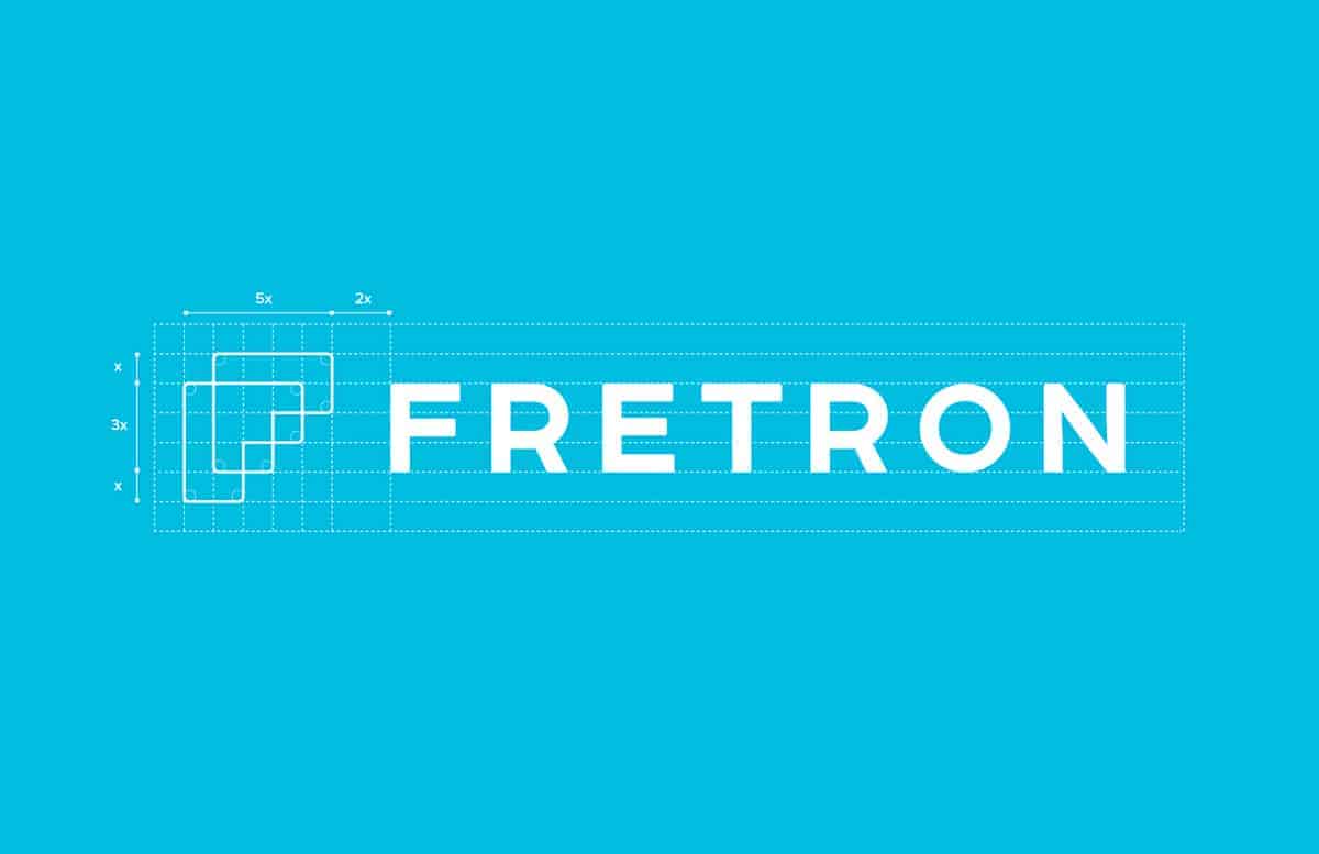
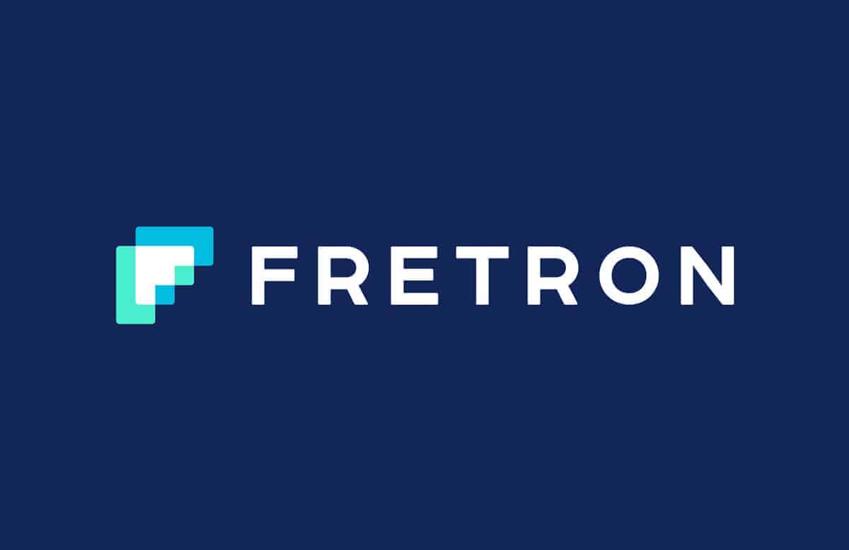
Shyam B's project is a logo design for Fretron: A Digital Freight Marketplace. The mark has the letter "F" formed by the juxtaposition of two arrows. The company aims to digitally transform a highly Fragmented 100 billion dollar Trucking Industry in India by enabling efficient, reliable and hassle-free transactions between Shippers, Transporters, Fleet Owners & Drivers by bringing them on a common platform.


The final logo was created in Adobe Illustrator. Once happy with the design I moved on to the color palette and selecting an appropriate typeface for the mark.

The client loved it and it really made the whole process extremely rewarding. Its always a learning process when you work on a project as you get to learn about the specific industry, the entrepreneur’s vision and that's something which stays with you always.
About Shyam B
Shyam B is a graphic designer specializing in logo design, illustration and icon design. His works have been published in several logolounge books including the Master Series and featured on numerous websites and blogs. Recently, one of his works has been included in Logo Lounge's annual Logo Design Trend Report for 2016.

nice iso
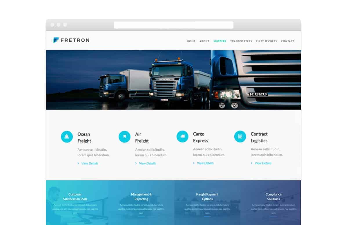
That's a great idea for a simple F shape created from the least amount of squares/pixels. It also looks great the way you incorporated it into the website and print designs. I would be happy too if I was your client.