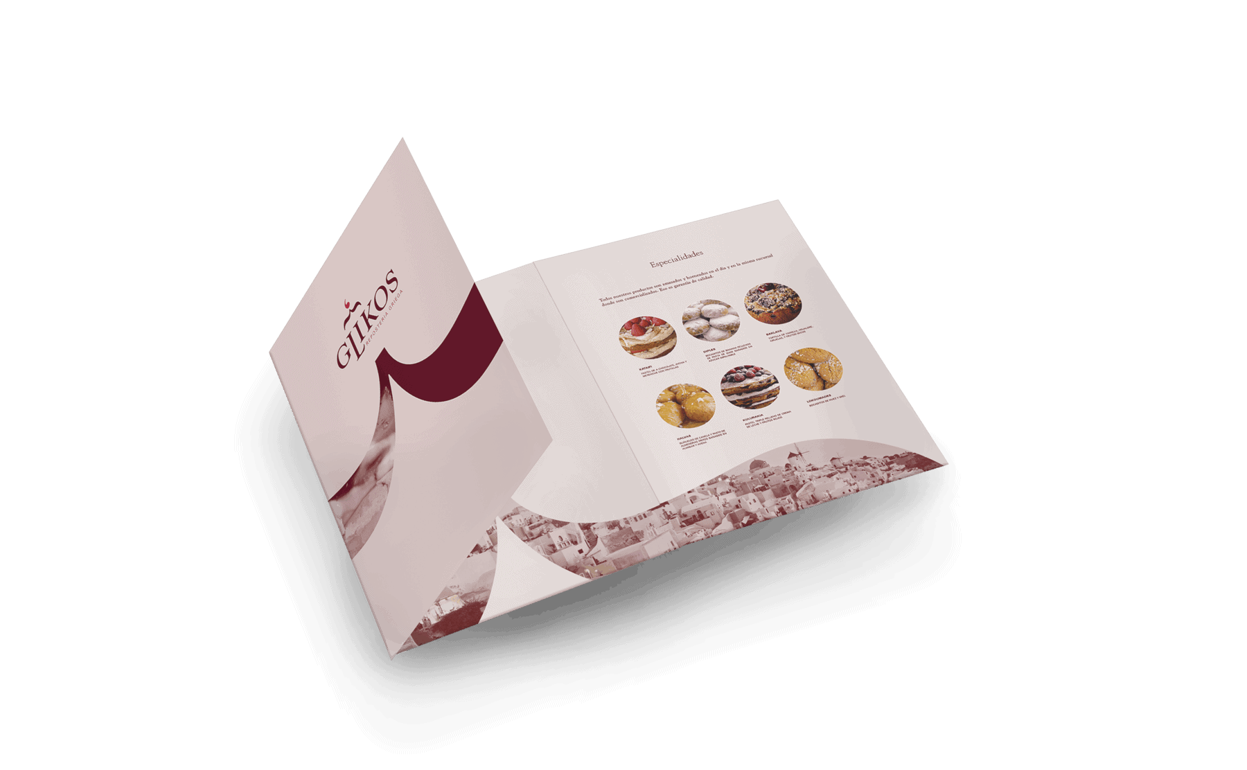
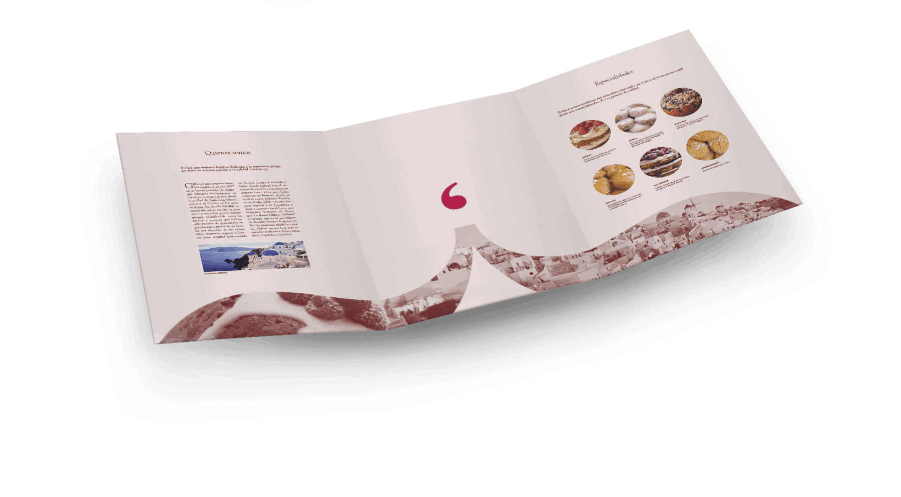
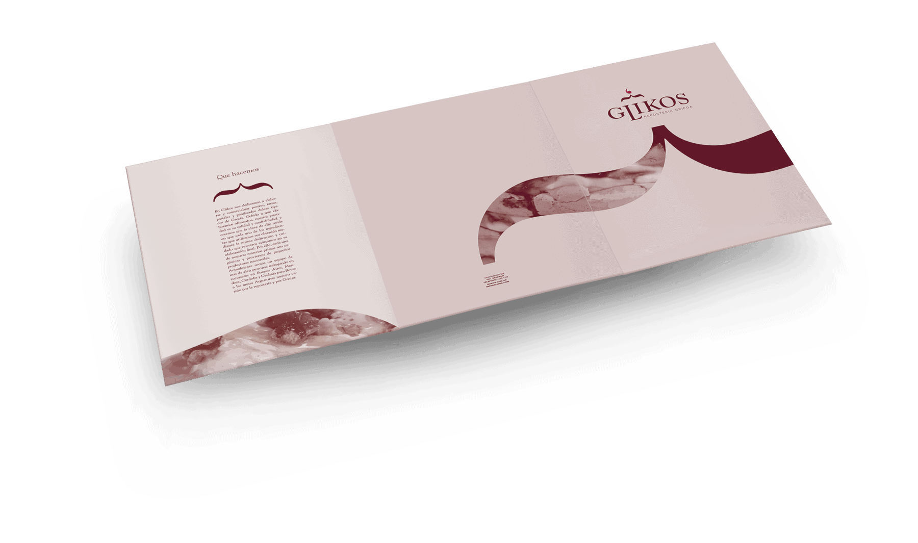
Glikos: Identity system

Glikos is a fictional greek pastry shop. It is an academic project made in 2015 for the "Typography II" class (National University of Lanús, Buenos Aires, Argentina). The main concepts were Pastry and Greece. Secondary concepts were: class, history, warm, swetness, austerity, seriousness, cleanness, stability.
The assignment's aim was to create a brand and graphic style for a business, starting from a given category which, in my case, was mediterranean food. I decided to shorten the field to greek food and then, after further research, i shorten it to specifically greek pastry.
The main rule for the project for the logo to be exclusively typographic, meaning, it was forbidden to draw or use letter/signs/shapes to draw something. The goal was to generate a metaphor, metonymy or other kinds of rhetoric through typography in a subtle way. There had to be one or two concepts clearly shown in the brand.
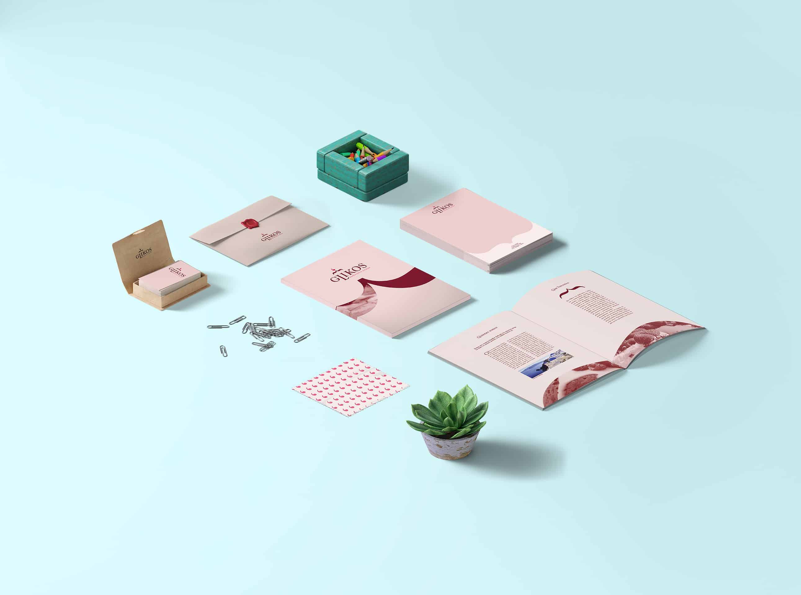
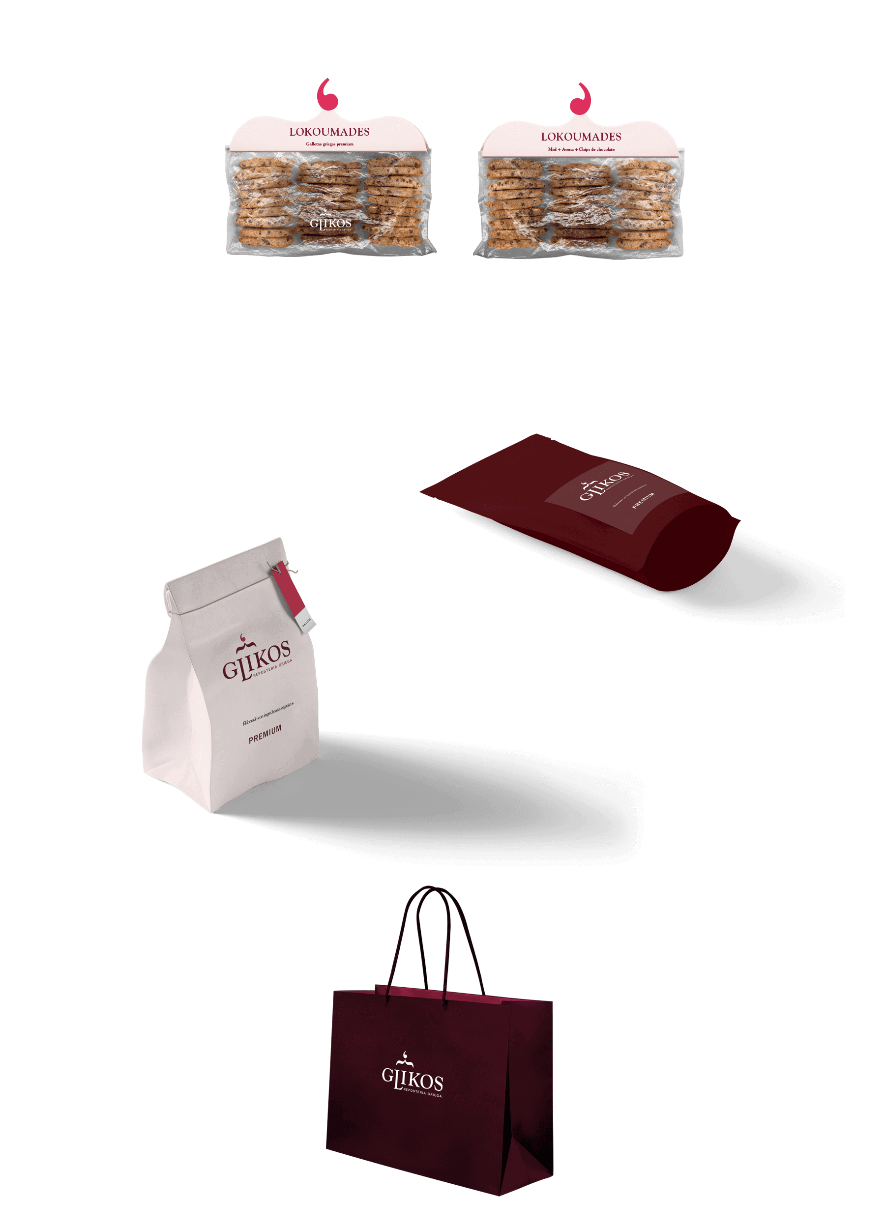
During the first stages i sketched in paper. I used photoshop for further sketching and made the final logo with Ilustrator. I used Illustrator and Indesign for the stationery, and Photoshop for the Packaging.
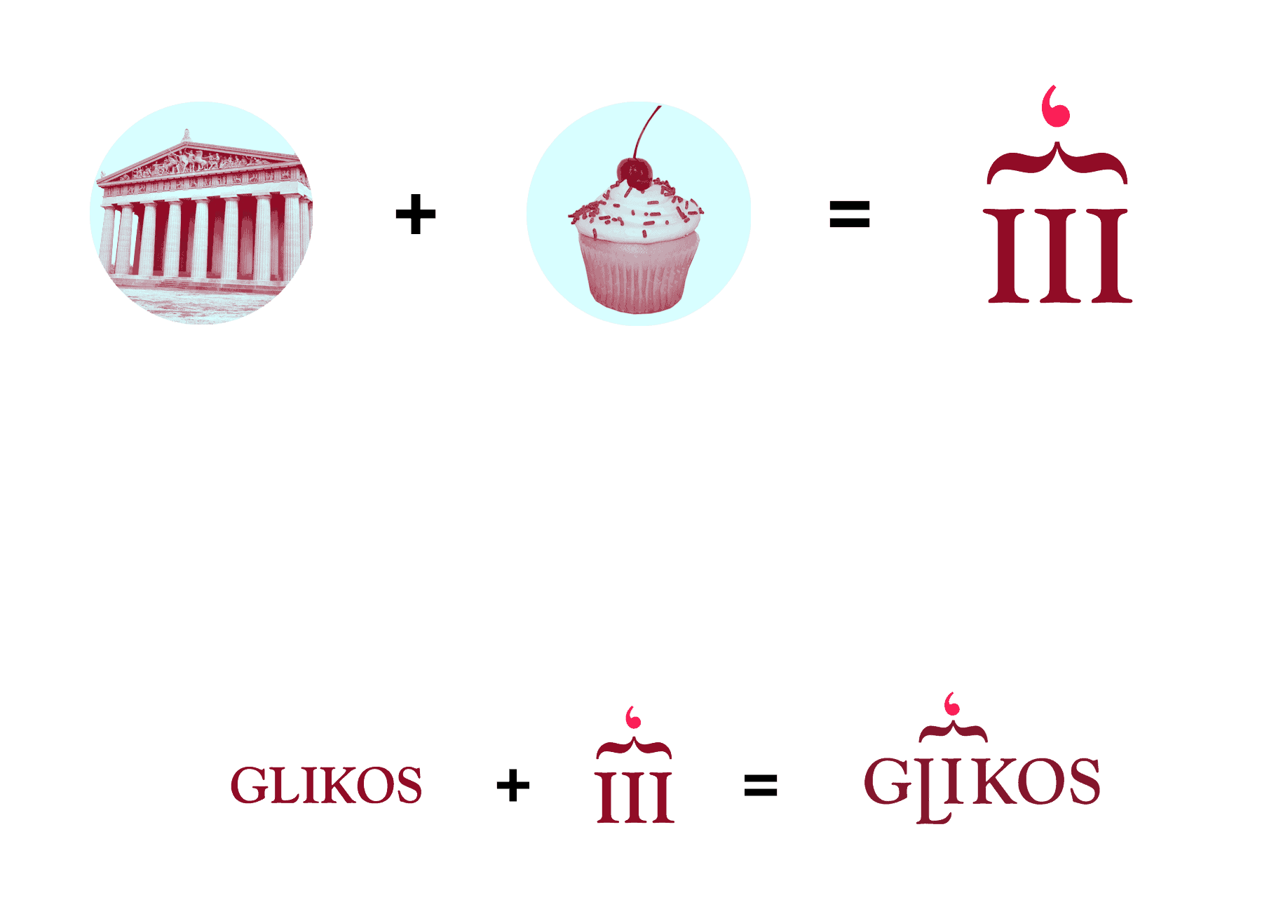
I started by researching the category as much as i could. I had two concepts that had to show in the logo: Greece and Pastry. Most greek food brands i found shared similar characteristics: They used generic greek style typefaces, mythology references, greek patterns and different shades of blue. I found none of these aspects were useful to my project because they have a fish/ocean/salty feel, so i decided to capitalize another element that kept appearing during my research: Ancient greek architecture. The most recognizible aspect of it is the big columns. I found architecture much more classy and delicate, easier to articulate to a pastry shop.
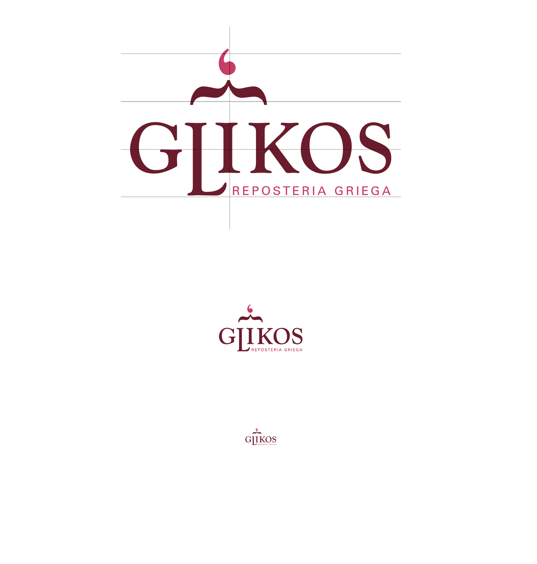
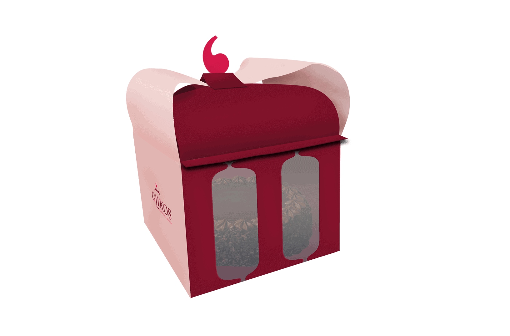
Once i had that aspect sorted out, i started to search for a name. The search wasn't hard. Even though i considered using mythologic names, i decded to choose a simpler path and just go for the word "sweetness" in greek: "Glikos" (γλυκός), this word was also perfect because it had three stems next to each other (letters L, I and K) that could work as "columns". I chose the Goudy Oldstyle typeface, since it's serif made the stems look like actual columns and it also has soft curves, appropriate for a pastry brand.
The idea of using a brace turned 90 degrees on top of the "columns" emulating cream, and a coma turned 180 degrees on it's top as a cherry came after A LOT of sketching and failed attempts to properly portait a cake with typography.
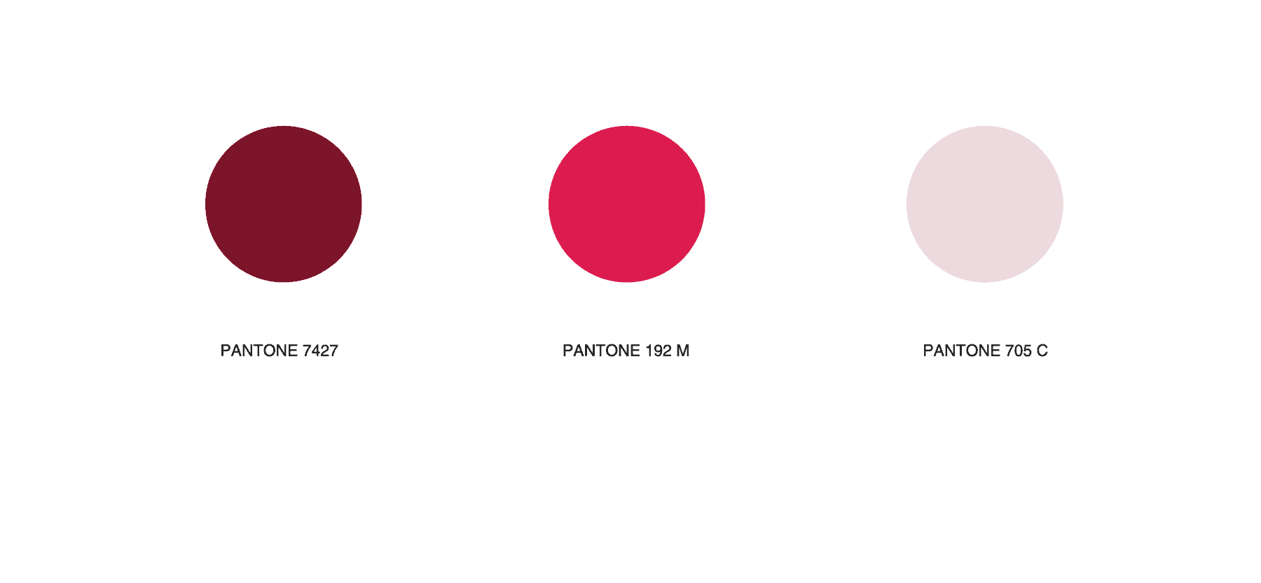
Despite blue beign greece's most emblematic color, i found it too cold for the shop's category, so i decided to go for a warm shade of brown and fuchsia for the "cherry".
The most challenging part of building this brand was to find an appropiate word and typeface to make the three stems look like actual columns, and finding a resource to bring the sweetness/pastry concept to the logo.
It was graded with an 8 (1-10 scale) and almost everyone who saw it understood what the fake business was about without me explaining it. I consider that to be the most successful aspect of the project, since these subtle typographic "jokes" can easily come out as abstract or be so subtle that nobody understands or sees the joke, and a logo has to be understandable at first glance. Also, people online seem to like it a lot.
I got really hungry during the research for this project.