Glow Flow Chefs
Glow Flow Chefs is an online platform that provides advice and carefully crafted products to enhance life and serve as a kind reminder that we all have the power to change our lives —to regain our confidence, to find our purpose, and to become a magnet for abundance and love.
Founded by sisters Amy and Emily, Health & Wellness coaches, Glow Flow Chefs empowers you to recognize all that you can be. We developed the identity system and packaging.
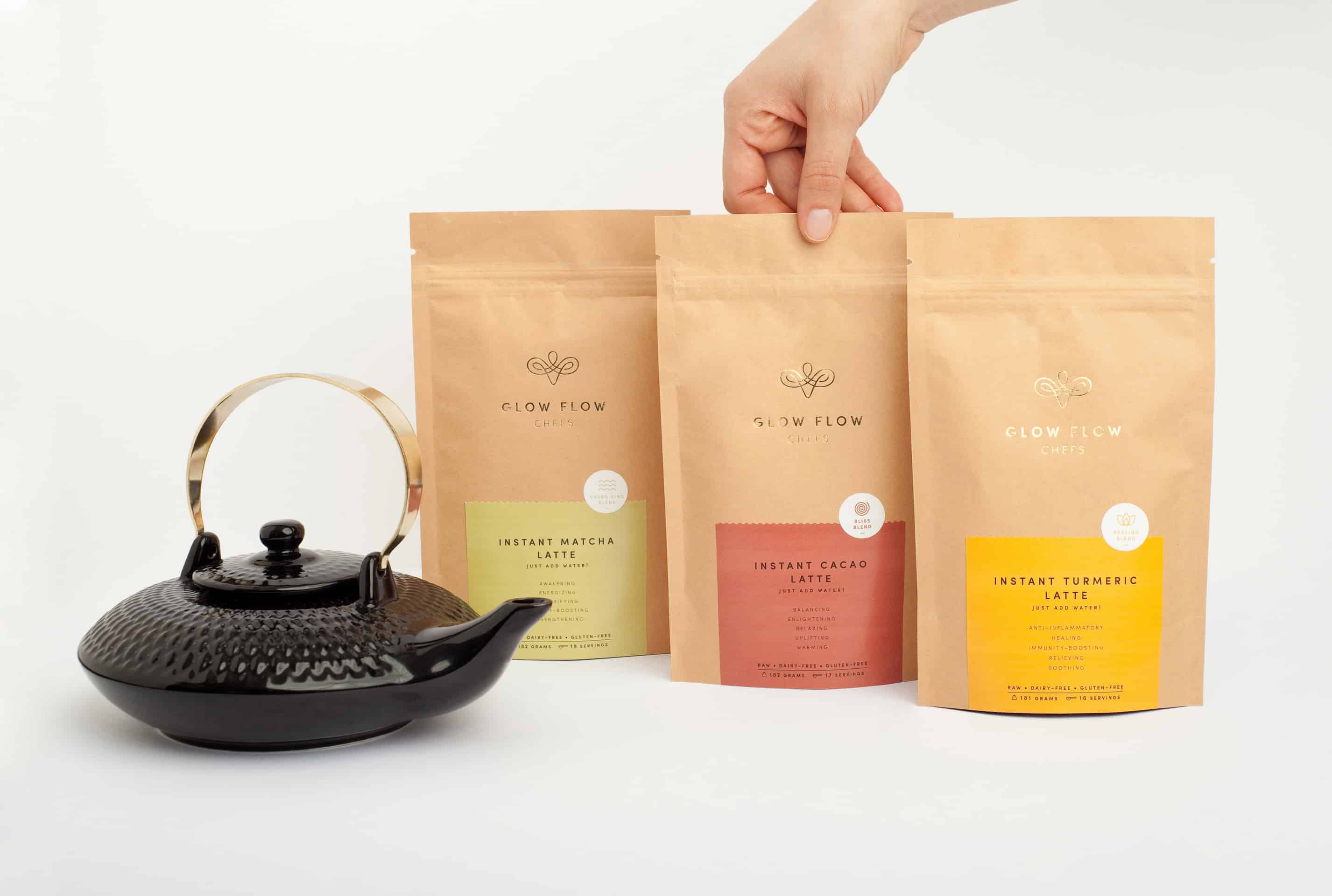
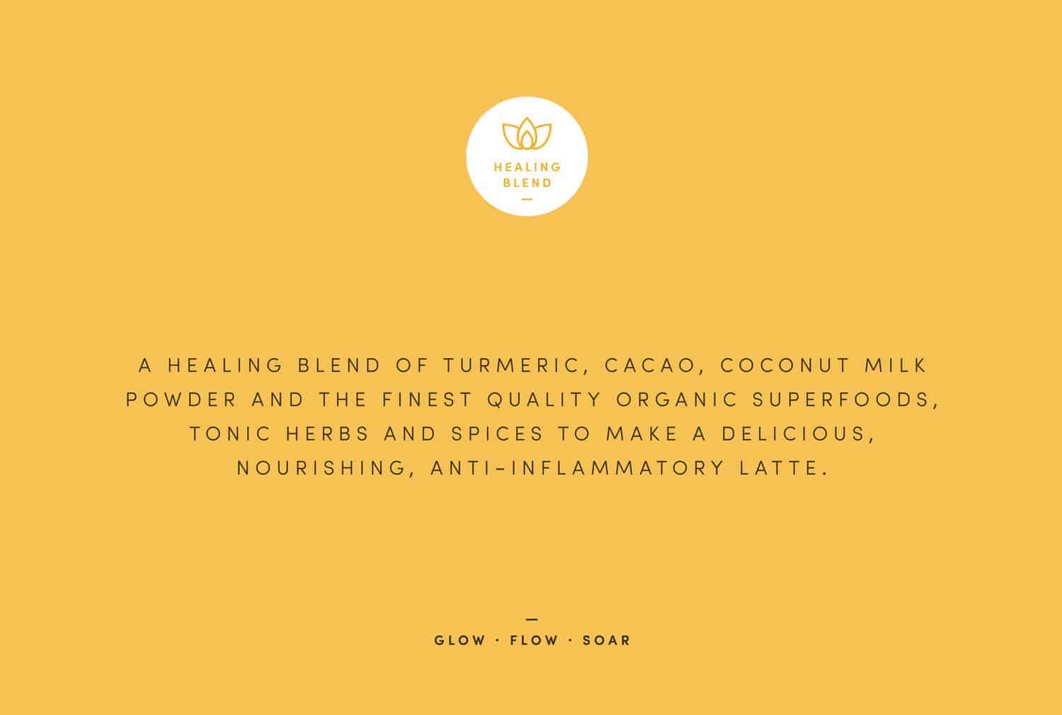
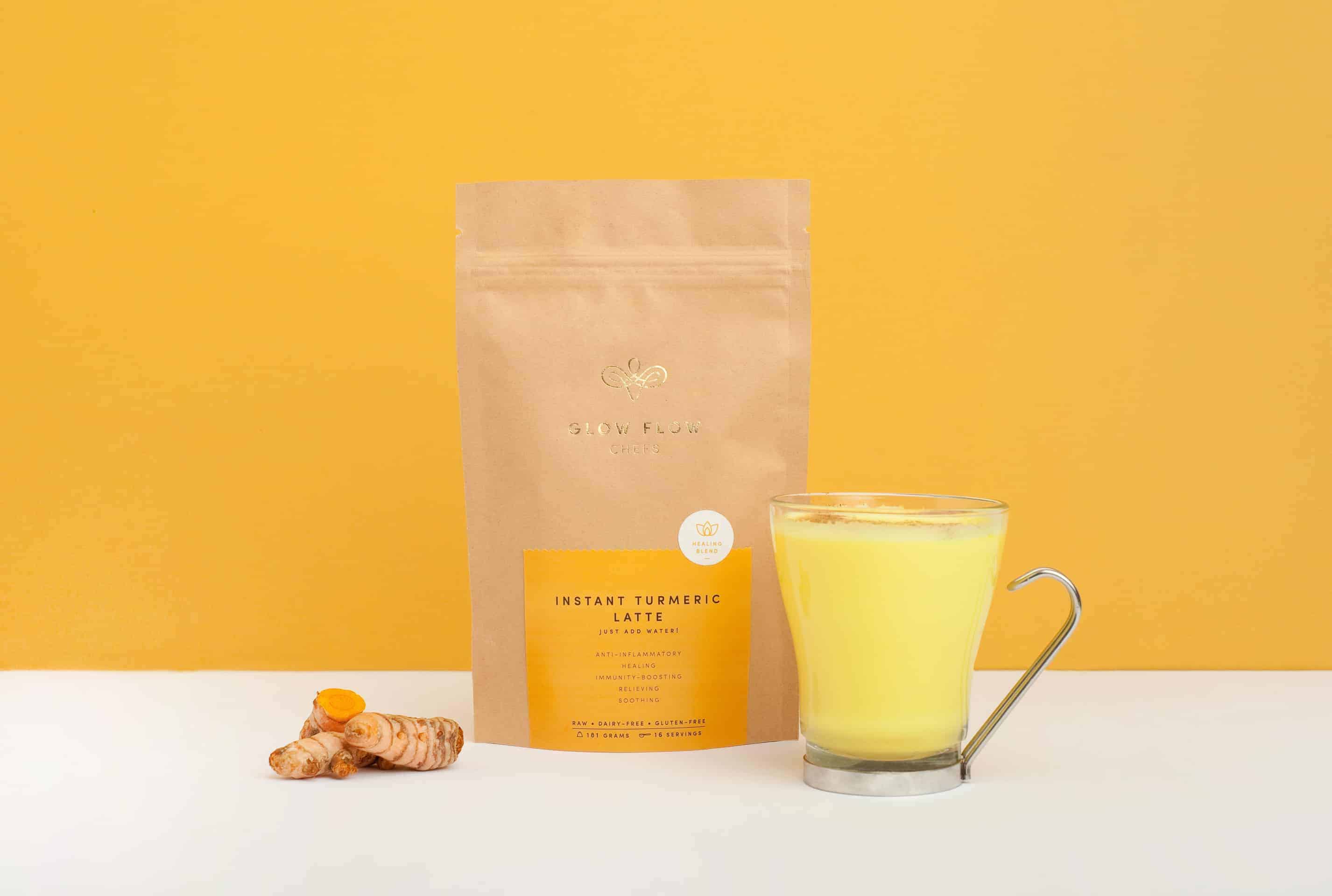
The logotype of Glow Flow Chefs represents a human silhouette that flows in an infinite cycle of good vibrations and health, guided by an inner intuition. The concept follows the idea of Glow Flow Chefs offerings, resulting in a clean, minimal and impactful packaging. We created a family of icons that represent the main benefit of each product: Matcha, Turmeric and Cacao. The colours are simple and slightly vivid, while the logotype is printed in gold foil to inspire spirituality and prosperity.
![]()
After the first meetings with our client, and making sure we understand their vision, we create a moodboard to translate our creative direction. A moodboard is a wonderful tool to illustrate interesting references, maybe a type style or a preliminary color palette we envision for the brand. When the moodboard is approved, we move to the sketching process — one of our favorite parts! We sketch a lot, we keep an analogue mode at the beginning: drawing, illustration, paper mock ups, etc. After refining the best sketches, we work digitally, mainly with illustrator. We presented a couple of logo proposals with one or two mock ups. Once we worked in the final refinements, we were ready to work in the packaging proposals. Some copy was edited until our client felt it was perfect and ready to be printed!
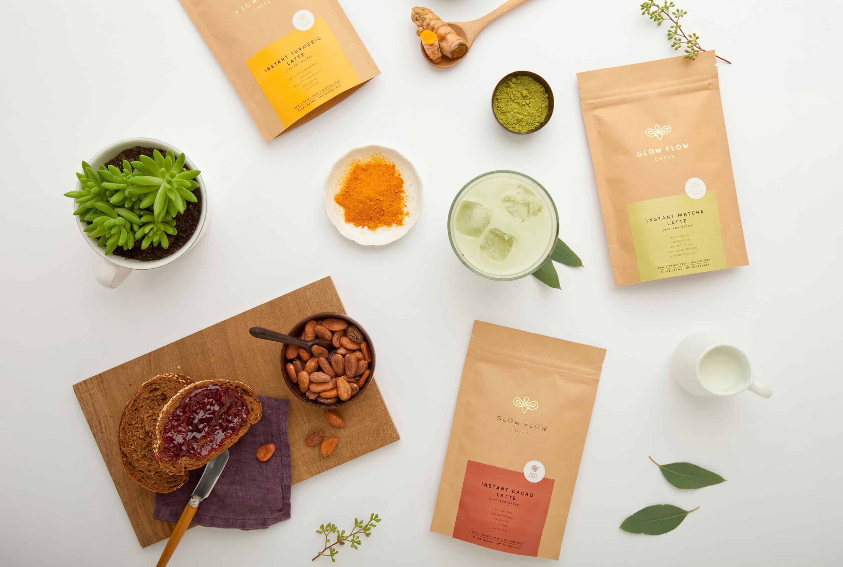
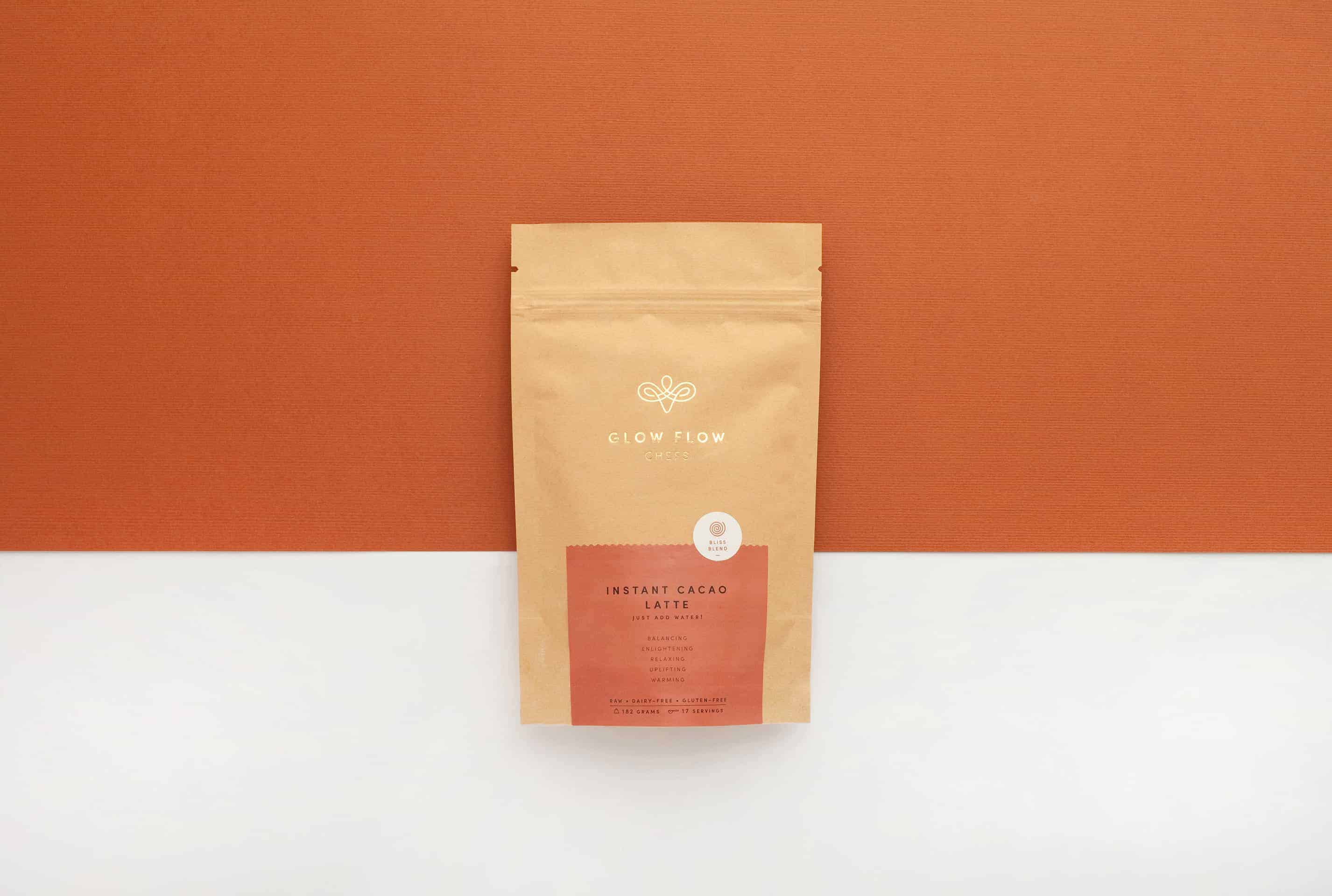
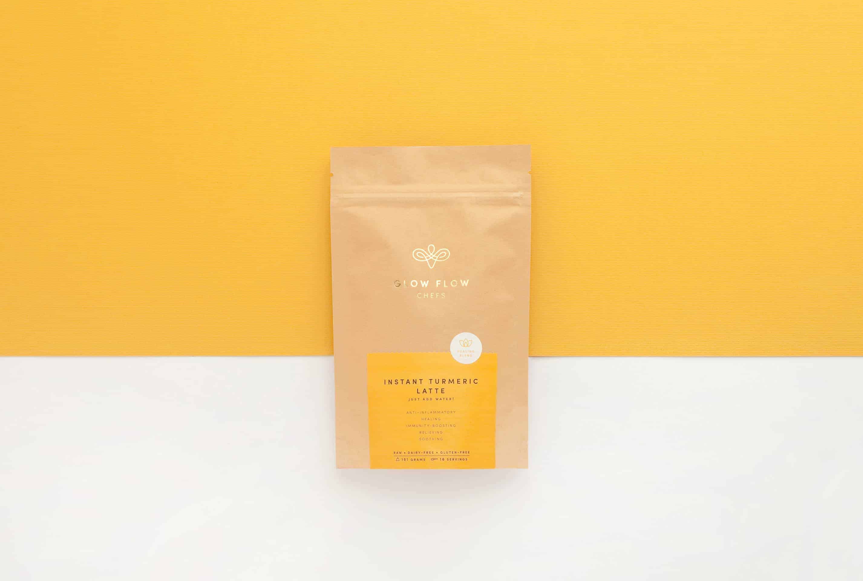
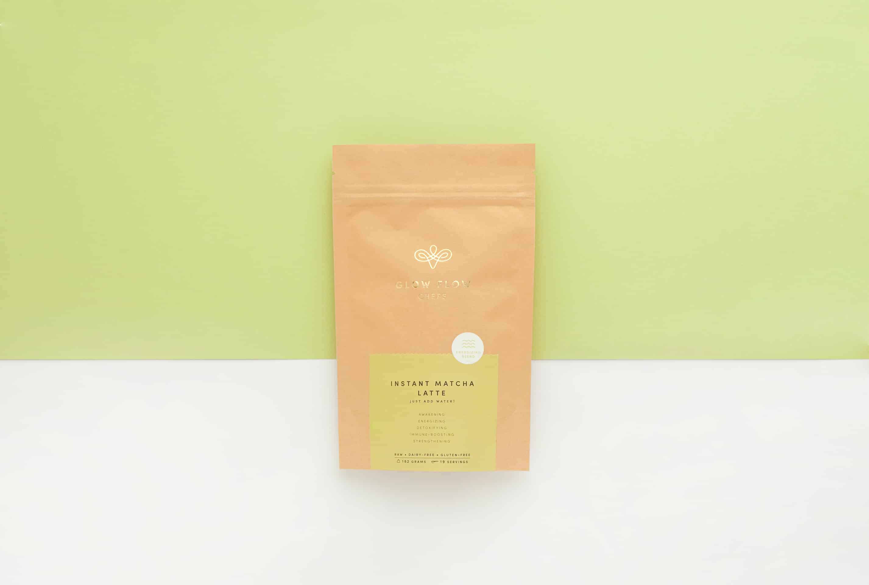
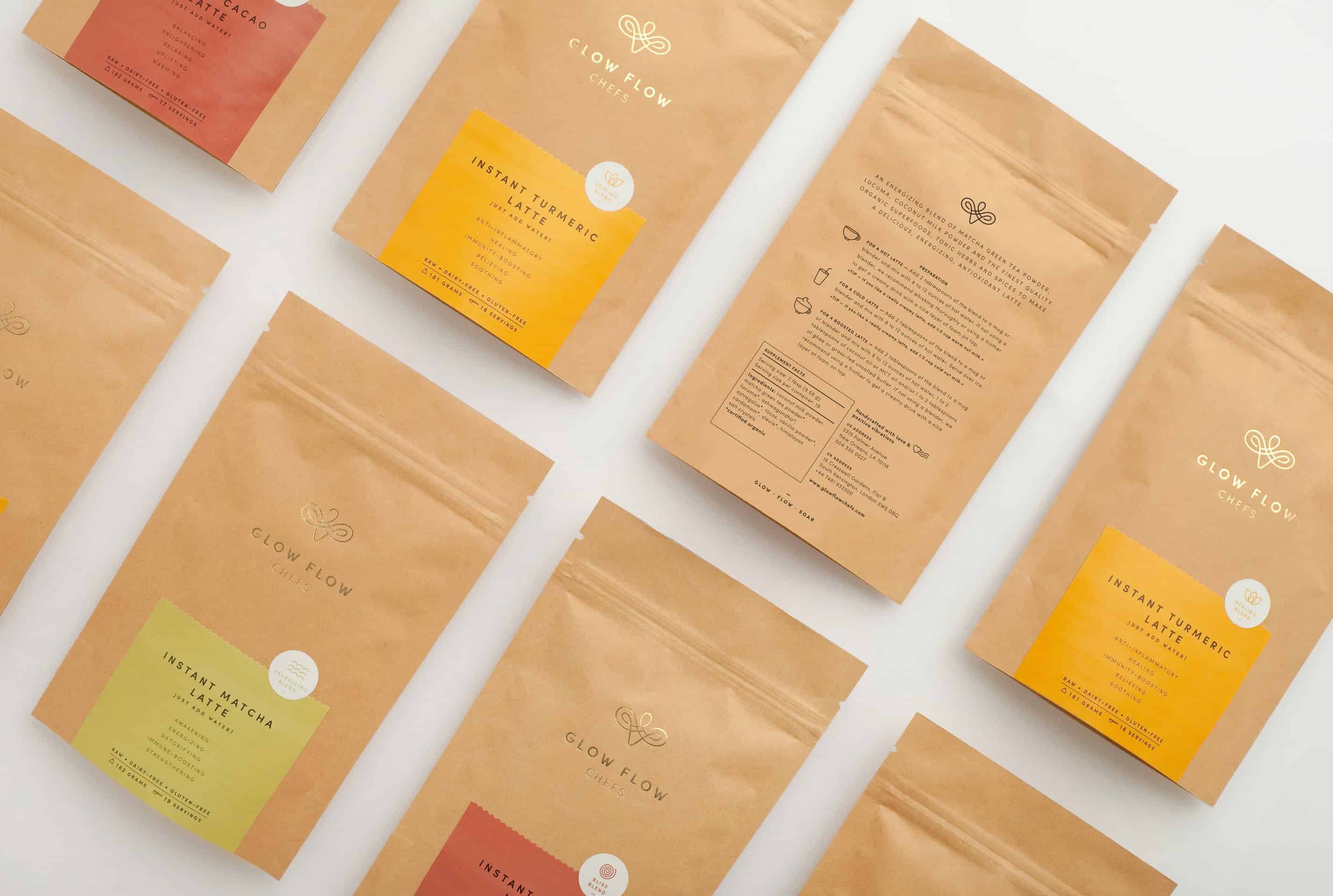
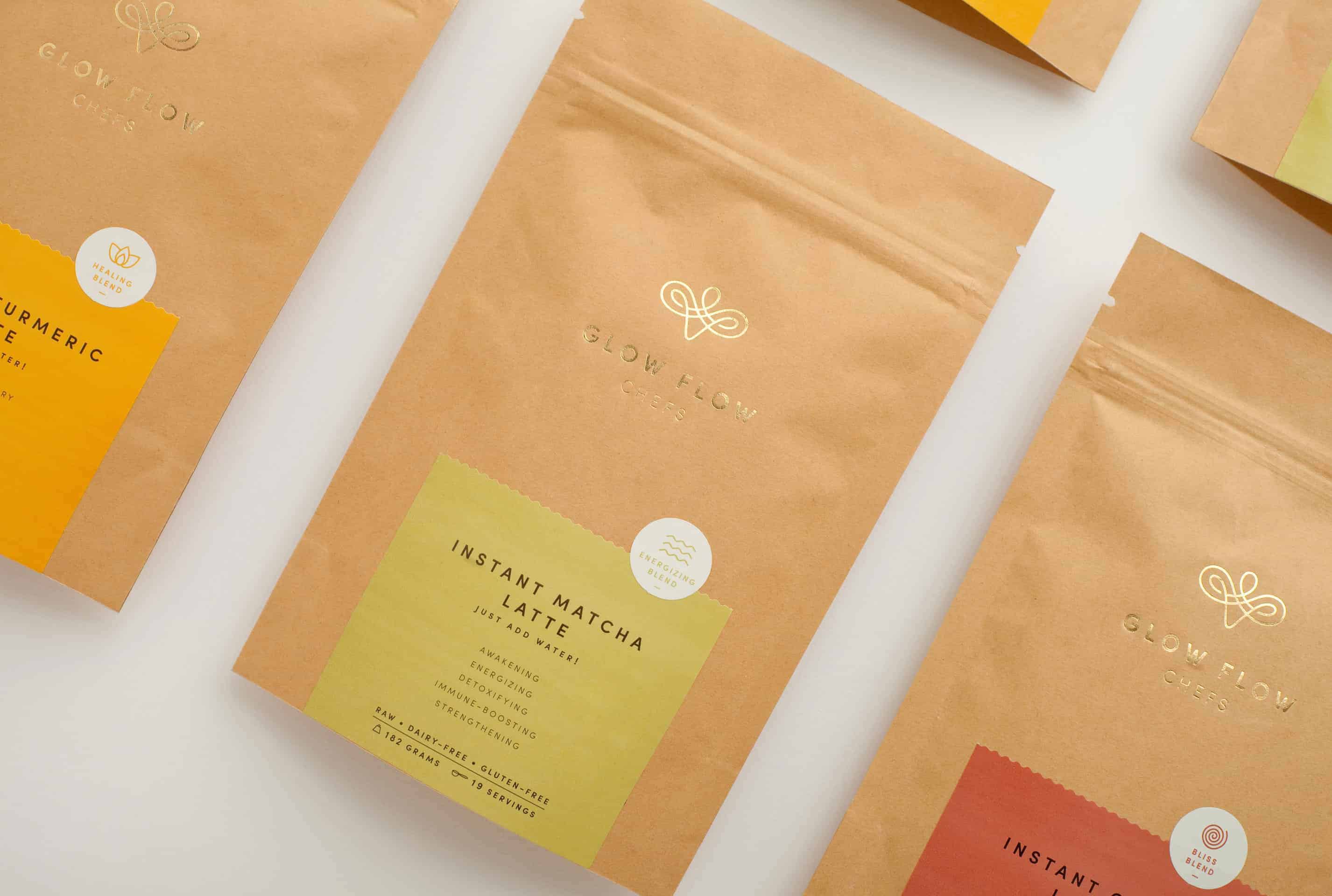
Amy and Emily, founders of Glow Flow Chefs, shared with us that the project has been very well received. In their words: We've received extremely positive feedback with friends telling us it is a great fit for the wellness brand. People have said that it's very unique, it's clean, and its elegant. People enjoy the gold stamped logo. Additionally, we've been told the colors are a perfect fit for the lattes - the mint green for the matcha, the mustard gold for the turmeric and the rusty red/brown for the cacao.
At Menta, we learned that simplicity is the key to decoding the creative development of a project. Simplicity that caught your eye and speaks to a global audience.
We believe in two ideas, the first one is anchored in our phylosophy, which we name it as The Simplicity of Allure, which means that our work attempts to be so refined that is simple yet with that special je ne sais quoi, that allure anchored to the concept of the brand that makes you feel deeply connected. We place great attention to typography and all details in each application, taking inspiration from the european typographic tradition, as well as latin american colourful heritage, with a contemporary approach. We are a very handmade studio, where ink is preferred over vector where possible.
The second idea is specialization. We believe that choosing the projects and disciplines that truly represent what you do or would like to do, defines your value as a studio. Don’t be afraid to say no, when you say no to a project you don’t feel identified with, you are including something more valuable that will come in the near future, naturally and more joyfully. In our case, we like to define ourselves as a branding and packaging studio that works for brands with natural or organic products, start ups with a conscious ethos, or companies with a social wink.