Grolsch | Label design

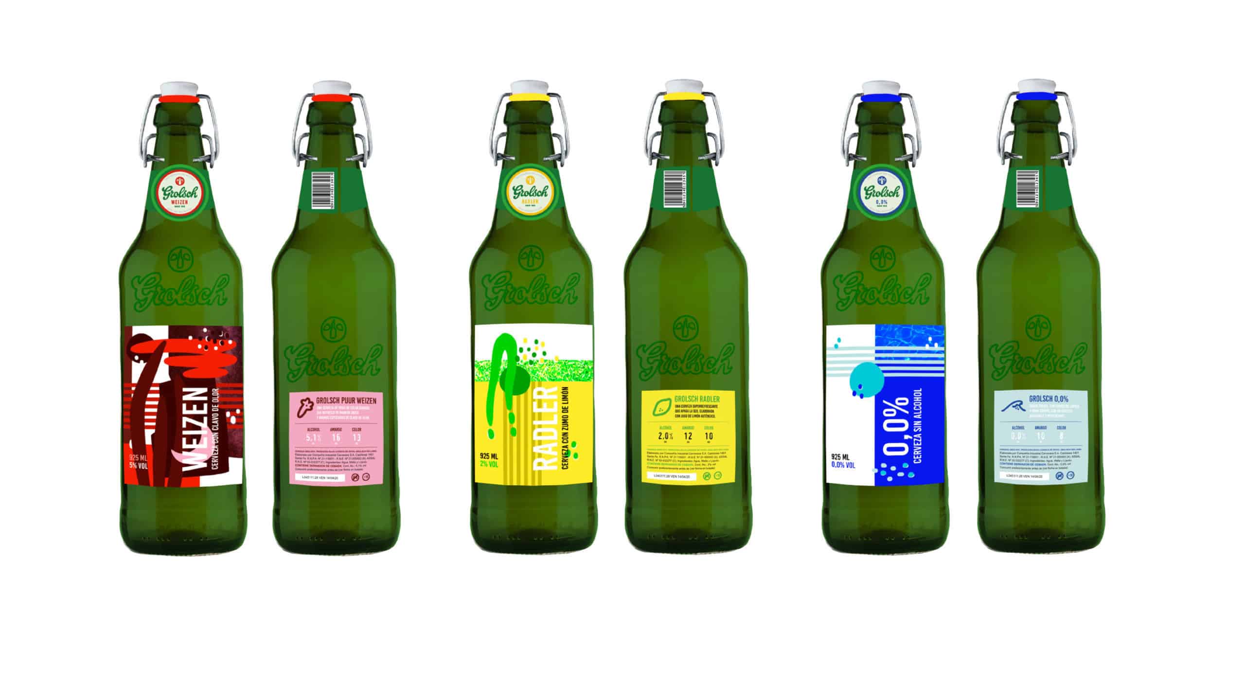
A graphic system of three beer labels planned to be used in a limited edition of Grolsch's Puur Weizen, Radler and 0.0% in Argentina.
We know Grolsch is a brand that seeks to identify with young adults who express themselves with creativity.
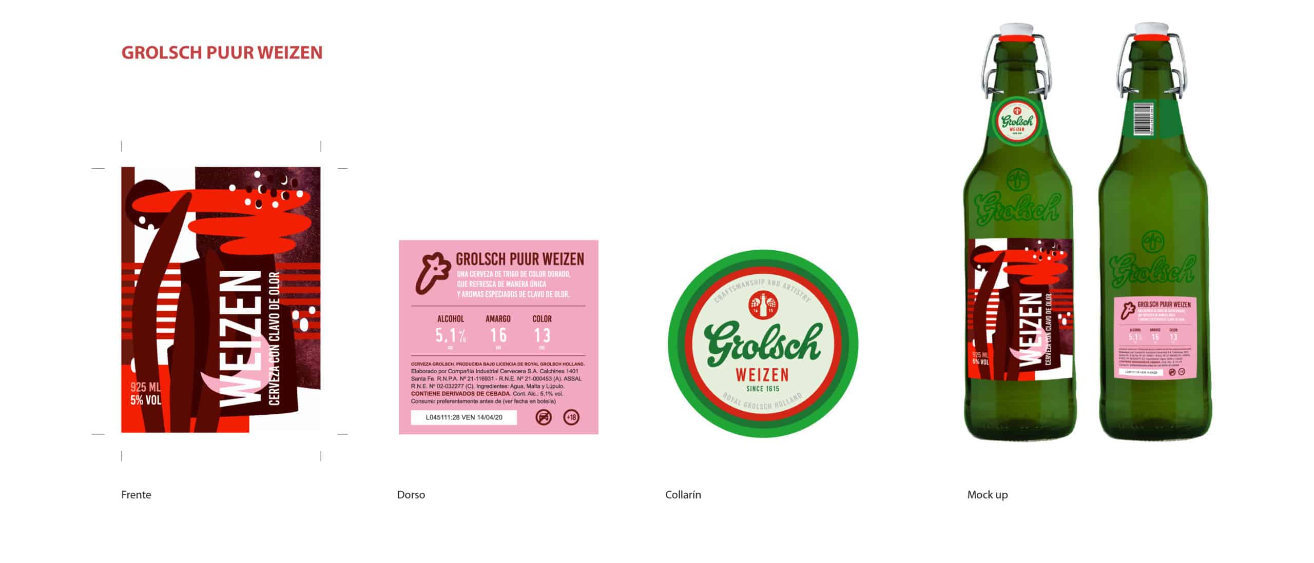
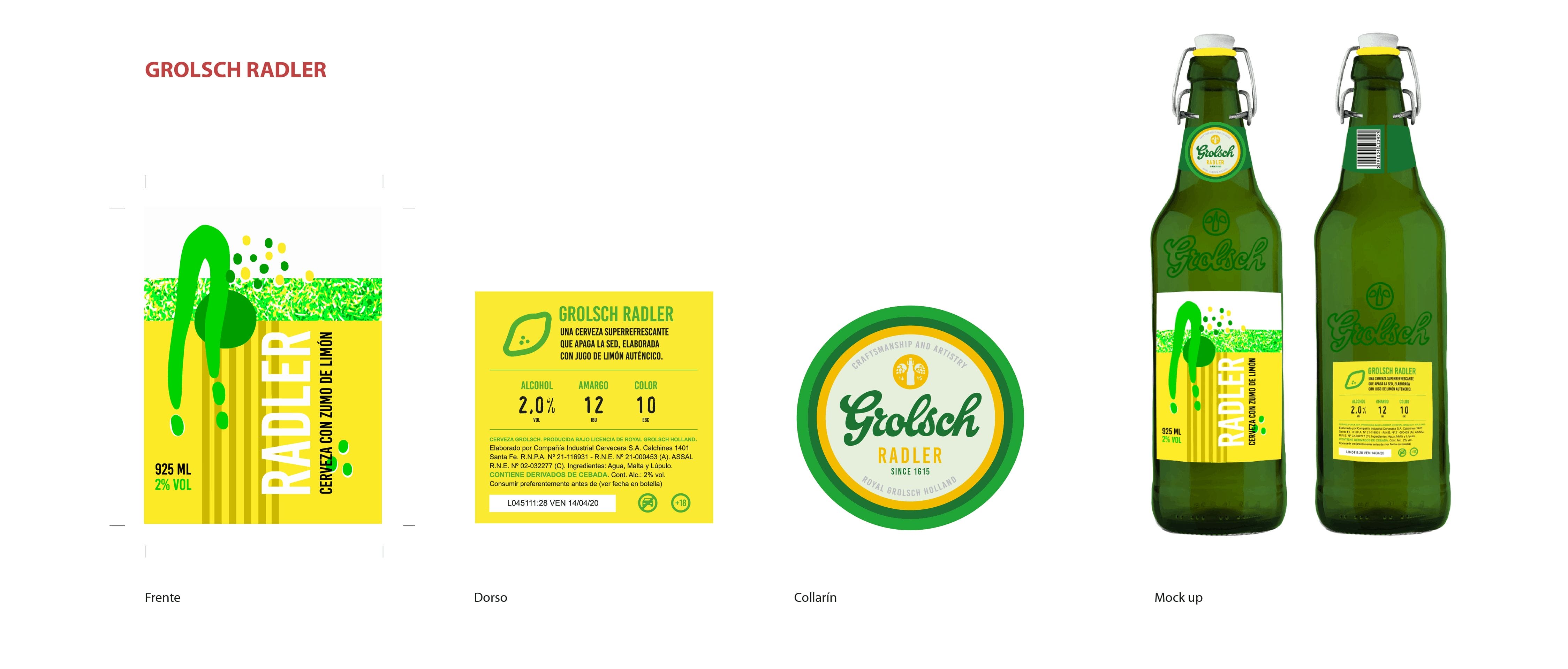
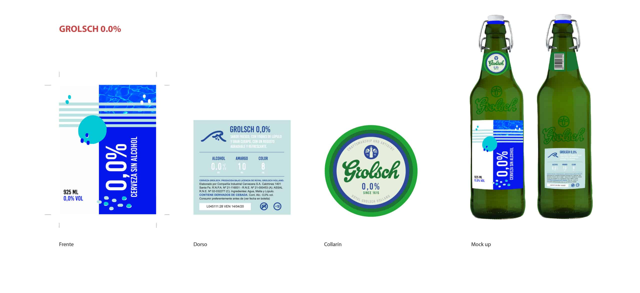
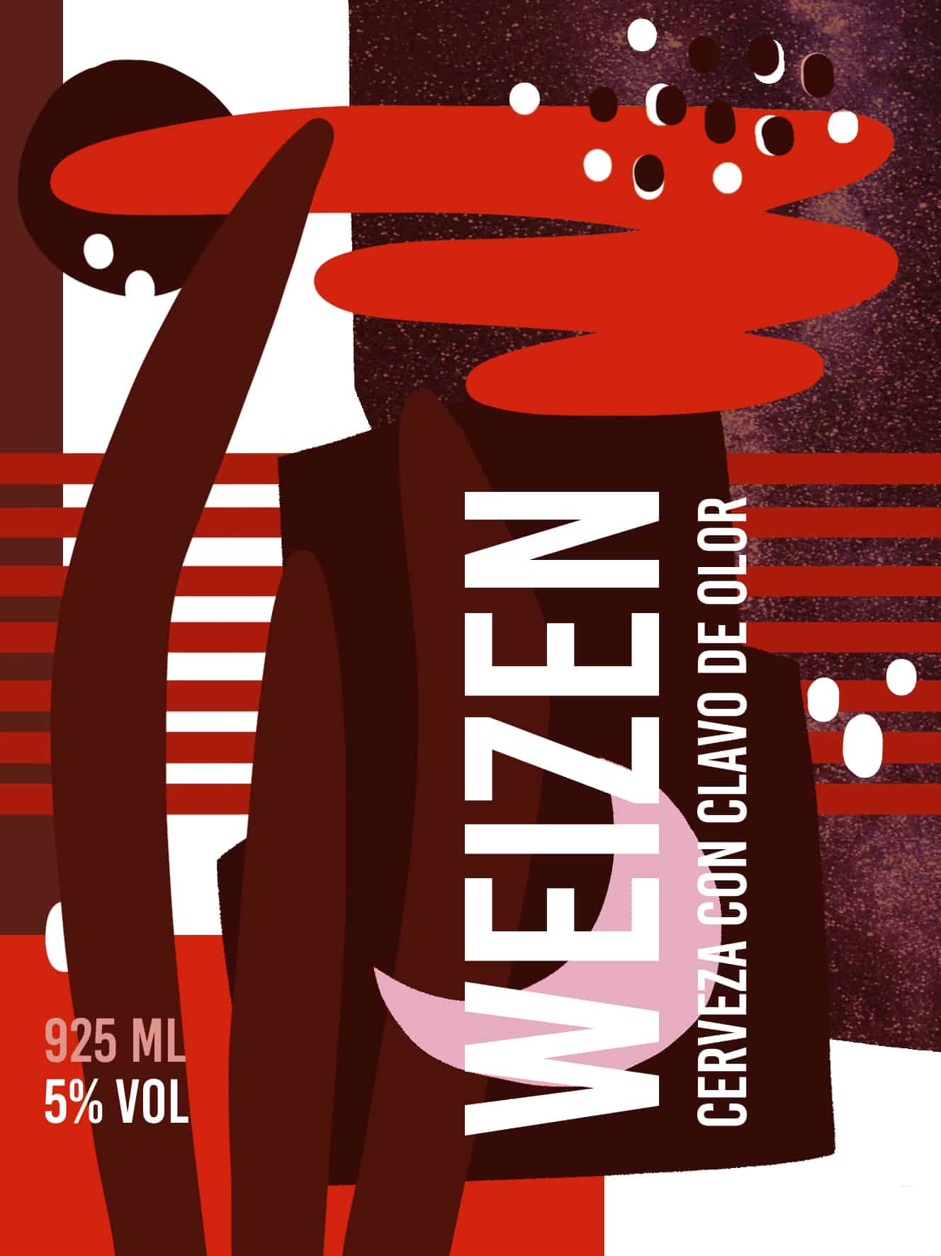
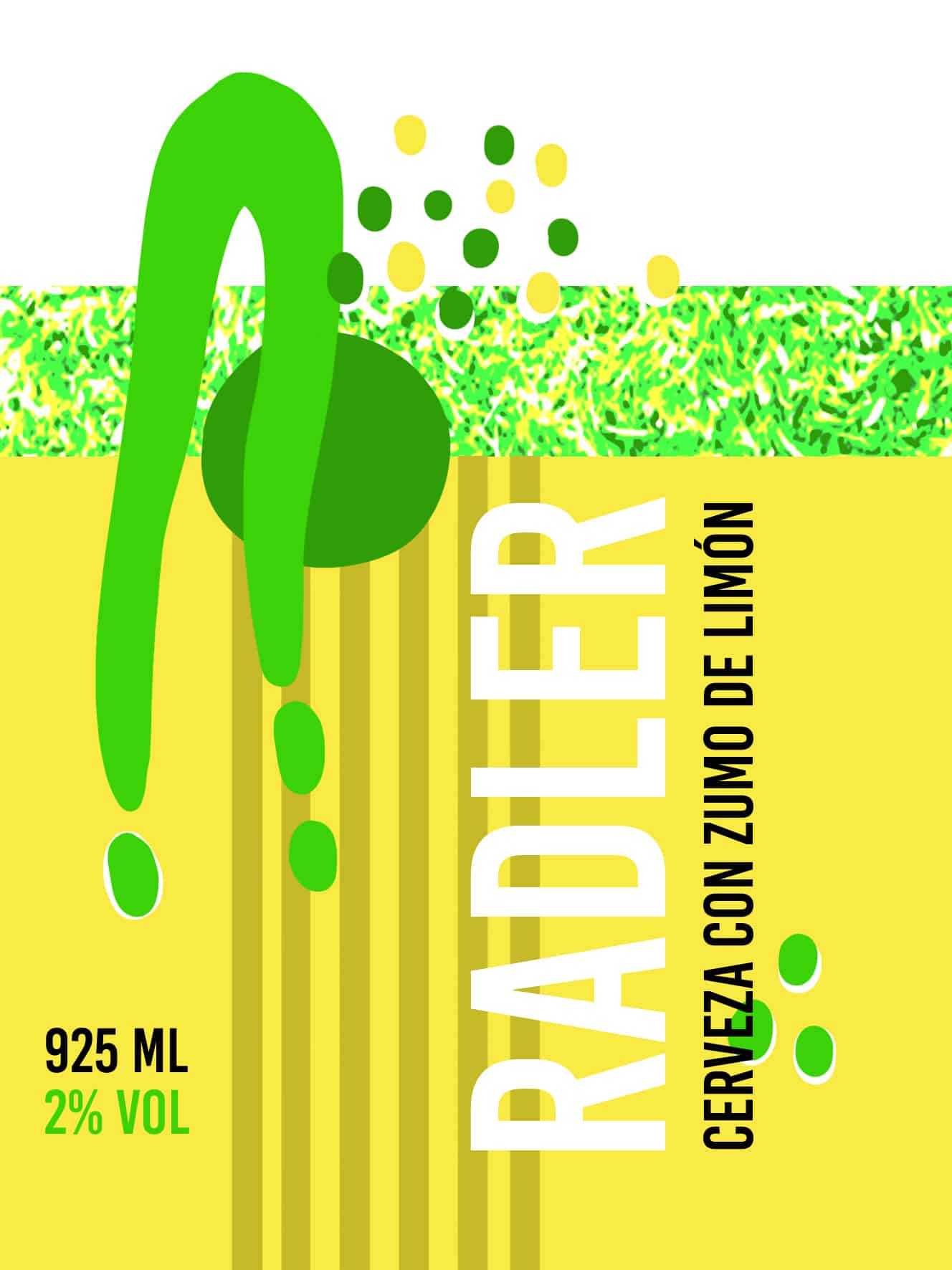
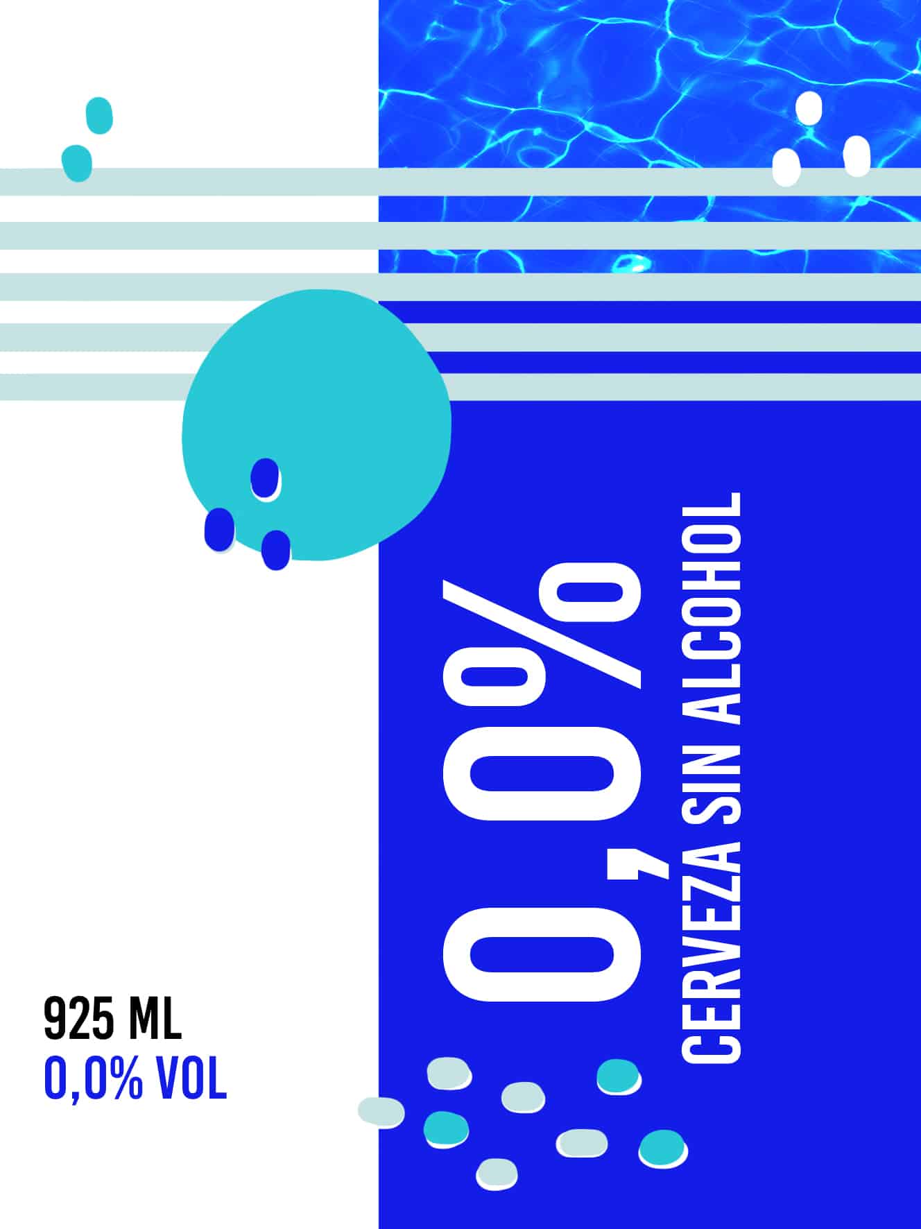
For this limited beer edition, I wanted to associate each characteristic ingredient to a perfect moment and way it could be consumed, and show it in an abstract way. In addition, I gave each variety a representative color and introduce it in Grolsch's logo.
Grolch Puur Weizen is the variety with strong body and the higher percentage of alcohol. Spiced with cloves and ripe fruits, associated with a night consumption, in large gatherings such as bars or clubs.
Grolsch Radler is a lighter and more refreshing beer, with authentic lemon juice, associated with a mid afternoon relaxing activity and the company of a smaller group of friends.
Grolsch 0.0% is the alcohol free variant, with a high percentage of water. Ideal for a morning consumption, when waking up or after doing sports, since it preserves the refreshing taste of beer and it's vitamins and minerals but with a fermentation that totally reduces it's alcoholic content.
Every bottle will have it's representative colored lid. Labels will be printed on paper and will have sectorized lacquer on the name and description. The bottle will also have two embossments for the brand's logo.
I first used Adobe Photoshop for making the illustrations that I later vectorized on Abode Illustrator. I also used AI for putting together the rest of the design.
The project got a positive response, it was seen as an attractive system that could identify itself as one.
To identify a group of pieces as a design system is important to have constant elements that link them as a whole and variable ones that gives each design it's individuality.
In this project, the constants are the description's position at the front and the structure at the back. Also lines and dots that are used as an indicator of the perfect moment of time to drink that beer. The variables are the amount of elements that compose the illustration and, of course, it's color.
Did you redesign the logo too?
Looks great, good job!
I like the label, it's very modern.
Thanks Alice!