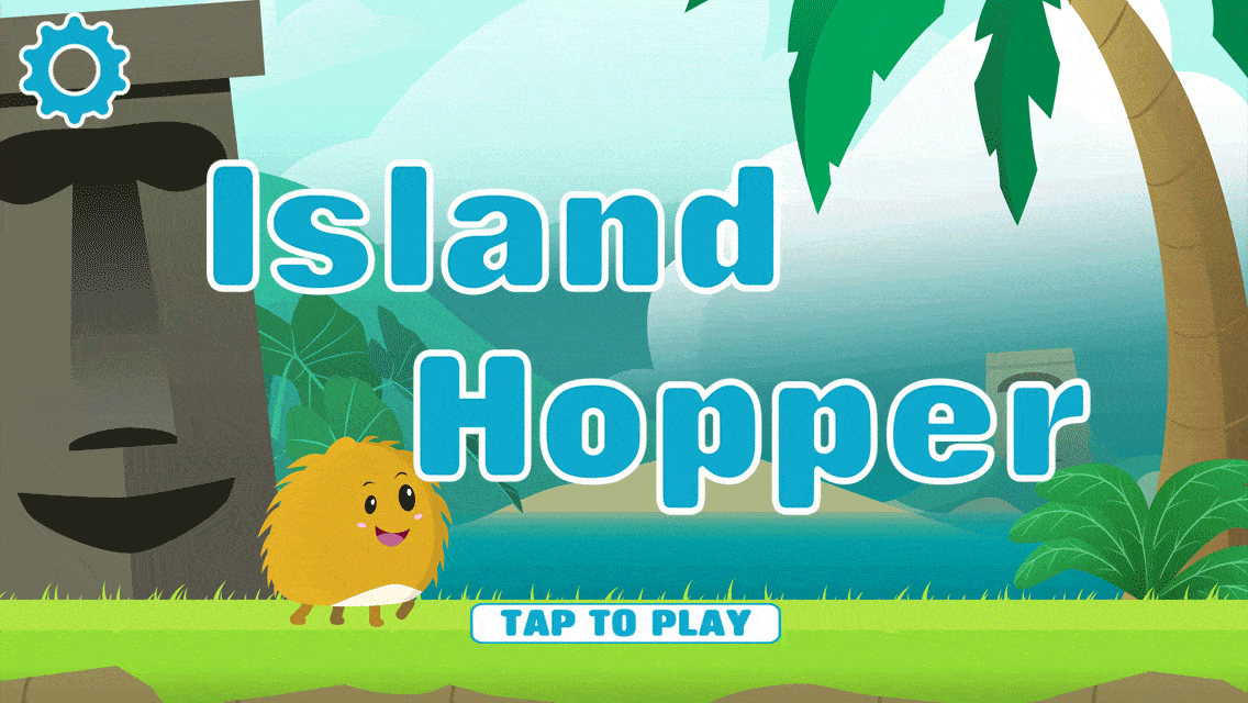
Island Hopper Artwork

This artwork was created for the mobile game Island Hopper, by Dezign Corp. (Find it on the Android or App Store!) It consisted of 5 unique levels, a character, hazards and power-ups. Due to the nature of the game, the assets were fairly modular in design.
The artwork direction for this game was fairly open, in that the game creators knew roughly the overall look that that they wanted, and that they needed an unique environment for each level, but left it up to me to decide specifics.
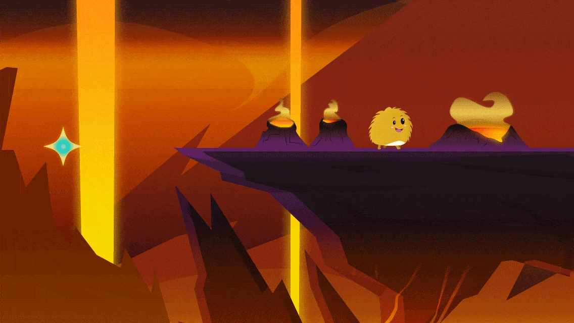
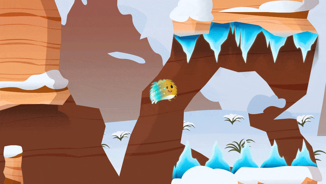
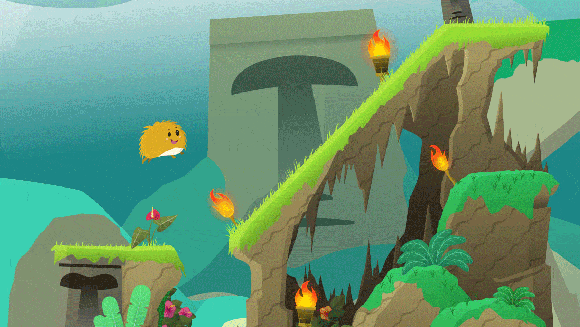
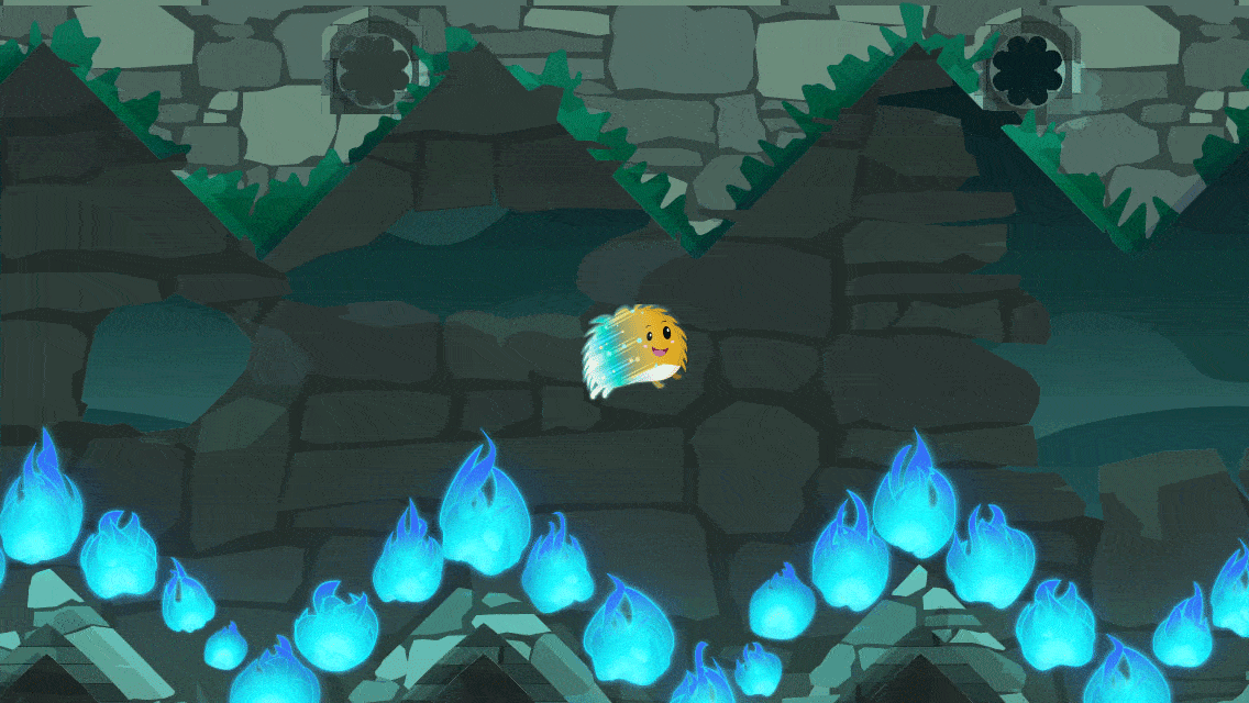
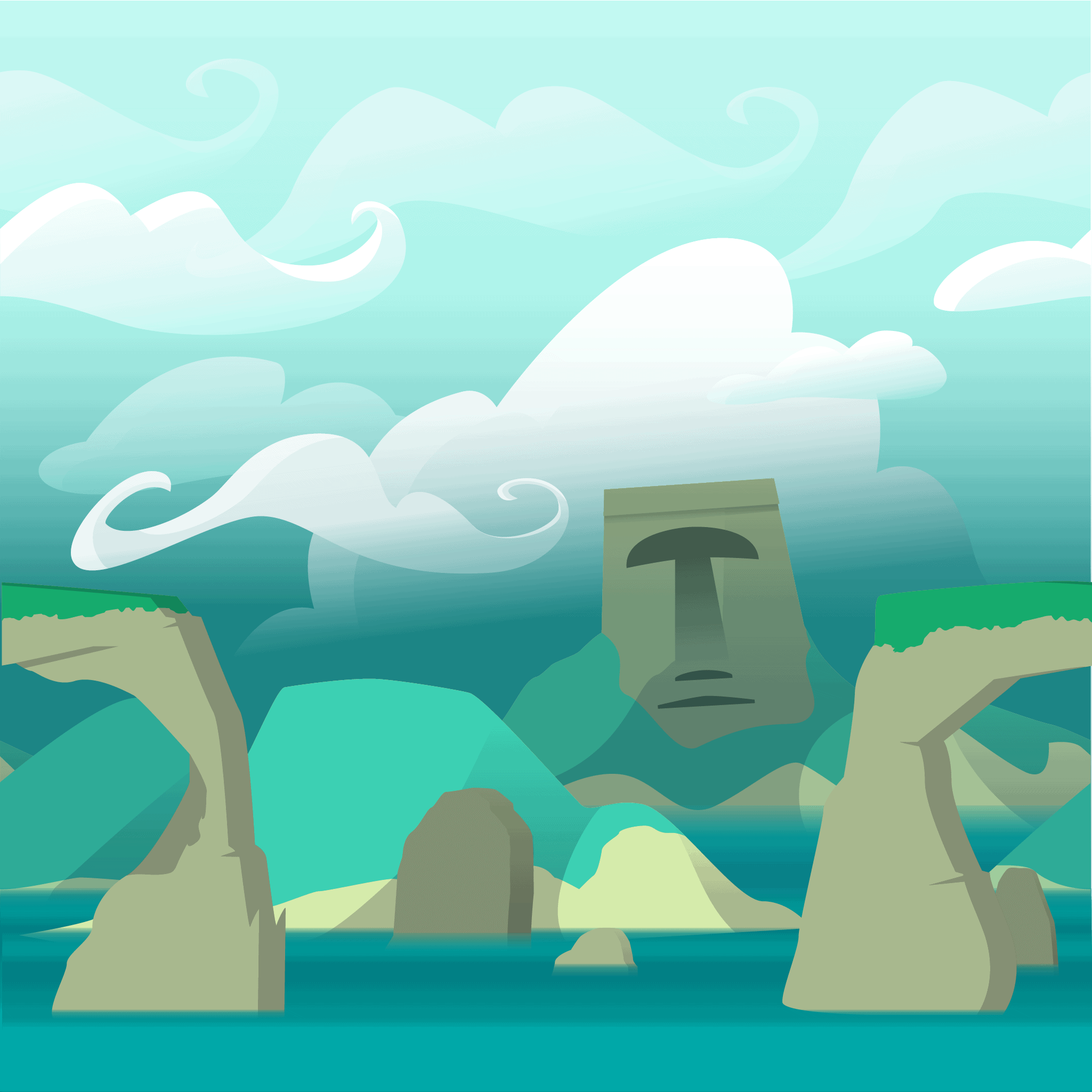
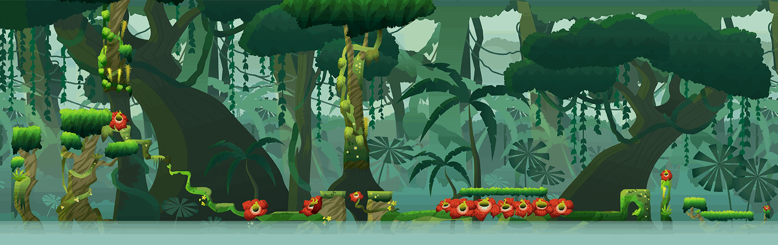
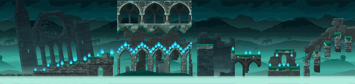
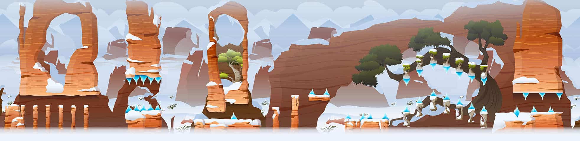
Given that initial direction I took influences from real-life environments including: tropical islands, the American southwest during winter, volcanos, the Amazon, a misty Scottish graveyard. I also wanted to bring a different color scheme to each level, for the sake of contrast; while being sure that the chosen colors all worked with the character and his powers-ups so that they would be easily visible in every level.
Since I was doing this project as a contract artist, things started with a style test to make sure that the game creators and I were on the same page.
After that, I gathered references, sketched the level in photoshop, and then created the level art in illustrator. Typically I did this by creating the base vector shapes first in a stand-in color, and then incorporating the final colors from my sketch.
To help save space, the levels would then be exported in three parts, foreground, middle-ground, and background; with the backgrounds being seamless so they could be tiled in-game. Each level also had a unique help & lock screen. Once the assets were ready, I helped check them in the game to be sure they looked correct.
During each step of the process I was in communication with the game creators to make sure of what did and didn’t work, and to be sure I was taking their preferences into account. The design of the character in particular was chosen from other designs largely because the game creators really liked his sketch.
During development, it became clear that the assets would need to be more modular then had initially been discussed. As part of that, I learned some important questions to ask about modularity and level design that I’d never before had to consider from an outside perspective. This reinforced the importance of being on the same page as a client, and to not be afraid to ask questions that fall outside of your immediate responsibilities especially when the answers will influence your design.
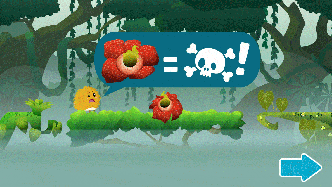
One of the main goals of this artwork was readability- because of the fast-paced gameplay it always had to be clear to the player where they could and could not land. Because another goal was variety, each level also had unique hazards. Coming up with those unique hazards and how to communicate the danger of said hazard to the player at the start of each level lead to the help screens, which ended up being one of my favorite parts of the game.