LEMON GRAVE BRANDING

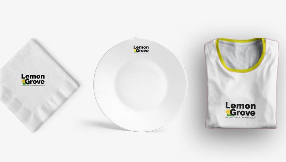
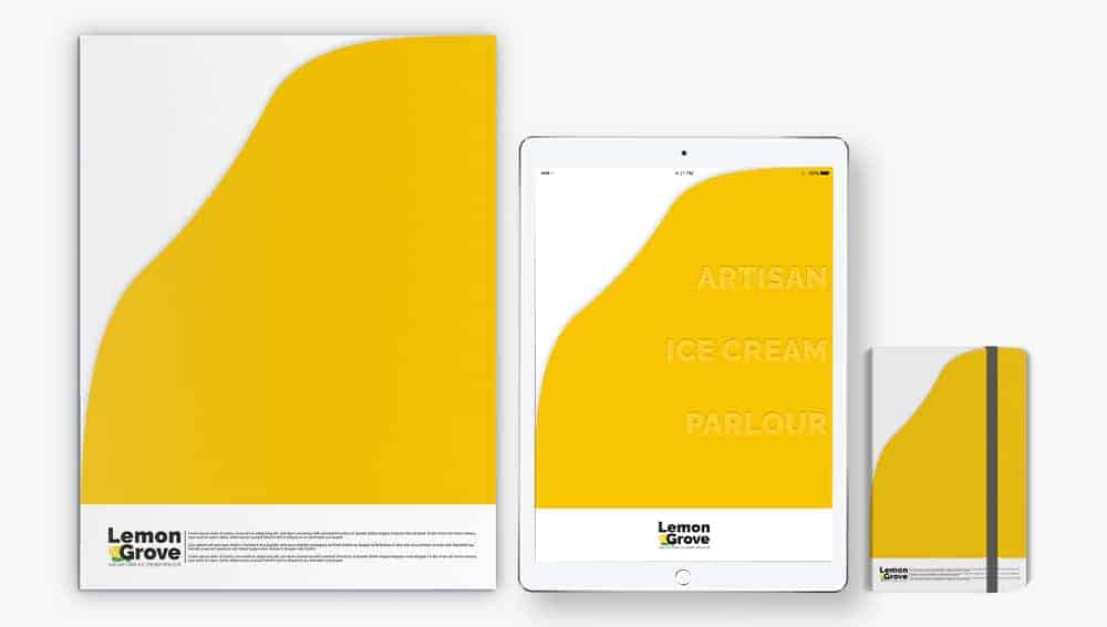
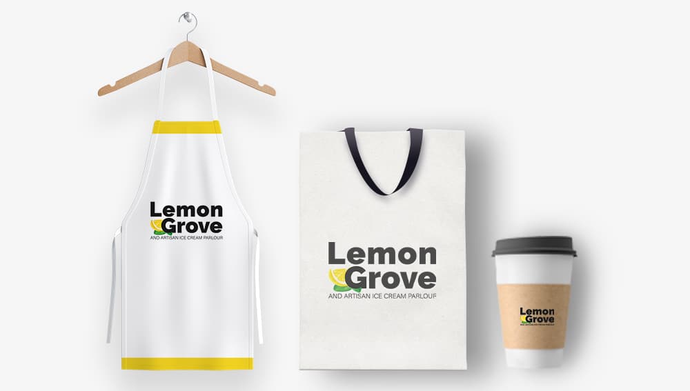
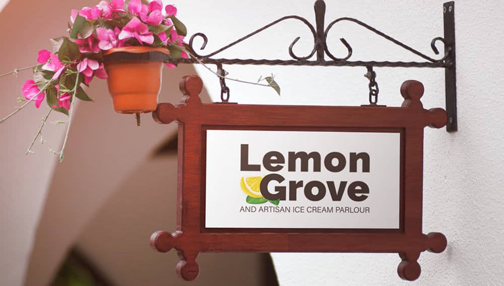
Brand design for ice cream called LEMON GRAVE AND ARTISAN ICE CREAM PARLOR. The main purpose of this brand is to work on ice cream. This is the basic motto. They want a simple, detailed and elegant design, so I avoid complexity. The idea was to show the company's values, to give credibility to the new market and to interact better with the final public.
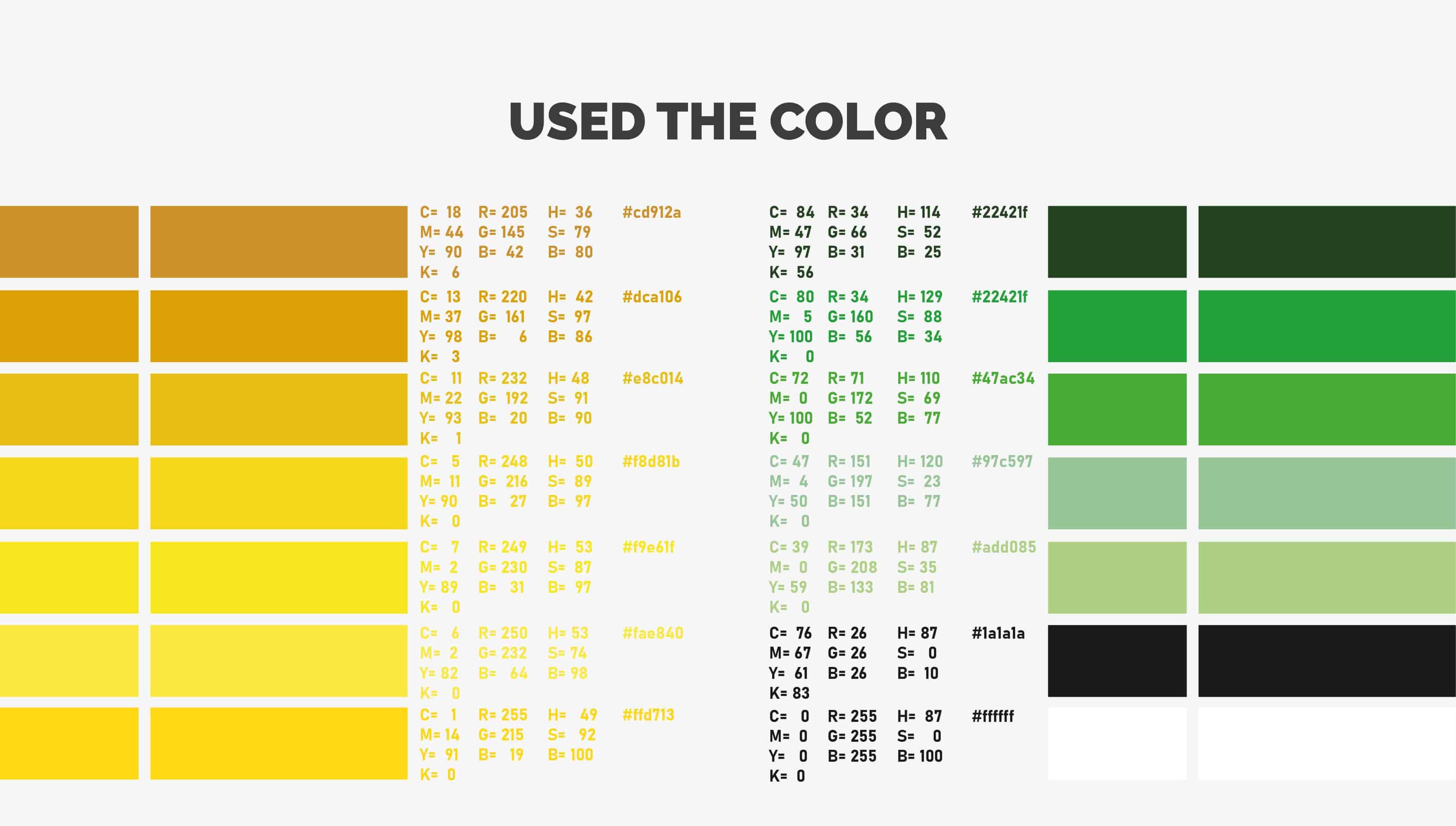
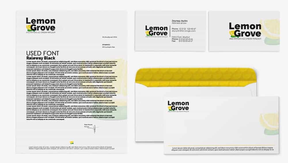
The idea of the logo consists of the initials of the ice cream brand LEMON GRAVE. lemon figure wanted a logo. The colors are black and lemon yellow. This is because the brand name is LEMON. They wanted corporate identity.
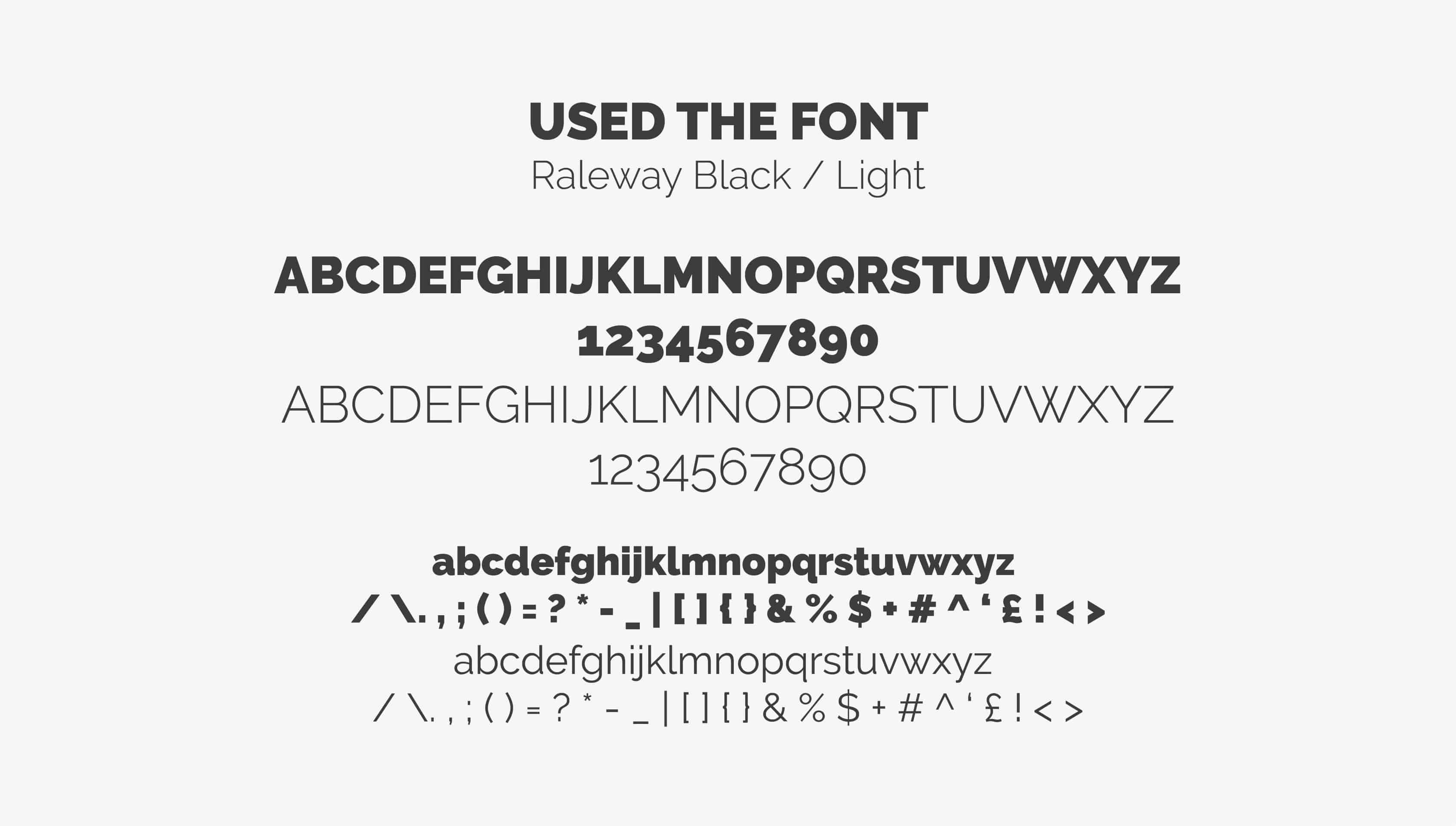
I used Adobe Illustrator and Photoshop. I turned the font I used into a shape. I applied masking on the shape. The font I used was Raleway. Cleverly has a heavy design with a fun touch. The round and serif font is simple and, on the contrary, its weight gives a feeling of safety and reliability.

I published this project at www.behance.net. Everyone reacted very well, I got an excellent approval, so I was invited to be published here at designideas.pics, thank you to my entire team for the calendar here!
I want to end this project by saying that I believe that a good design should not only be a beautiful design, but also functional and interactive. Understanding customers’ needs and habits is crucial for planning and developing projects that can affect the human development process as well as simply communicate.
For contact: [email protected] & [email protected]
I love this, so simple and elegant!
Thanks