Logo Design: Tedd Hoffman Insurance Company

Logo Design for Tedd Hoffman Insurance. Client requested a practical logo using blues and dark colours. The guidelines for the logo were sophisticated, classical and literal. So it was more of a mature logo using dark blues and clean lines.
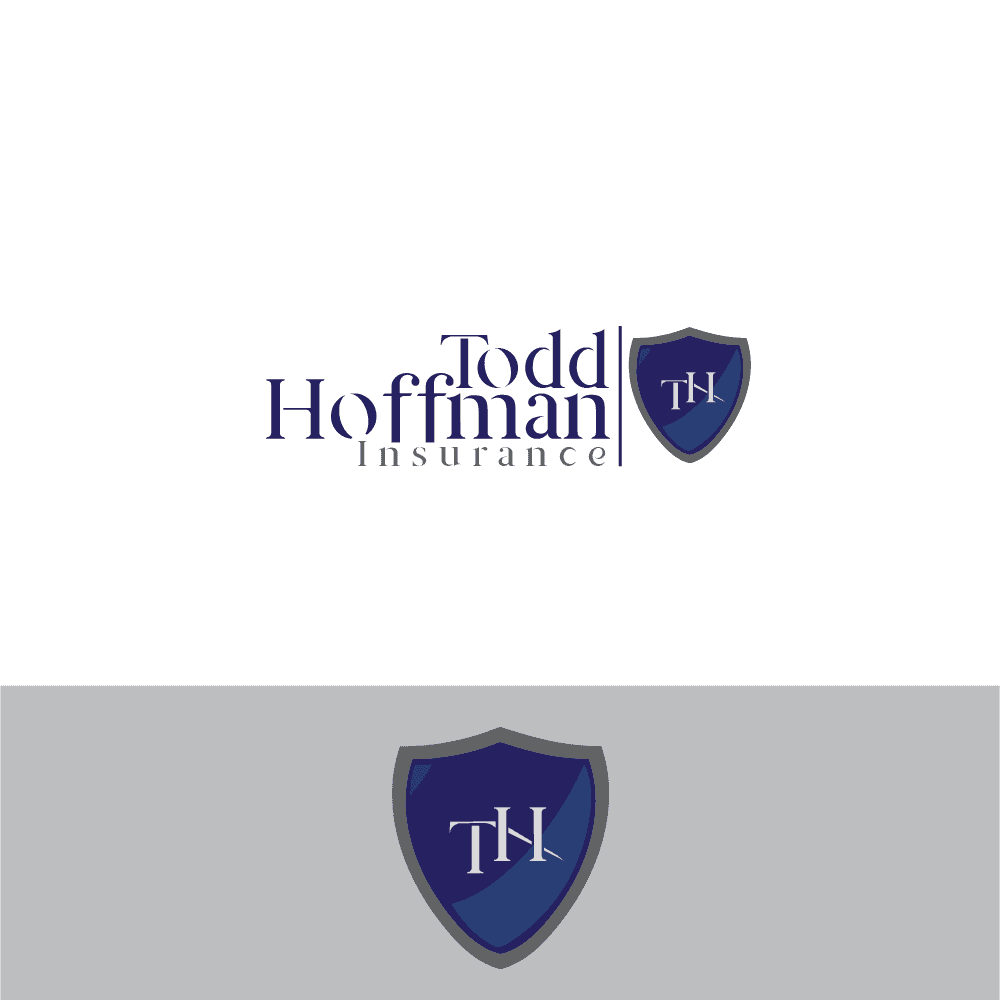
The client requested a practical logo using blues and dark colours. Before creating any logo I usually make some research about other logos in the same fields. The colours, the lines, the fonts. And then I put them all in a blender and come up with my own design having integrated everything I saw.
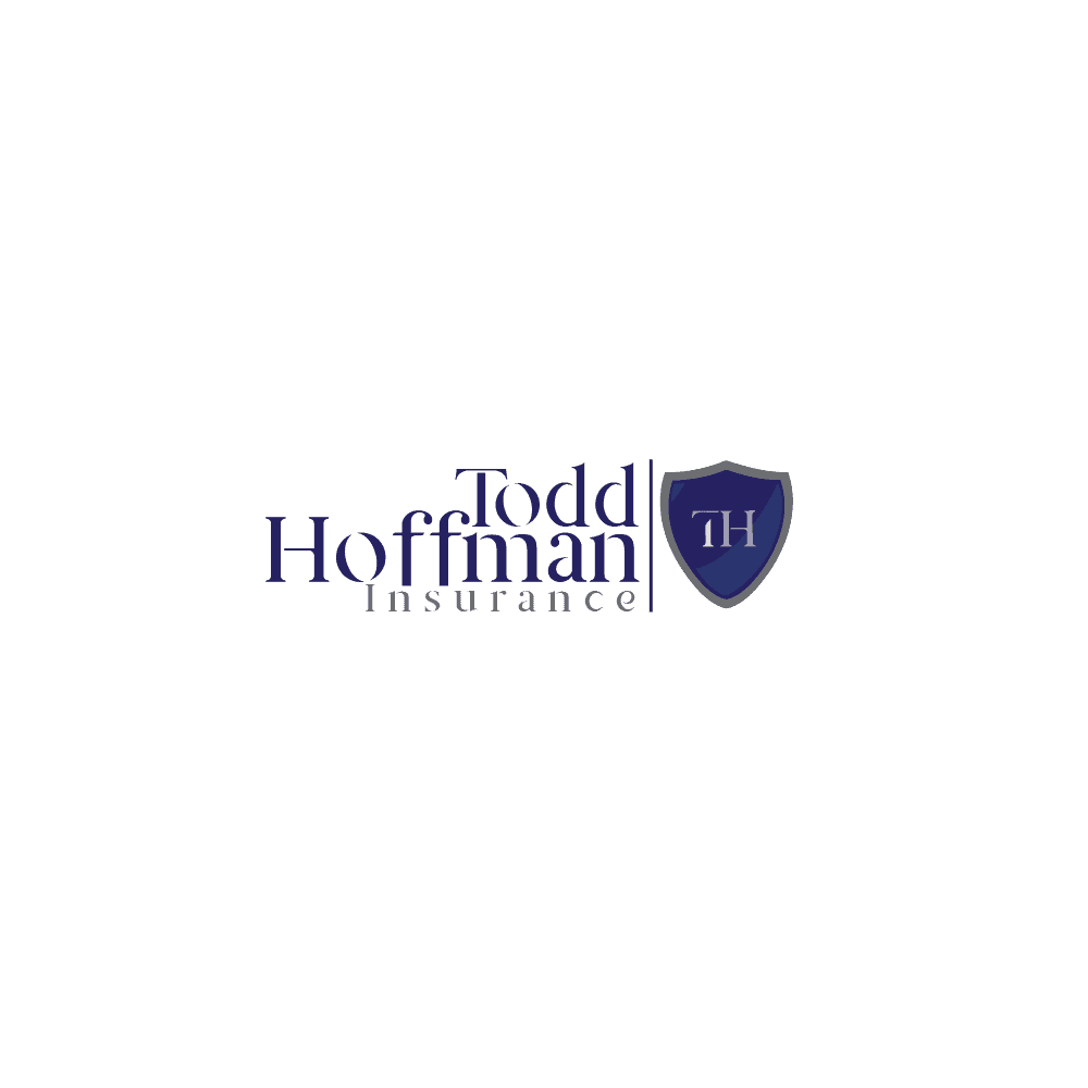

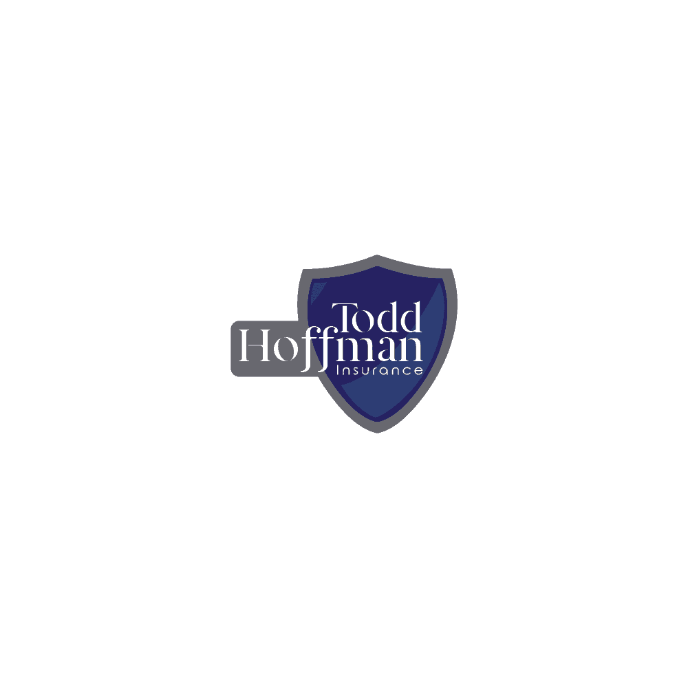
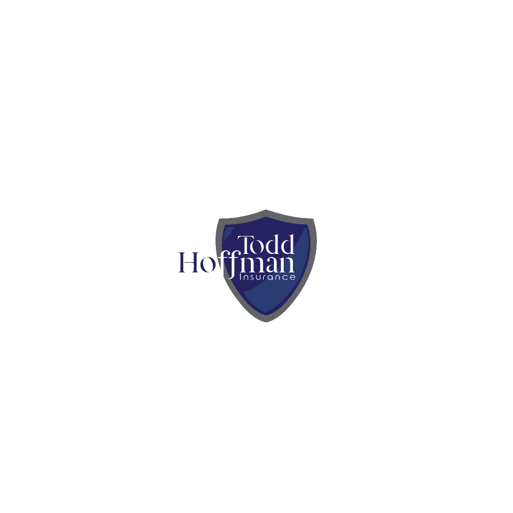
I used Adobe Illustrator to create the logo. To begin with I experimented the title "Tedd Hoffman" using several fonts until I found one that matched the client's profile. I then researched for insurance-icons. I drew the shield using the pen tool, then added some darker and lighter shades to give it depth. After that I created outlines on the font and cut some parts out to show other parts of the logo. And viola!
The client gave it a 4/5 star rating. I learnt that the more you stick to the clients guidelines, the more likely you are to win the bid.
And that sometimes when you think that your work isnt really looking that good but submit it anyway, you might get surprised that this work ends up being the clients favourite. So always sumbit all the work that you do even if you think they wont like it.
Paragraph writing is also a fun,if you know afterward you can wriute otherwise
it is complicated to write.
Awesome design! Very stylish :)