
Minimal Metroid Essentials by Kirk Wallace

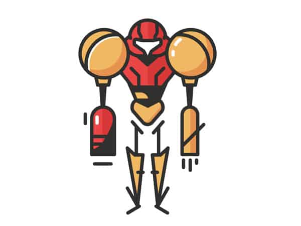
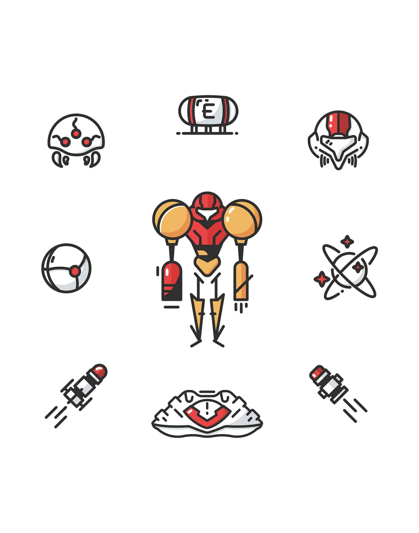
So much nostalgic feels on this one especially for the Metroid video games players out there. Who can relate? Enjoy a minimalist illustration that features the Super Metroid (SNES).
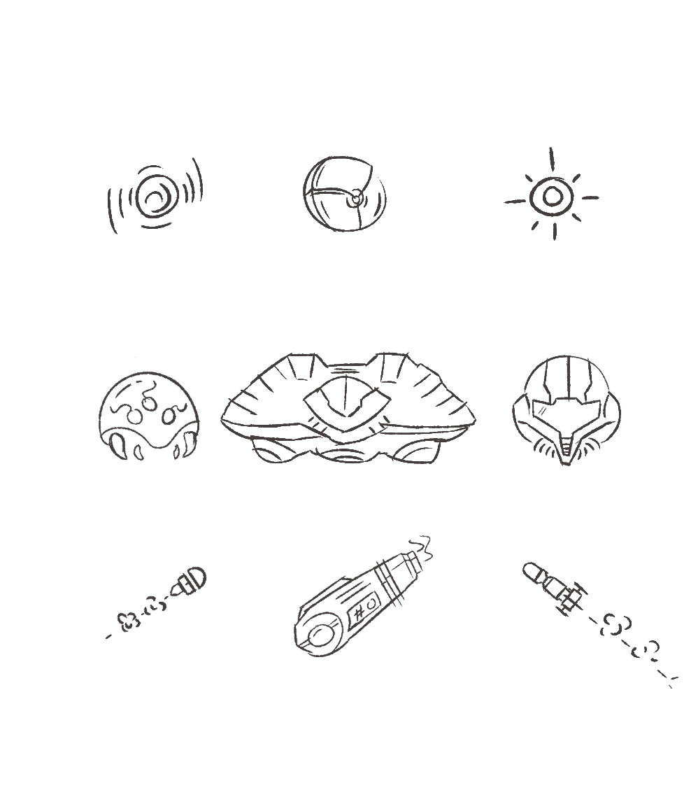
The "Minimal Metroid Essentials" is a series I've started doing as a personal / passion project to try to challenge myself by recreating the nostalgic and lovely feeling that video games (and other things like cartoons / tv shows in the future hopefully) bring me when I played them the first time. The challenge is to try to keep things as simple as possible. What I mean by simple is not so much visually or the way it 'looks' minimal, but literally trying to duplicate the essence of the content with a few strokes as possible while staying stylized. Things like the limited color palette, keeping all outlines / strokes the same width, etc. It's a challenge that helps push my creativity while limiting it severely. Very fun! I hope to do this with more styles as well as more subjects (Adventure time would be great!)
ABOUT KIRK WALLACE
Kirk Wallace is an illustrator and printed goods maker from the North East area of the United states. Spending every summer skateboarding and reading comics outside for many years now, he's accumulated a gritty but fun story-telling art style. Exploring recently further into graphic design, he's constantly infusing every piece of inspiration and culture he sponges up into his work. His current drive is making more artistic products for people to hang on their wall, stick on their computer, or wear on their bodies over at his small but humble shop.
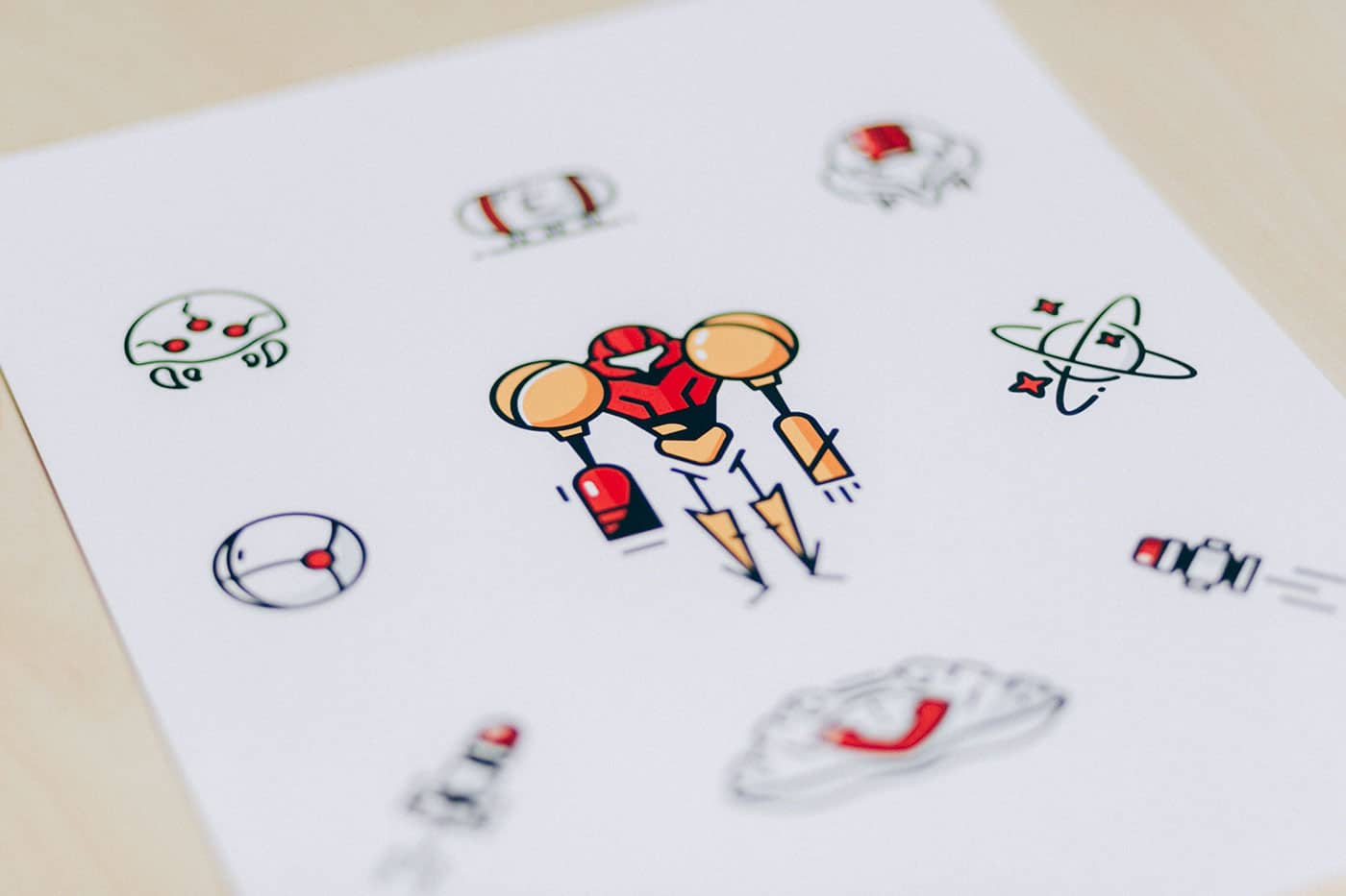
wonderful photos!!!!
Yeah, surely very minimalistic while keeping the essence of the game characters/elements intact. Many a times, designers while making such complex characters go on a rampage by doing too many things and make a complete mess.
But what Kirk Wallace has done here is he resisted that same temptation and went with using as fewer resources as possible while making it. The resultant design which came out, while telling us everything, is still very clean and minimalistic in its looks and feel. An ace job!
What a sleek design! Well done =D
I love the colors and the stroke you chose! Perfectly executed