Odyssey Poros Re-brand

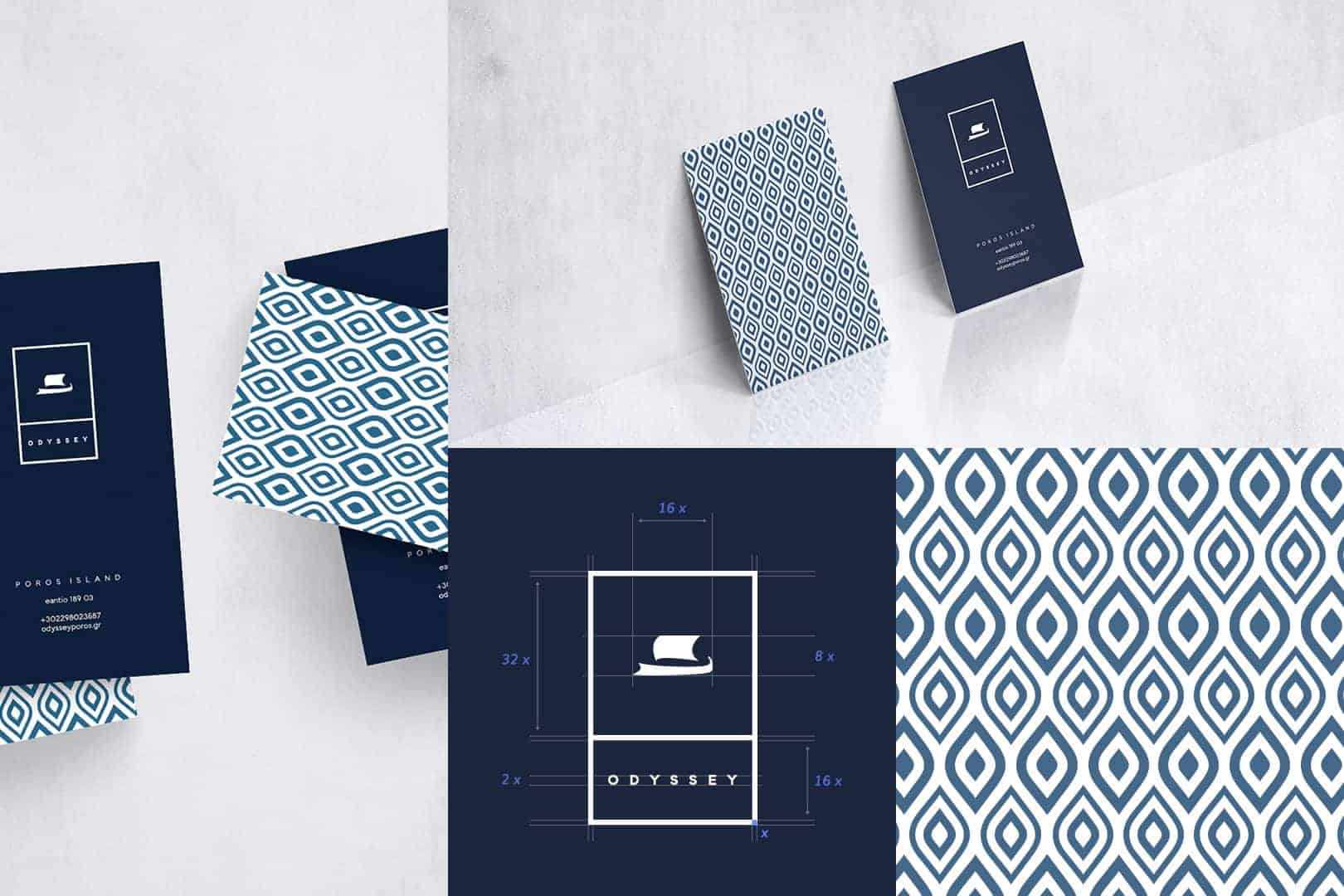
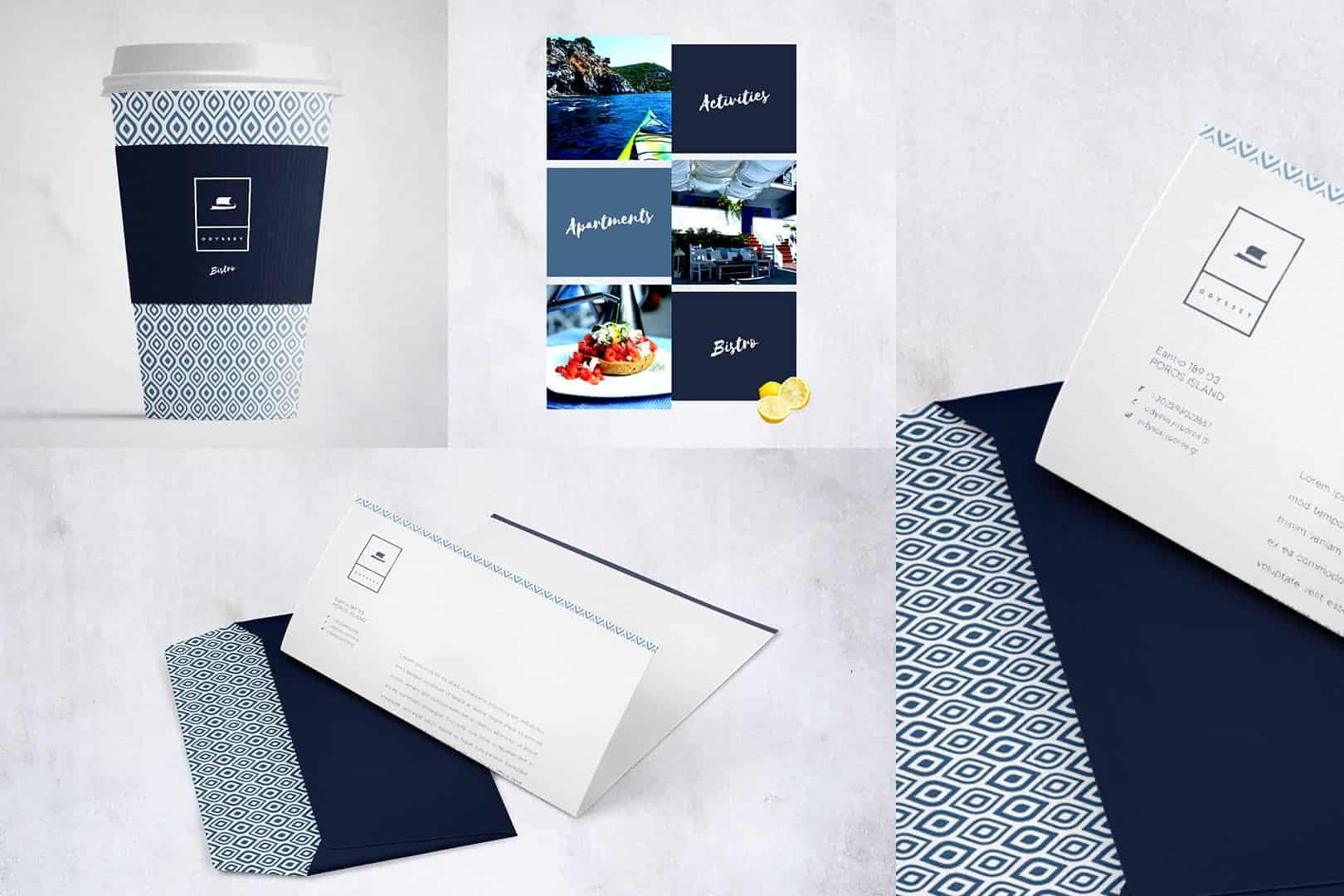
This is an ongoing project to re-brand all aspects of Odyssey; a family run business based on the island of Poros in Greece. Established in 1994, they have a complex of 11 apartments as well as a bistro, and offer a range of activities. The branding includes a refreshed and modernised Odyssey ship logo and custom made pattern to be used in print, as well as a new web design.
Greece has a very strong visual identity and as a result there is much inspiration to be drawn from when creating a Greek based brand, especially in the hospitality sector.
If you are holidaying in Greece there are certain expectations you will have: delicious fresh food, clear skies, blazing sun, translucent seas and the feeling of belonging that comes with the warm Greek culture to name but a few. These things embody Odyssey, especially the latter, where you arrive as a guest and leave as a friend.
I based the style around the notion of "contemporary" Greece, while avoiding the use of overly clichéd Greek visuals. I wanted something with more nuance. I find the flip side to Greece's strong visual identity can be the overuse of certain elements, like an "ancient Greek" style font or meander border.
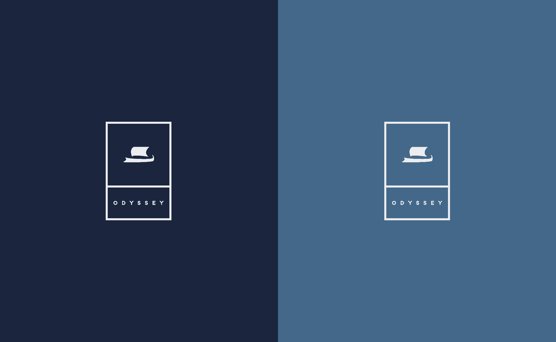
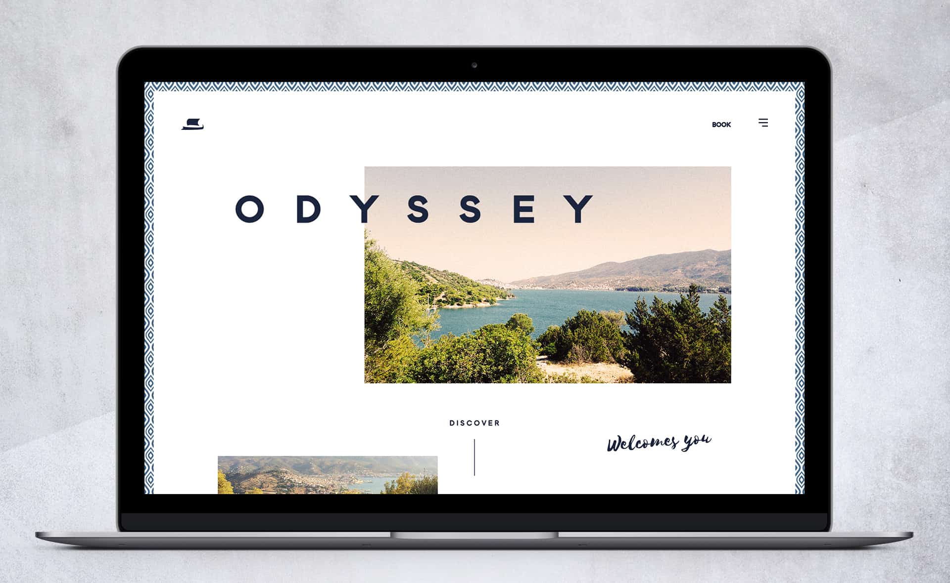
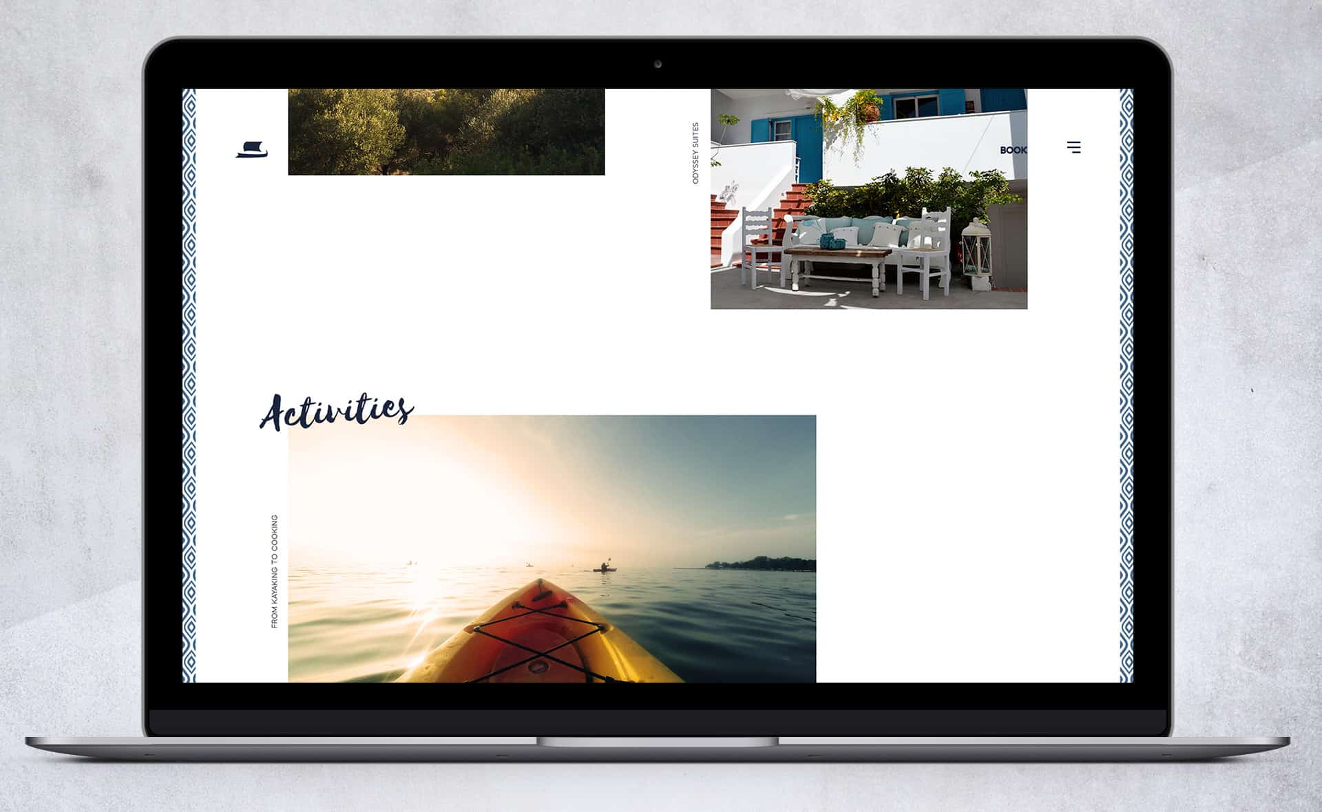
With contemporary Greece in mind, I chose shades of blue and white as the palette. These reflect clear blue skies, azure seas and the white washed buildings of Greece.
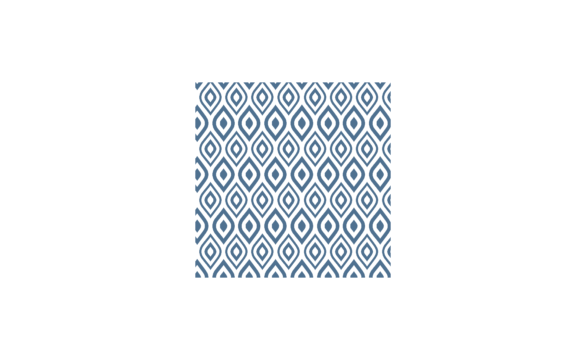
Pattern has been used as a design element extensively throughout Greek history and I wanted it to be a major part of this branding. The pattern I created is loosely based on the Greek "evil eye", a subtle nod to a mainstay of Greek symbolism.
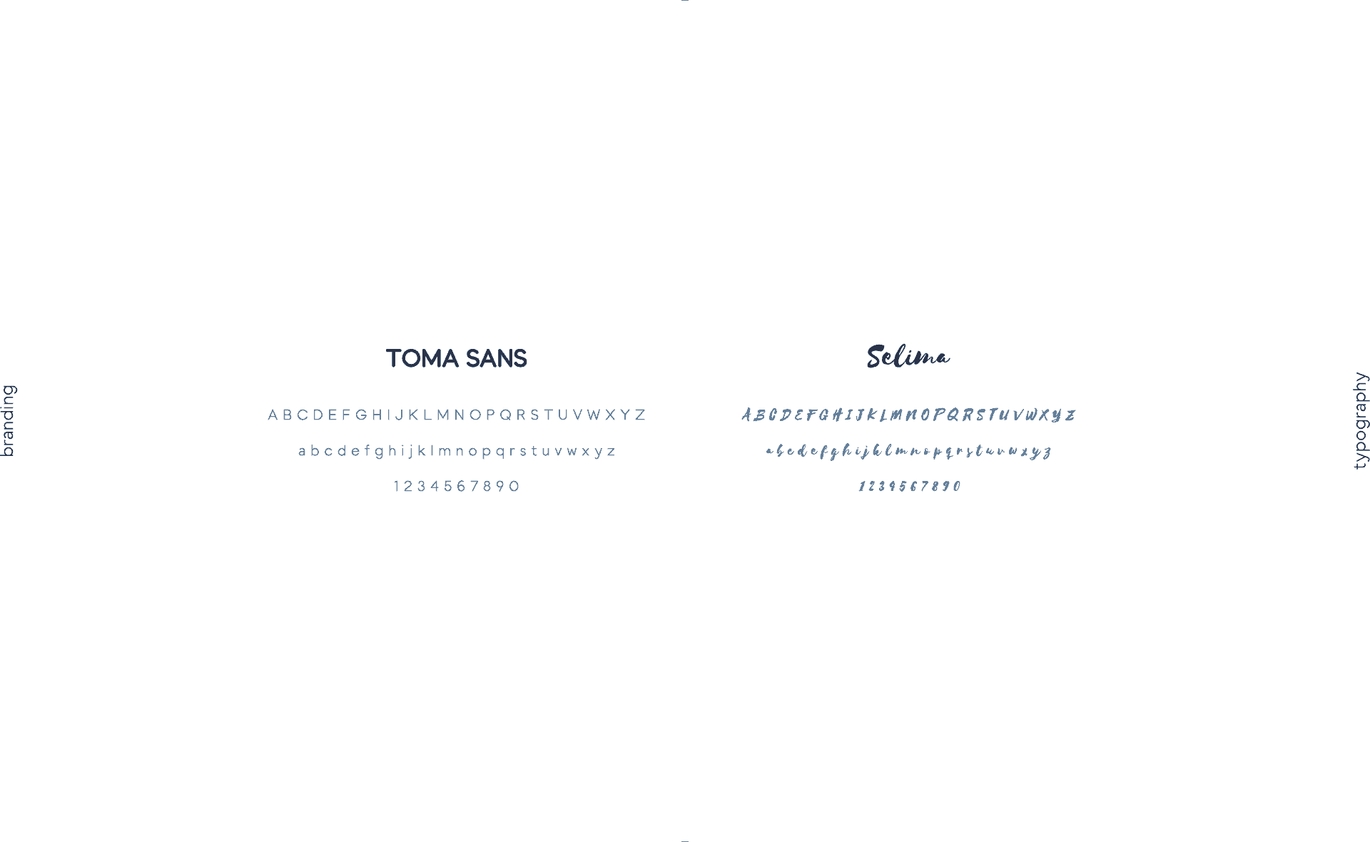
I chose the typography with "arrive as a guest and leave as a friend" in the forefront of my mind, coupled with the fact that Odyssey offers a high quality service. I wanted the type to communicate luxury and quality, but also friendliness and hospitality, and so chose to partner a modern sans-serif typeface with a dash of a warmer hand-drawn font.
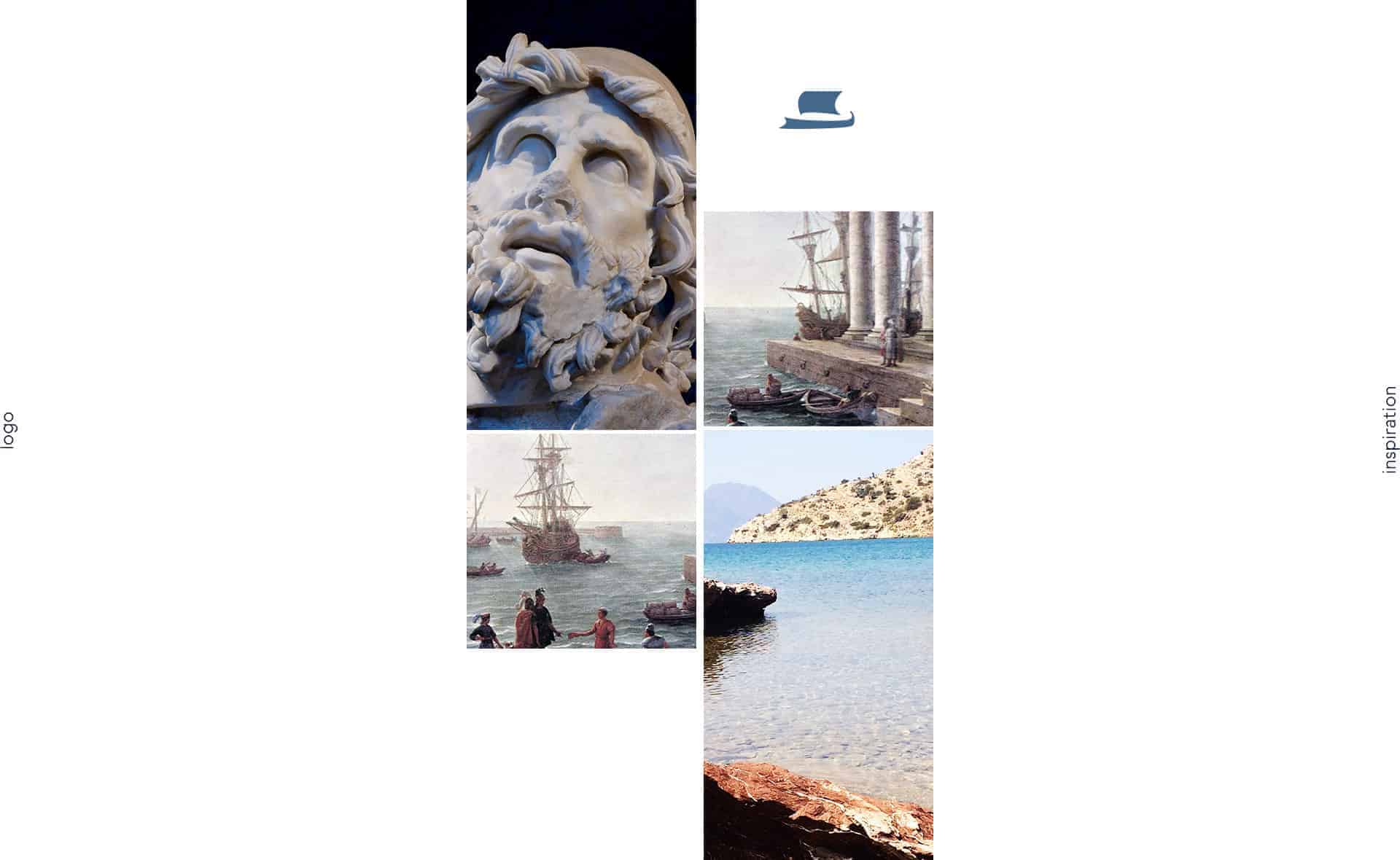
Odyssey is named after Odysseus; the legendary Greek king of Ithaca and the hero of Homer's epic poem The Odyssey. They have used a stylised version of his trireme (an ancient vessel) as their logo since establishment, so instead of starting from scratch and scrapping the 20+ years of visual identity already built up by the business, I decided to modify and modernise the logo.
I started by sketching out the new logo with pencil and paper. It needed to look much more modern and streamlined so I removed any unnecessary elements (oars/mast/rope) and kept it to just two: the ship body and sail. I then created the final version in Illustrator tweaking the dimensions to create a more harmonious ratio between them.
The pattern was also created as a vector in Illustrator to ensure it could be tiled infinitely. Mock-ups were created in Photoshop, with final print files to be created in Indesign. I used Photoshop for the web designs.


Reaction so far has been pleasing and positive with supportive comments, especially on the pattern and colour scheme.
It's important to stay true to yourself and your design decisions, and be able to explain to the client exactly why you have chosen to do something in that particular way. I'll view my project a success if the client is delighted and people can draw inspiration from it, but also if it makes a viewer look twice and really think about why it is designed the way it is.
Many thanks for reading!
You can view the full project at https://www.behance.net/gallery/34074906/Odyssey-Poros-Branding-(WIP) and more of my work can be found at kostaslagos.com