
Oyster's & Co. by Daniel Barba Lopéz

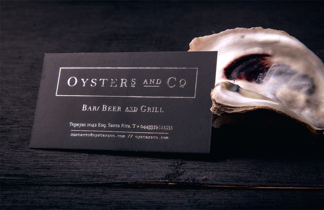
Oyster's & Co. is a restaurant based in Guadalajara. It name comes from the style used during the end of the 19th century. Big brands have the ending “Company (Co.)”. Read on and enjoy!
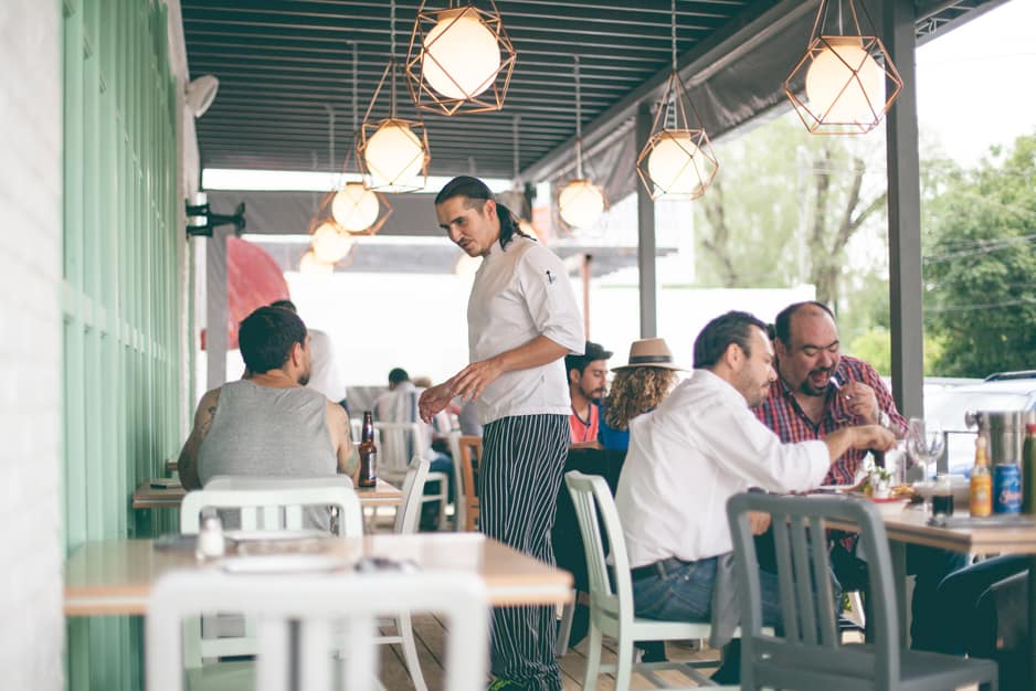
Due to launch a unique and new restaurant in Guadalajara, we came up with the idea of an innovative and fresh identity mixed with a classic and sober tender. This, thinking of our market: customers looking for high quality food, fresh concept, and at the same time a warm place to enjoy.
- Daniel Barba Lopéz
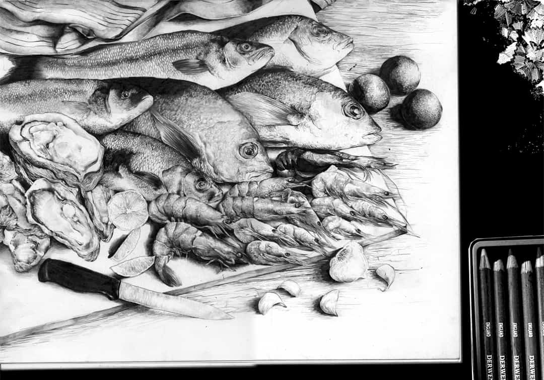
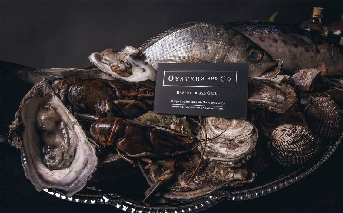
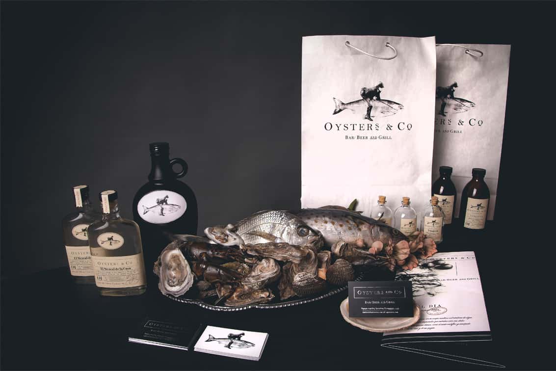
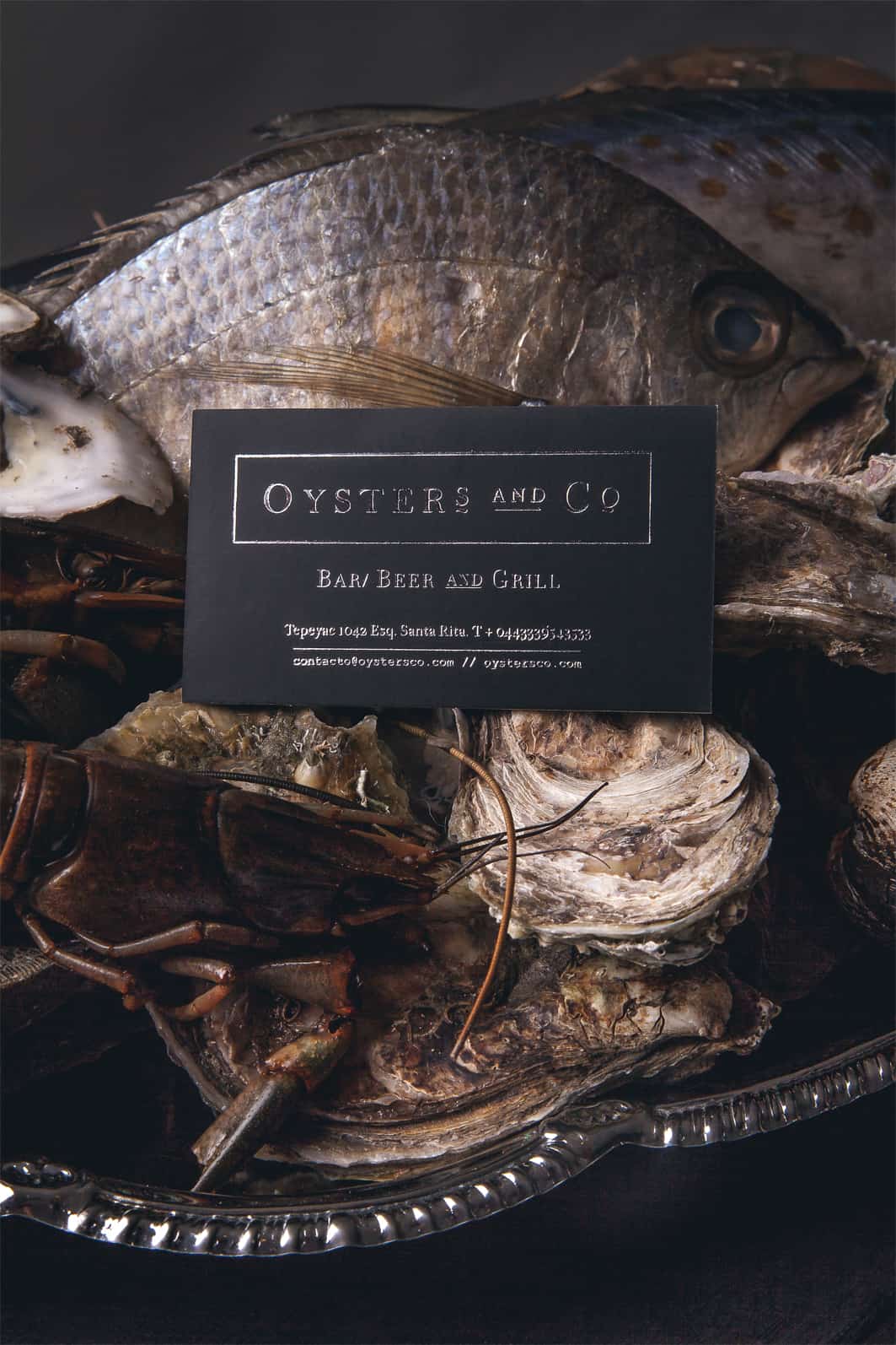
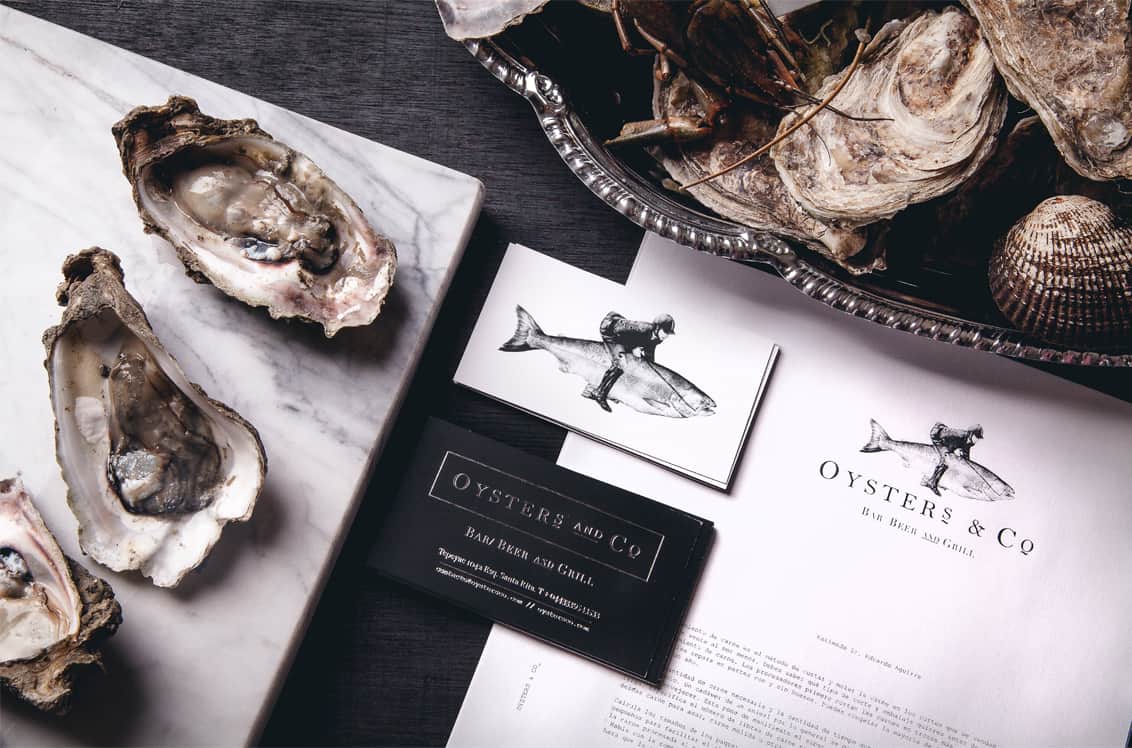
We took as reference the Victorian age from the 19th century, the vintage stetics from the oyster bars in San Francisco Bay. The corporate identity has also details inspired by European Renaissance, particularly in still life scenes.
- Daniel Barba Lopéz
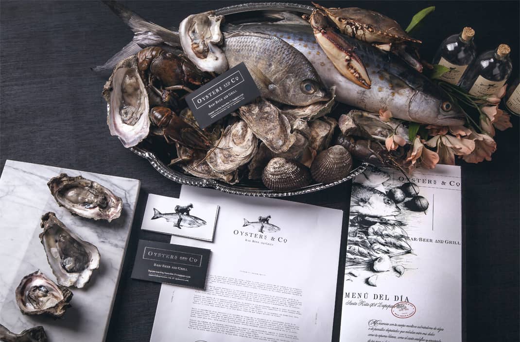
I got the ideas from art books and magazines, reading about this era, analysing composition photos of still life paintings and doing research of typical scenes of European Renaissance. Personally, I enjoy these topics and find them interesting, which is why I chose them as an inspiration for the project.
- Daniel Barba Lopéz
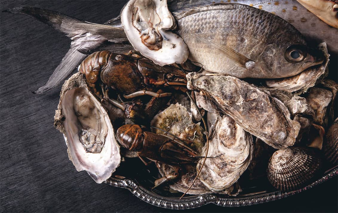
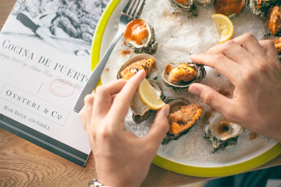
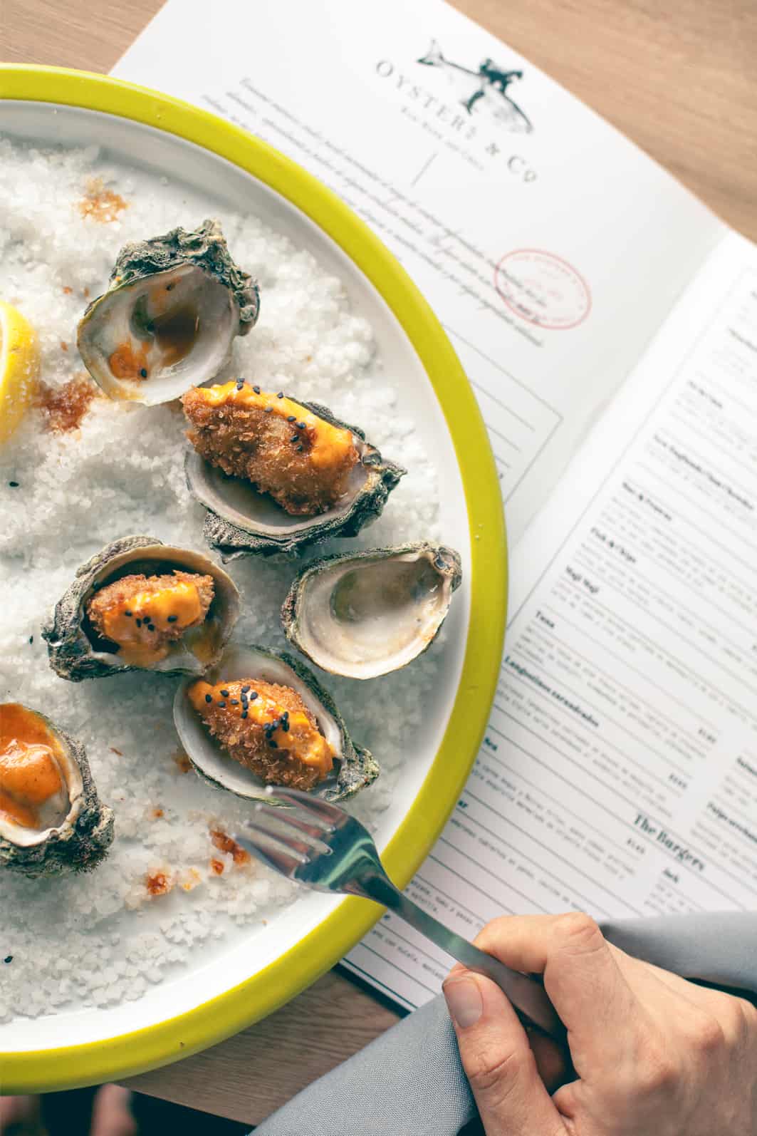
Each project has its own peculiarity and in this case, Oysters & Co. has the needing of a strong impact in photography, so the big challenge here was to create harmony between graphic design and art direction.
- Daniel Barba Lopéz
About Daniel Barba Lopéz
Daniel Barba López is a graphic designer and art director. He is the founder of MONOTYPO, a design studio based in Guadalajara, México. He is passionate about graphic arts, the creation of typographic alphabets and design in general, taking all involved on it as industrial, architecture, graphics and fashion. You can find more of his works on his Behance profile or website.
Awesome branding!