Redemptorists Logo Redesign

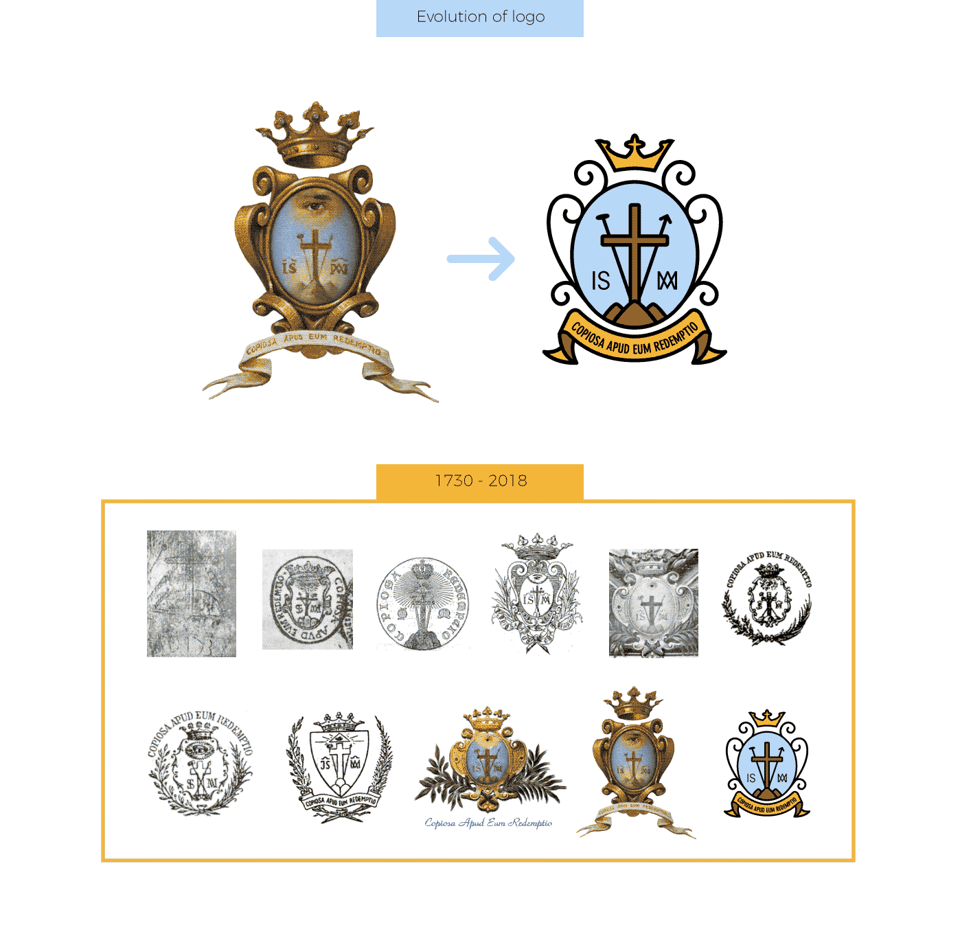
Redesign of the historic Coat of Arms of the Redemptorist Congregation founded by San Alfonso in 1732. This symbol has a rich history of more than 300 years, and has served as the official seal and logo of the congregation throughout its history. The challenge was to capture the most significant details of this complex symbol to preserve its essence.
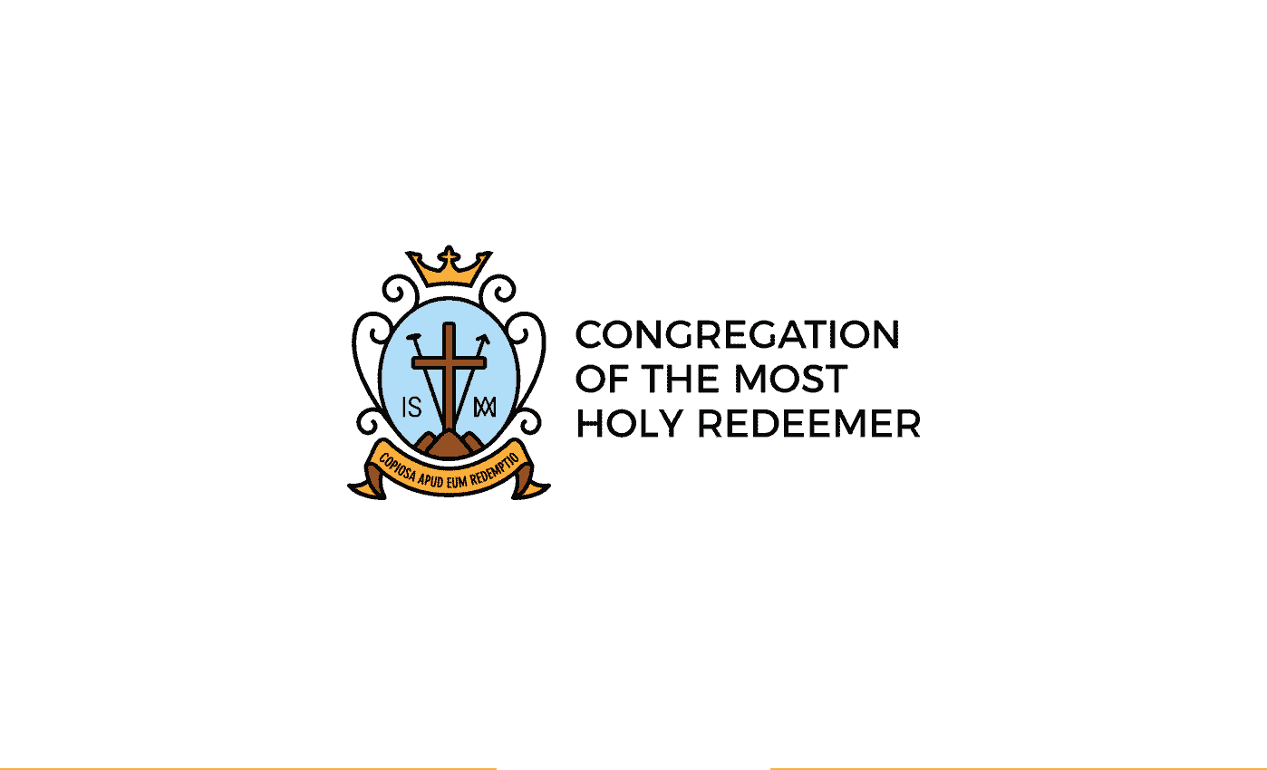
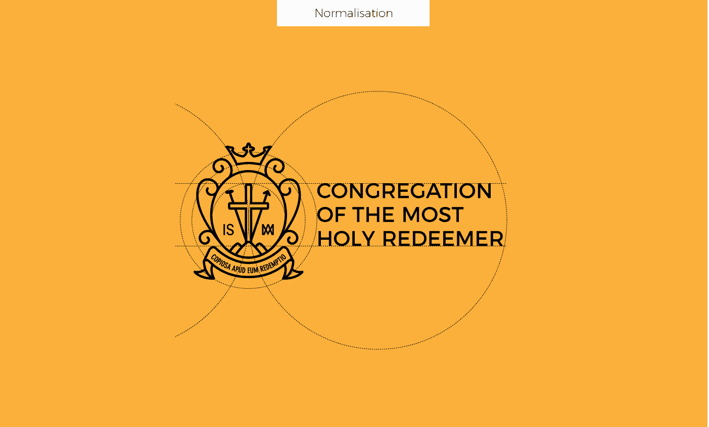
Inspired by the minimalist redesigns of heraldic symbols, I set out to give the Coat of Arms a more modern character, and make it the logo of the congregation. Visibly simpler, it consists of 4 basic colors, with possibility of application in black and white. Elements that were present from the beginning of the symbol, such as the Cross, the two spears, the 3 mountains, the slogan in latin, and the legend "IS", "IXXI" are preserved.
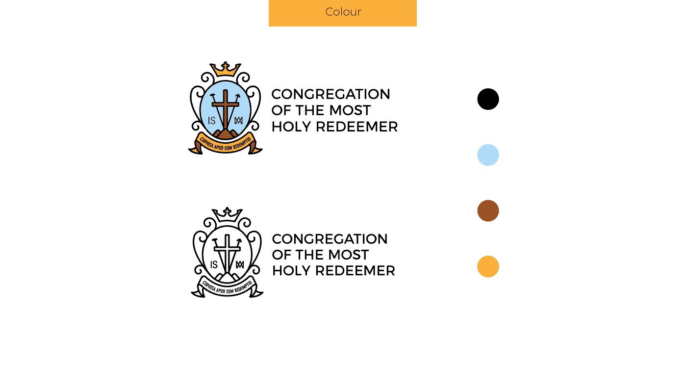
I started researching the symbols that the congregation has used throughout its history, so that I could rescue some elements that were always present regardless of the epoch. After this, I sought inspiration online on heraldic redesigns, and I chose to go with the minimalist style of light stroke. Then, after doing some very simple sketches by hand, I started to design in a vectorial software (Adobe Illustrator). I made a color variant, based on four predominant colours in the oil-painted symbol, and one in black and white, in contoured style.
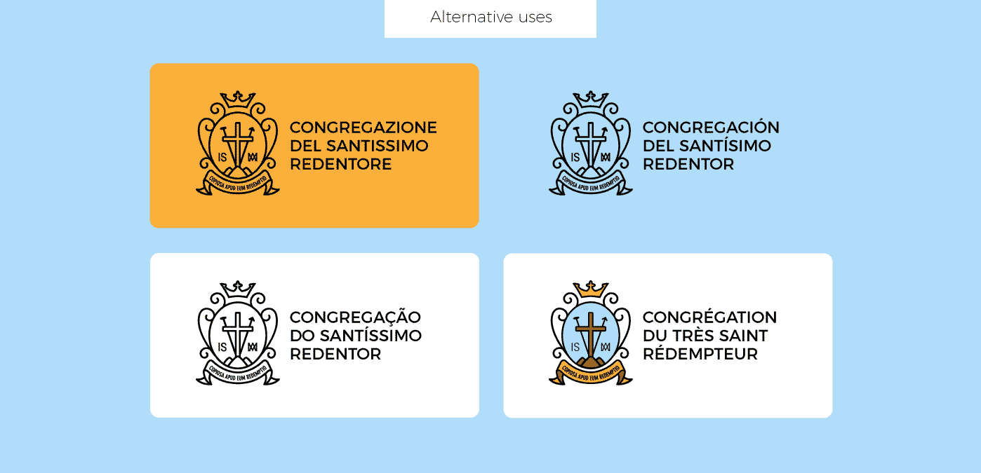
I have received positive reviews, and above all, the feedback that the Congregation of the Most Holy Redeemer finally has a modern logo that does not leave aside its historical identity, since with a simple online search you can find a wide variety of modern logos of the Congregation of the Holy Redeemer, however, very distant from the heraldic spirit of the original designs.
Check my Behance profile: https://www.behance.net/cintiqui9041
I absolutely admire this task. I teach at a Catholic School in Hinton, Alberta, Canada. Our school is named after the founding Parish Priest, who was a Redemptorist. I was tasked a couple years ago to re-design our school logo based on our previously hand drawn one from decades ago and make it more modern. I thought about incorporating some of the Redemptorist elements to Evangelize our logo more, but alas I was unsuccessful. I have definitely been inspired by your work. It is so good to see that the Holy Spirit can move people to use their gifts. I tend to gravitate towards the 'sporty, blocky' designs so that they will sell on a hoodie or t-shirt at school. Thank you again so much for sharing this.
CONGRATULATIONS CINTHIA BALBUENA With your graphic Designs You left your PROFILE and your STAMP on this work , your positive,productive and pleasant talent. I wish you happy and progresive time in the future!!