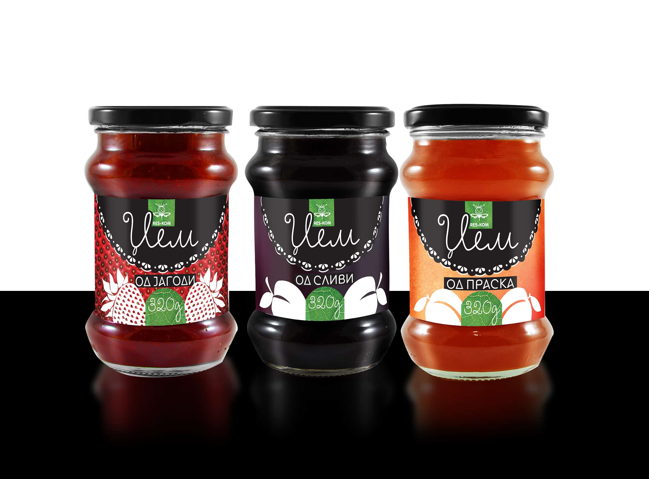
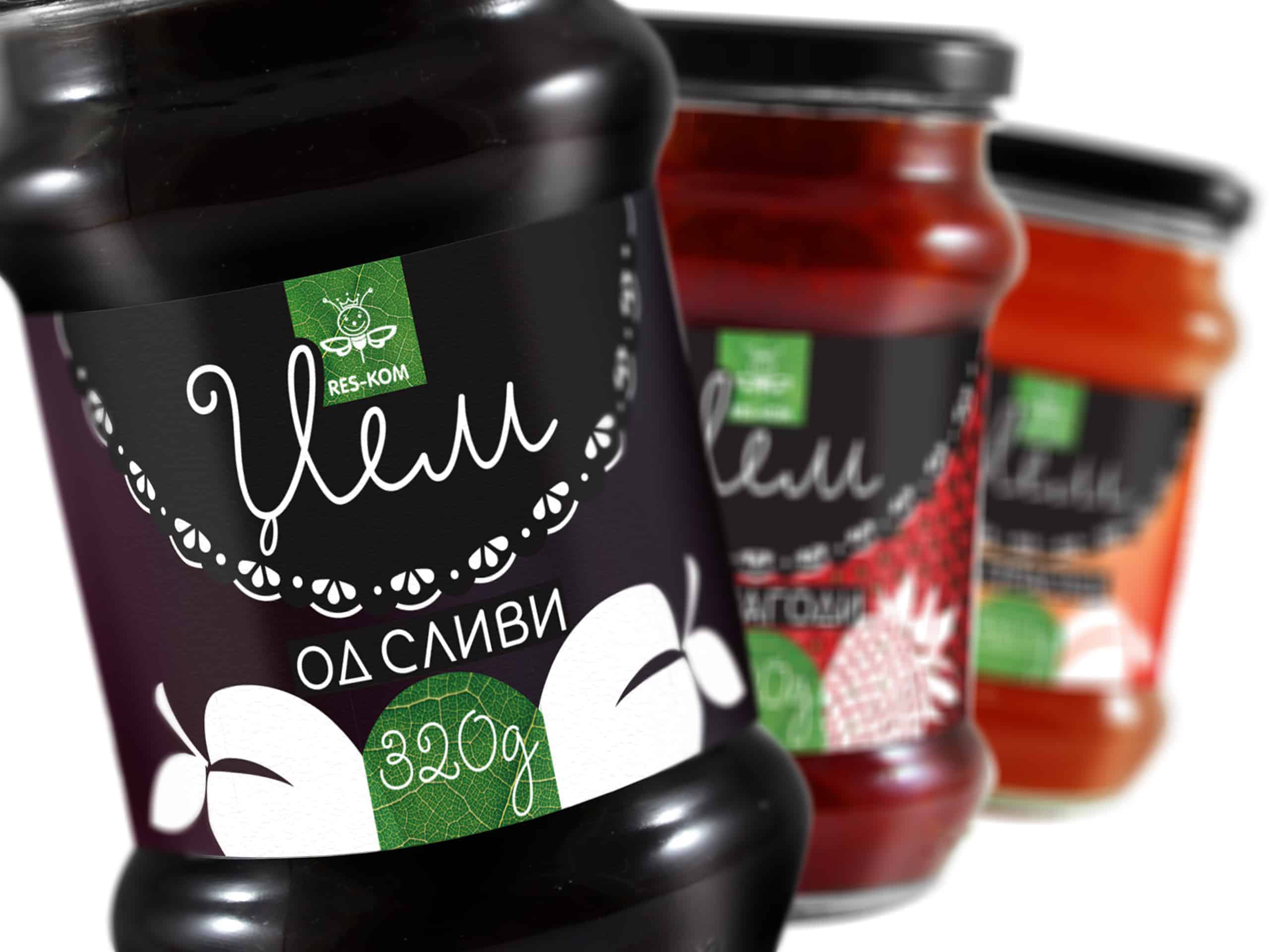
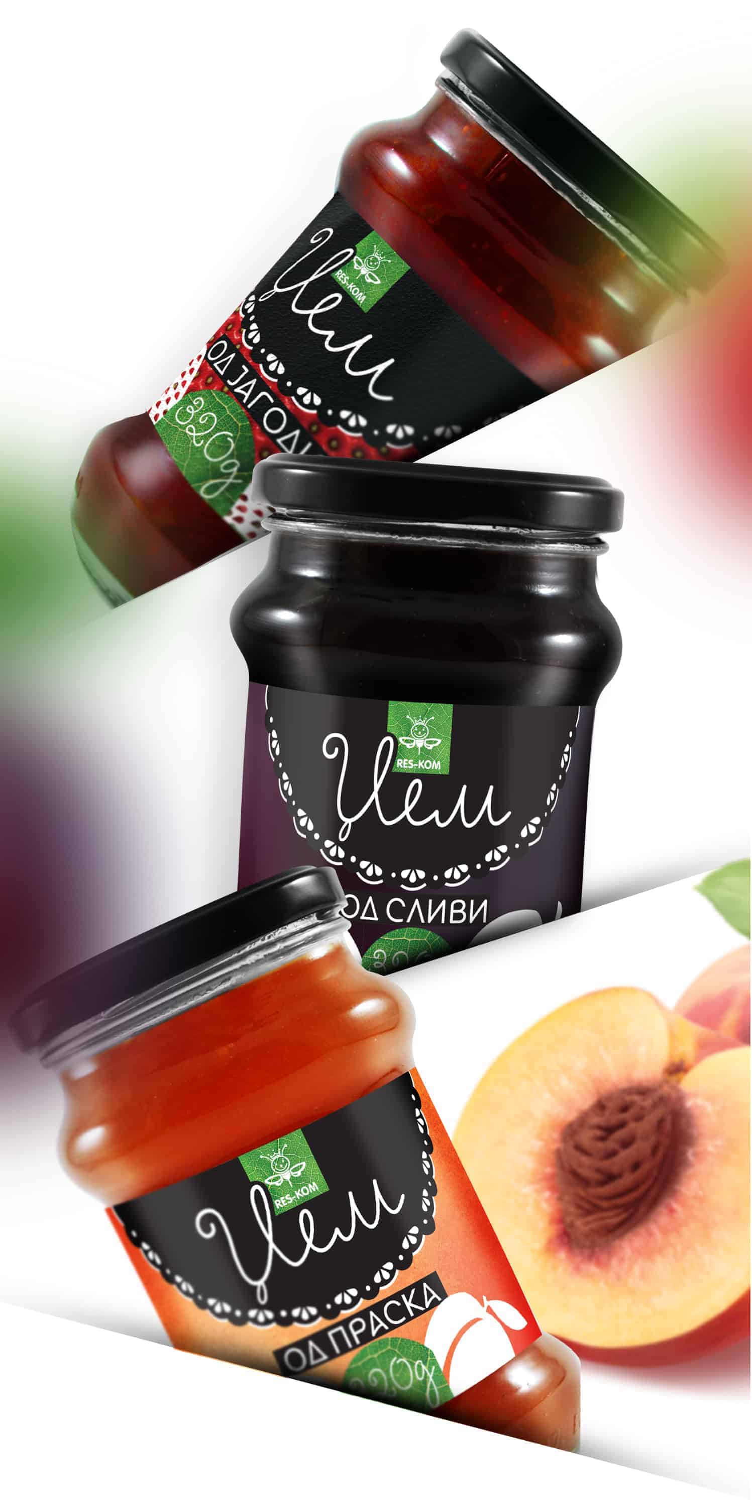
Res-Kom JAM

This project is about designing a label for Res-Kom Jam - a leading brand in producing honey, marmalade and jams in Macedonia. There are three different tastes of the jam, so the idea was to create a concept that will be easily manageable. The design had to be continuous for the three different tastes and open for further adaptation in case of launching a new taste.
The idea for the design was to keep it simple, but still remarkable. The main task was to make the design so, that it stands out from the other similar products on the market. This is crucial when you design a label for any product, because it is the first thing potential buyers can see and relate to, so if they don’t like it is very possible that they won’t buy the product.
Before I started thinking about the concept, I made a local research. I analyzed all similar products out there and I made a comparison. The conclusion was that all those designs were basically the same using a simple title and images of the fruit that the jam was made of. Because of this I decided to create a story behind the design.
Jam is kind of a traditional food on Balkan. It happens to be related to “breakfast at grandma’s”. Everyone can remember of a slice of bread topped with a delicious homemade jam made by their grand mum.
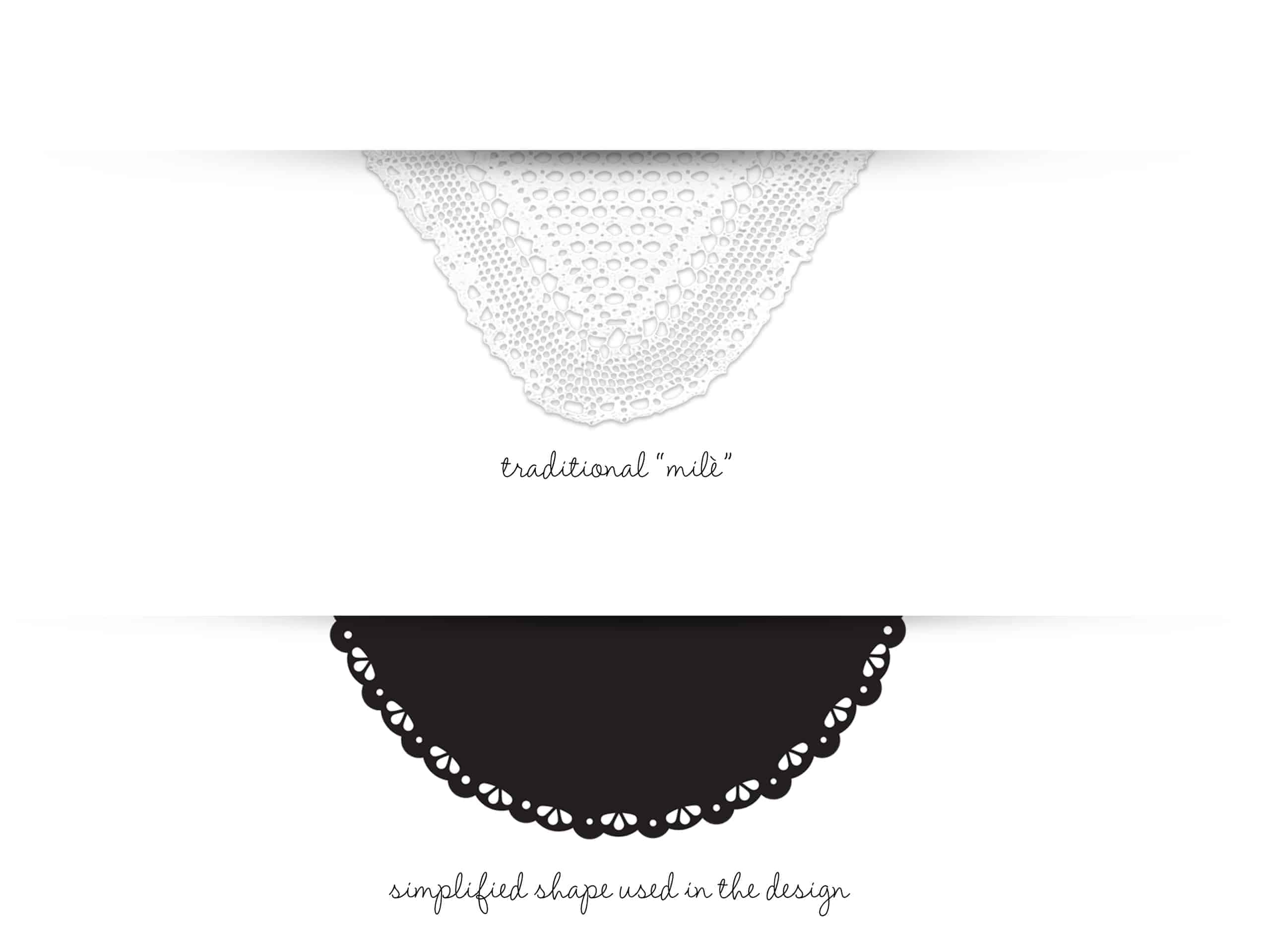
I was thinking about how to relate the label design with these memories, and the first thing I thought was “milè” - traditional hand knitted table cloth that every grand mum on the Balkan has on the dining table. These cloths were very popular on the Balkan in the past and they were used as decoration. Many would put them on the sofa, on the shelves and even on the TV slightly covering the screen.
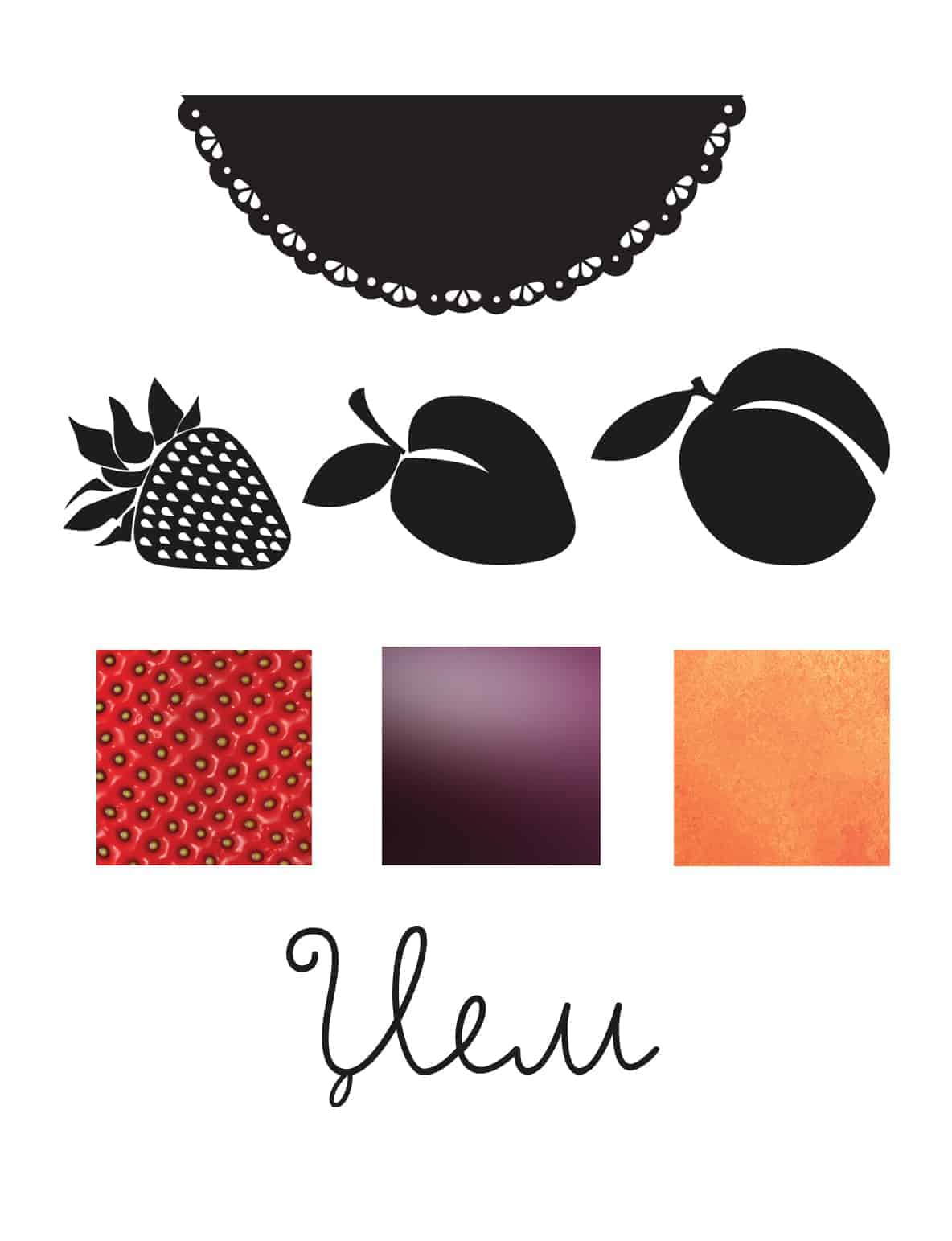
I used the main features of the “milè” to create a simplified shape that I could put in the design.
This shape is clearly recognizable for the potential buyers making them to remember the days of their childhood.
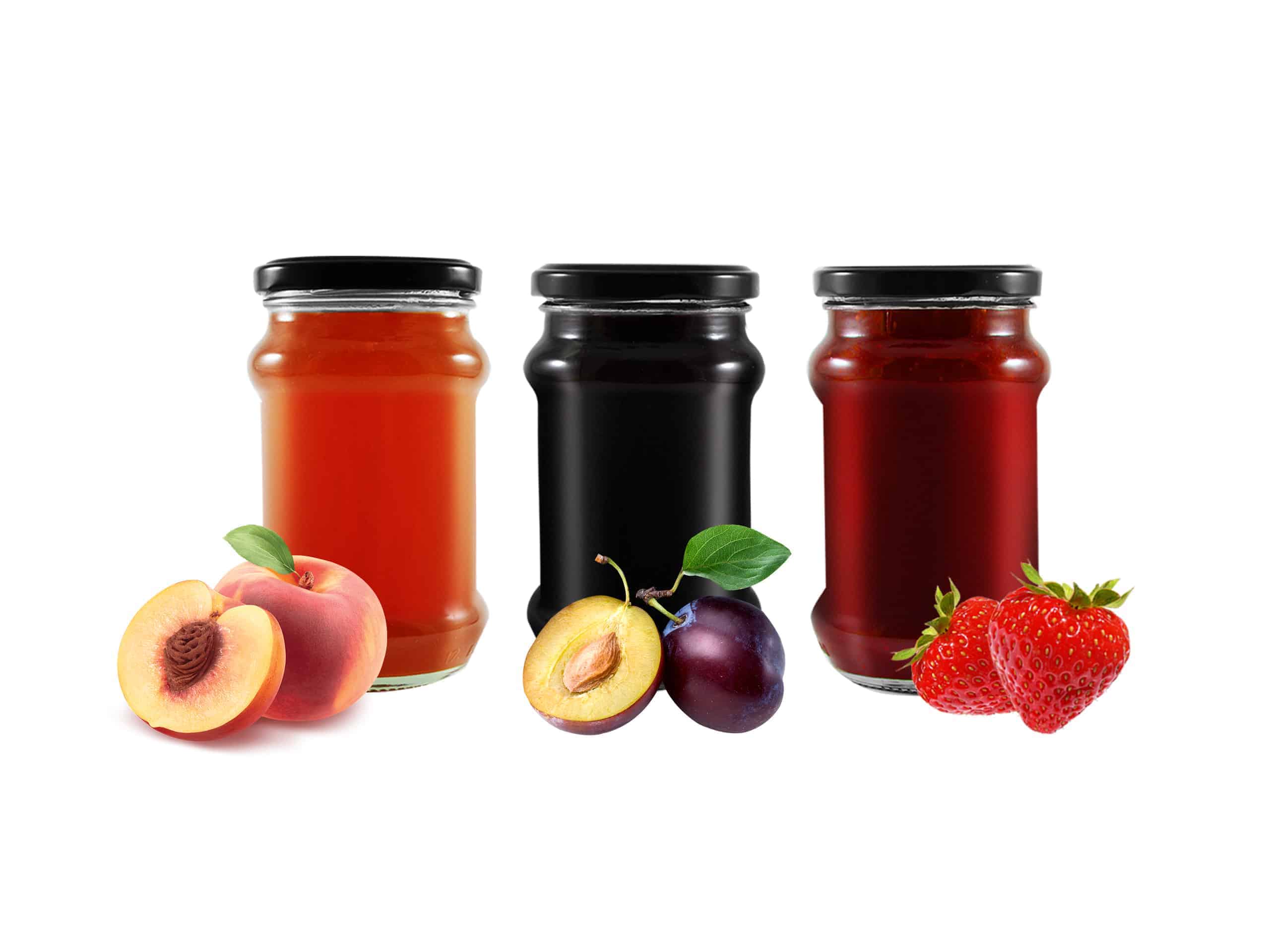
As I wanted to keep the design simple, but also different from the others on the market, I used simple shapes instead of photography of the fruits for each taste. As the label is for a natural product, I needed some freshness on the design so I used a texture of the fruit that each jam is made of and used that as a background. I also used a texture of a green leaf for some final details.
For the main title I used a cursive font that makes a great “seal” of the whole design.

When the design finally got “on the shelves” the respond from the buyers was amazing. This is very important for me as a designer and I am really happy to see that people like it. The feeling when you see someone buying the product you have designed is indescribable.
When you start designing an actual product it is very important to look around, make some research, comparisons and have some advice from the target group that you are supposed to sell the product.
It’s important to make a great visual identity and make the buyers relate to the design, but most of all you need to be aware of the quality of the product. You can make the most clever design ever, but it won’t go well on the market if the actual product is bad.