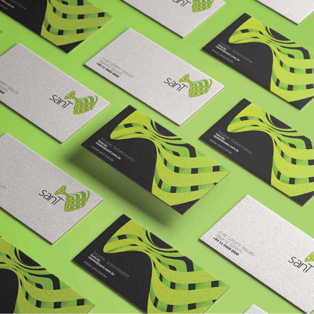
sanT

This project was developed for a hydroelectric plant in 2008. The project was not implemented in the face of a repositioning of the company. The concept was to use the handicrafts, foliage and fauna of the Amazon region as inspiration to represent a brand with social responsibility and engagement with local populations.

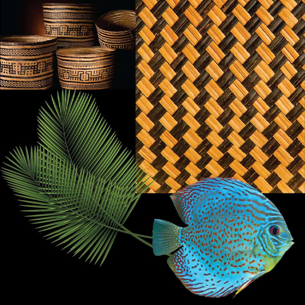
The local cultur is a huge inspiration field. It is composed by indians patterns, baskets made with foliages. The color represents the leafs. They interlaced as a basket with volume and brights. The form is a fish, an amazonic icon.
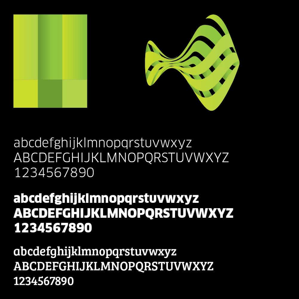
In first I listed ideas. After that, I started a benchmarking and I learn more about the market. The references and images show an environmental mood. The next step I drawn some icons and typefaces. The computer was the last one, a finishing tool.


This project had a great respond, but while the process occur a management change and new owners archived the project.The client has to told everything to you. Is partnership that depends the two parts to work. Hide informations isn't the best way.