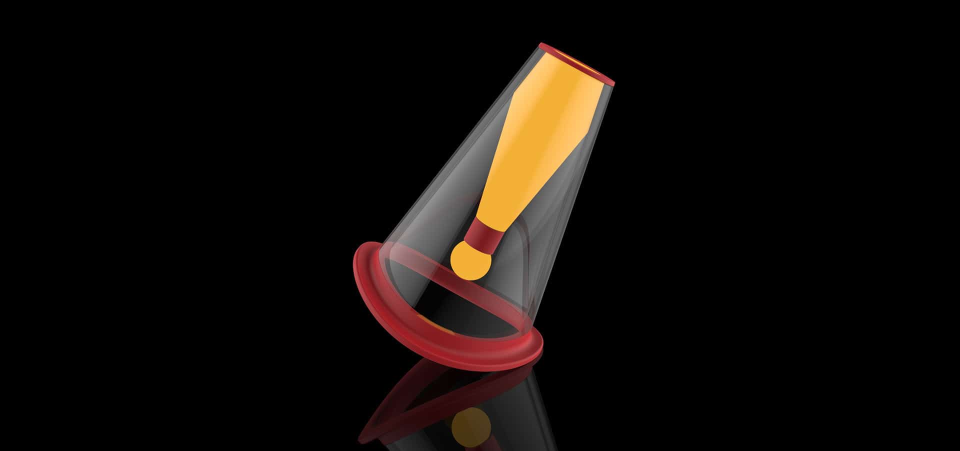
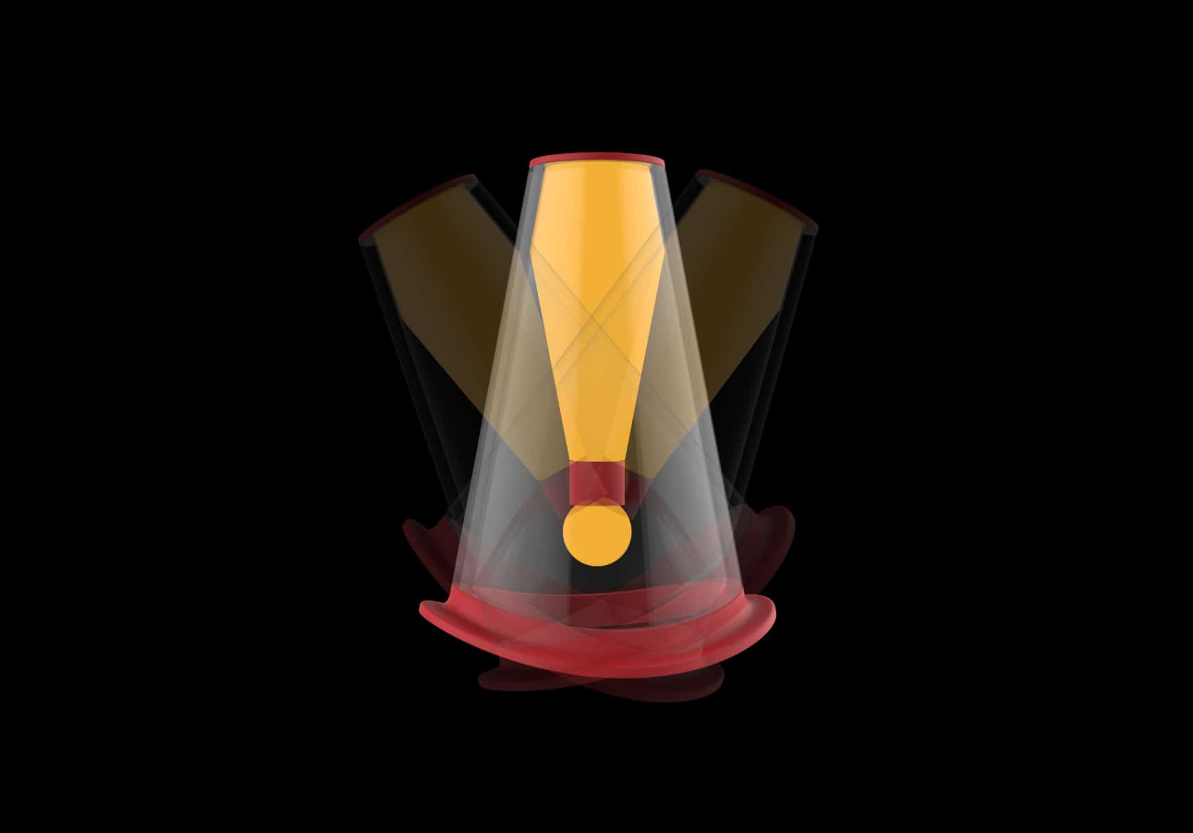
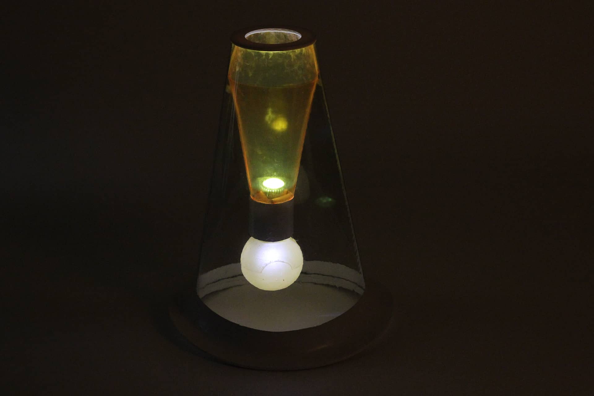
Traffic Cone

In recent years, much attention has been paid to the safety at roadworks.The warning signs are not only shows forbiddance but warnings. Yet, the warning signs can completely take effact only when a set or more signs are used together at the same time. Therefore, we believe that the design of warning signs needs to be improved.
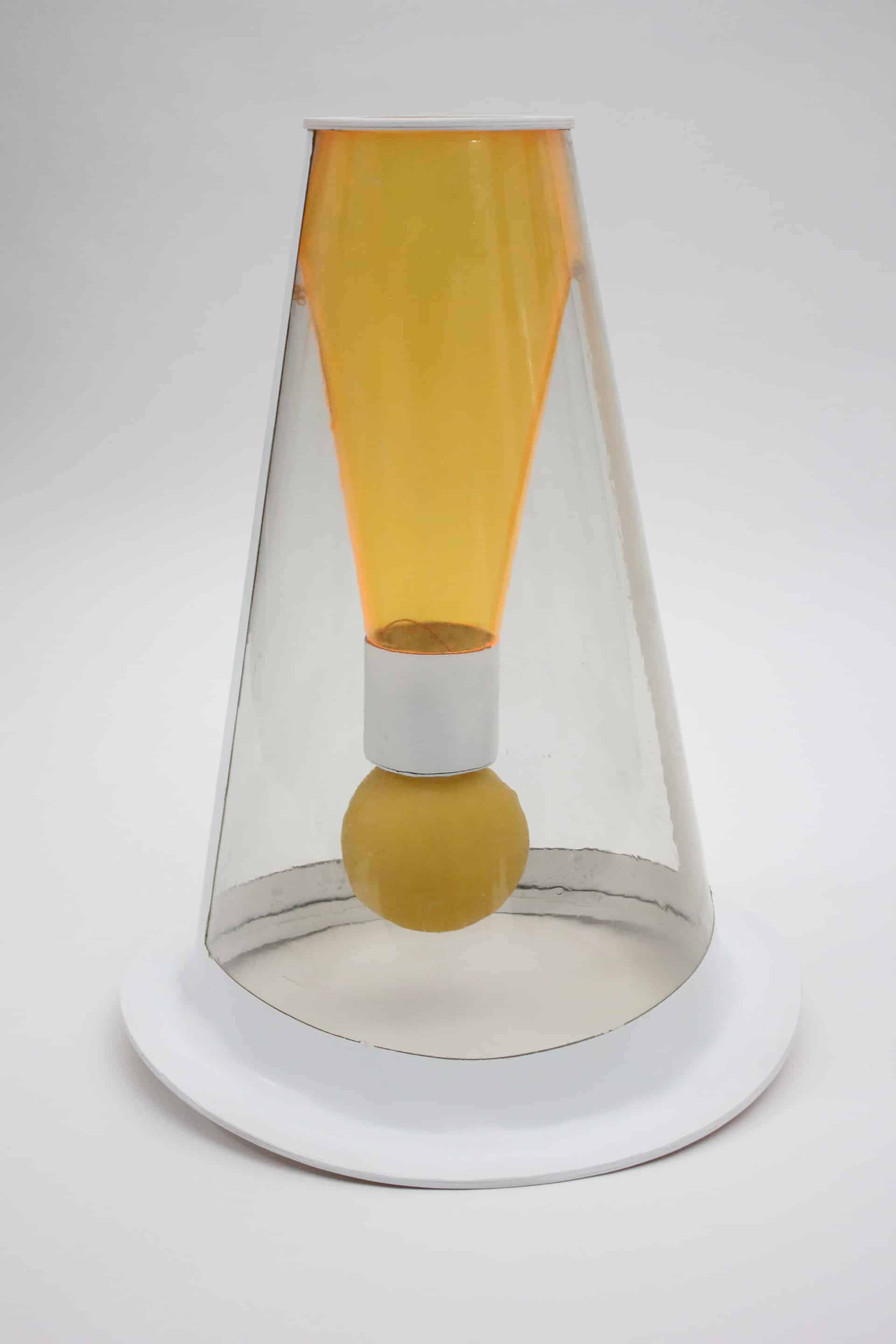
The exclamation-mark-like design is the best symbol to warn and notify. Shaking back and forth in day time can make it easily stands out. The combination of the design of shaking body and LED light works better for warning people.

We want to decrease traffic accident.
At first, we decide the body must to be transparent, so we choose acrylic.
And the color have to be notable, red will be good and symbol dangerous.
That our rough color plan.
About the style.. we hope it will be not too serious.
We used Pro/Engineer, Keyshot and photoshop.
First we had idea and sketch, then we discuss with our dissertation committee.
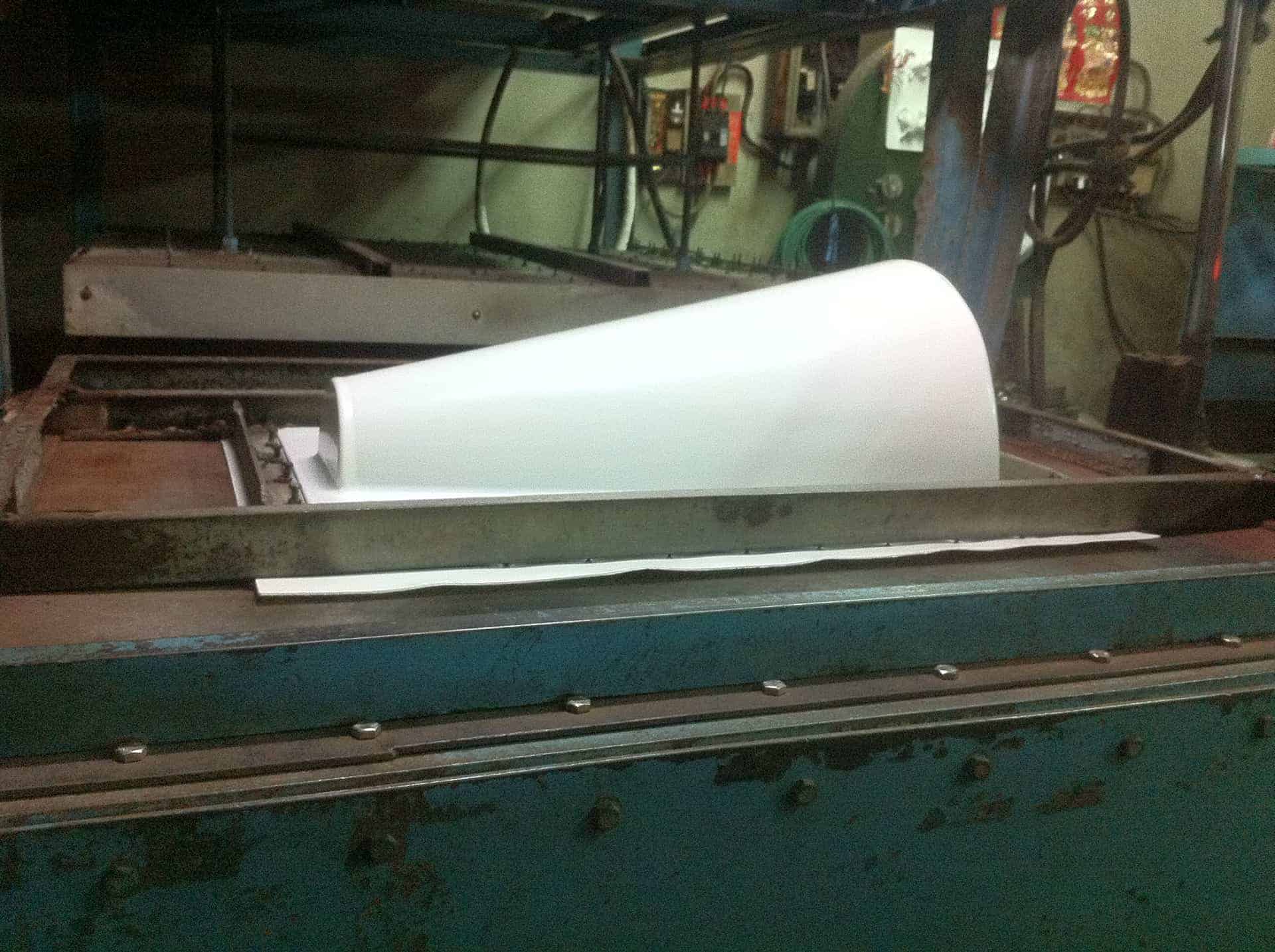
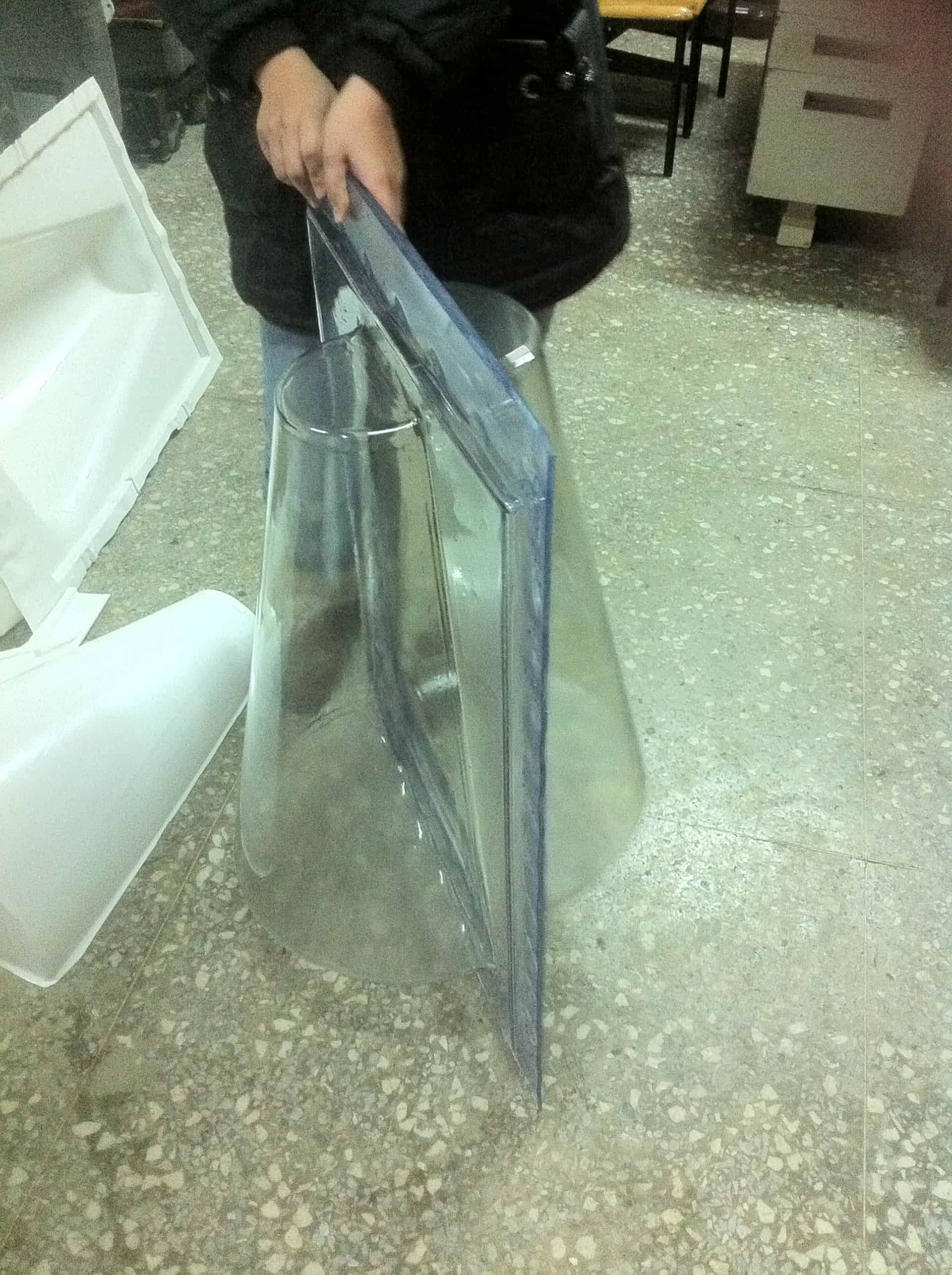
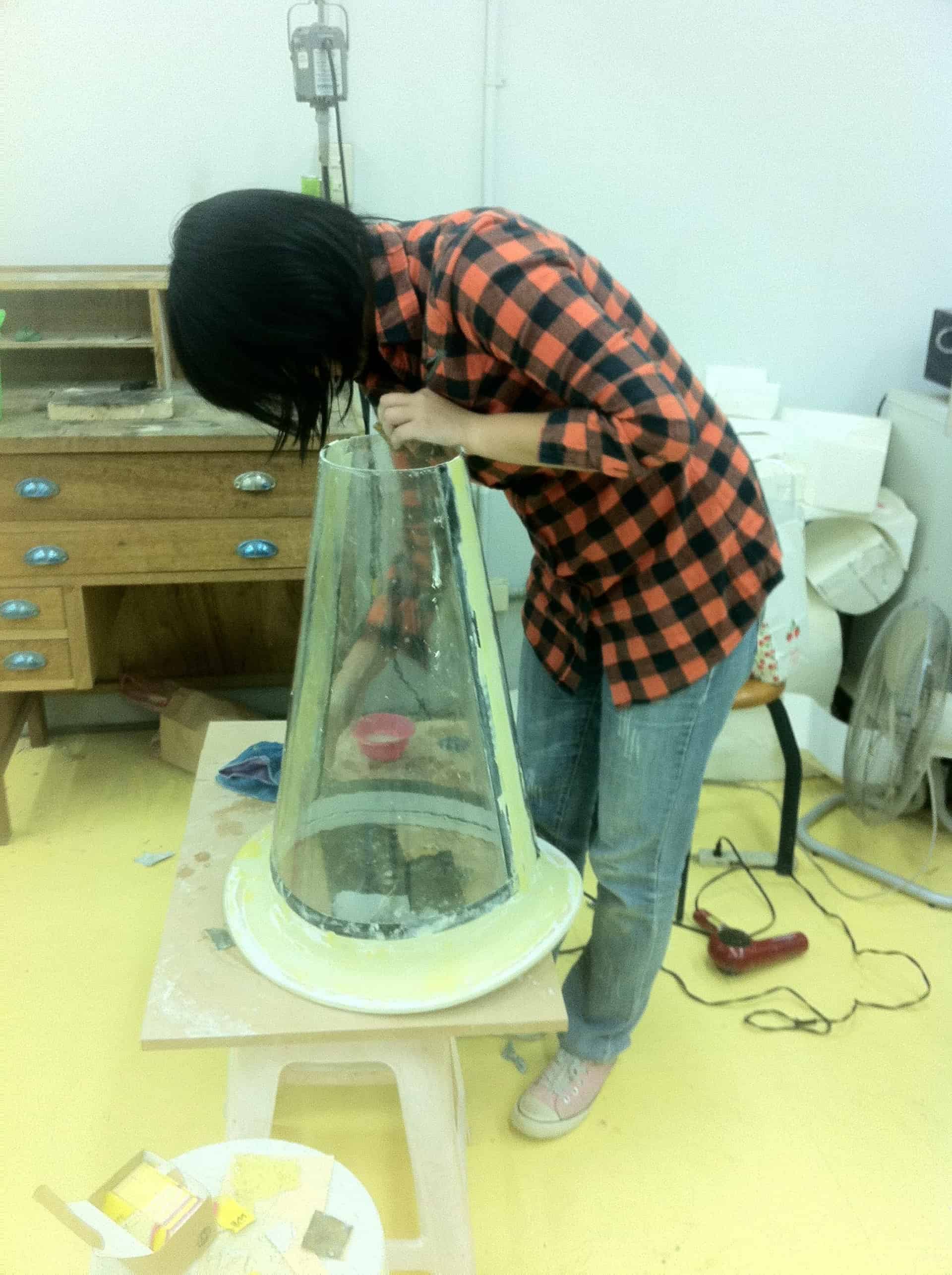
Soon we start to build the 3D model, but the most difficult part is made the 3D came ture.
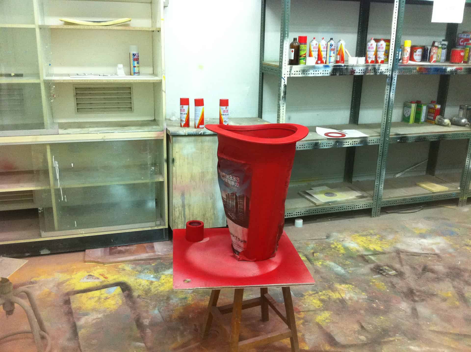
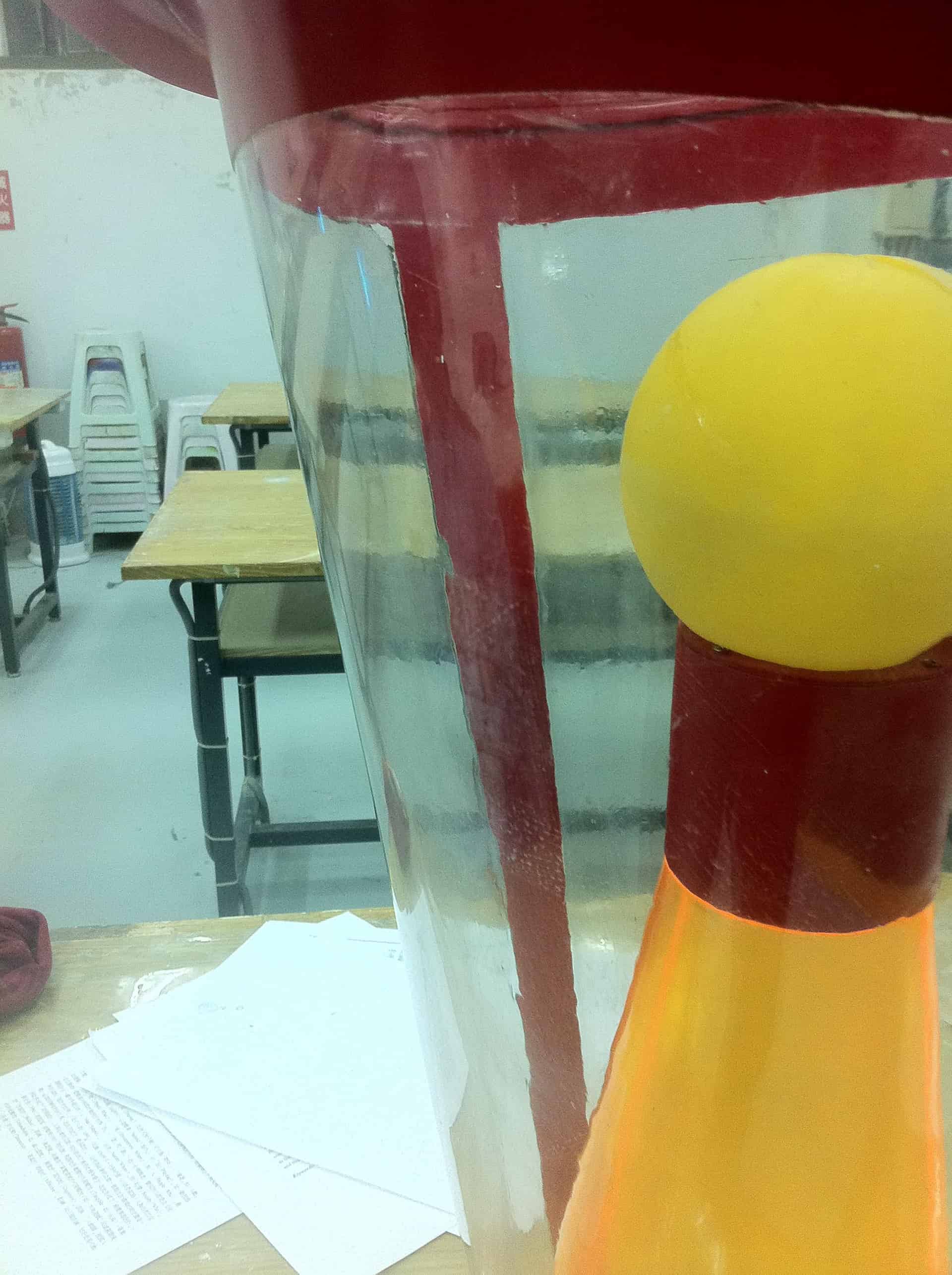
We made the transparent body by vacuum forming, bottom part by PU foam.
Then we assembled two part by putty.
At last we painted this and made it completed.
Most people think it's cool and funny.
but they are curious about the durability, because it's transparent,
so how to avoid scratch?
And how to storage them and transport?
Those questions let us know, a designer not only care foam but also think about every details.
Thanks for watching.. enjoy it.
Tthanks to dissertation committee Randy Lin and teammate Pei-Yu Lai / Ting-You Zhang.