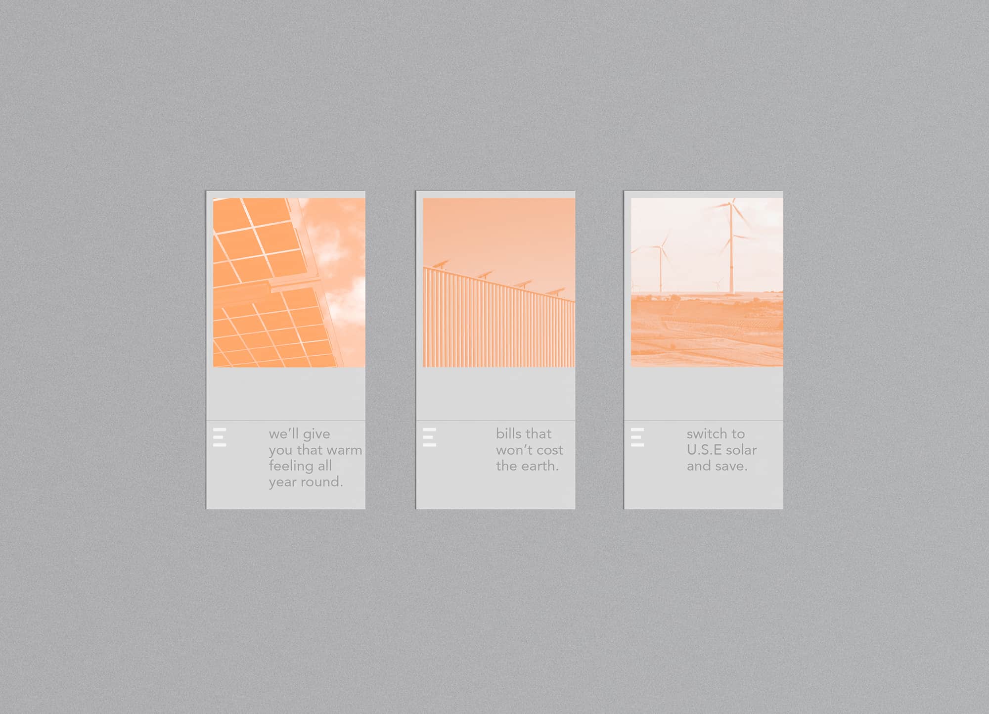
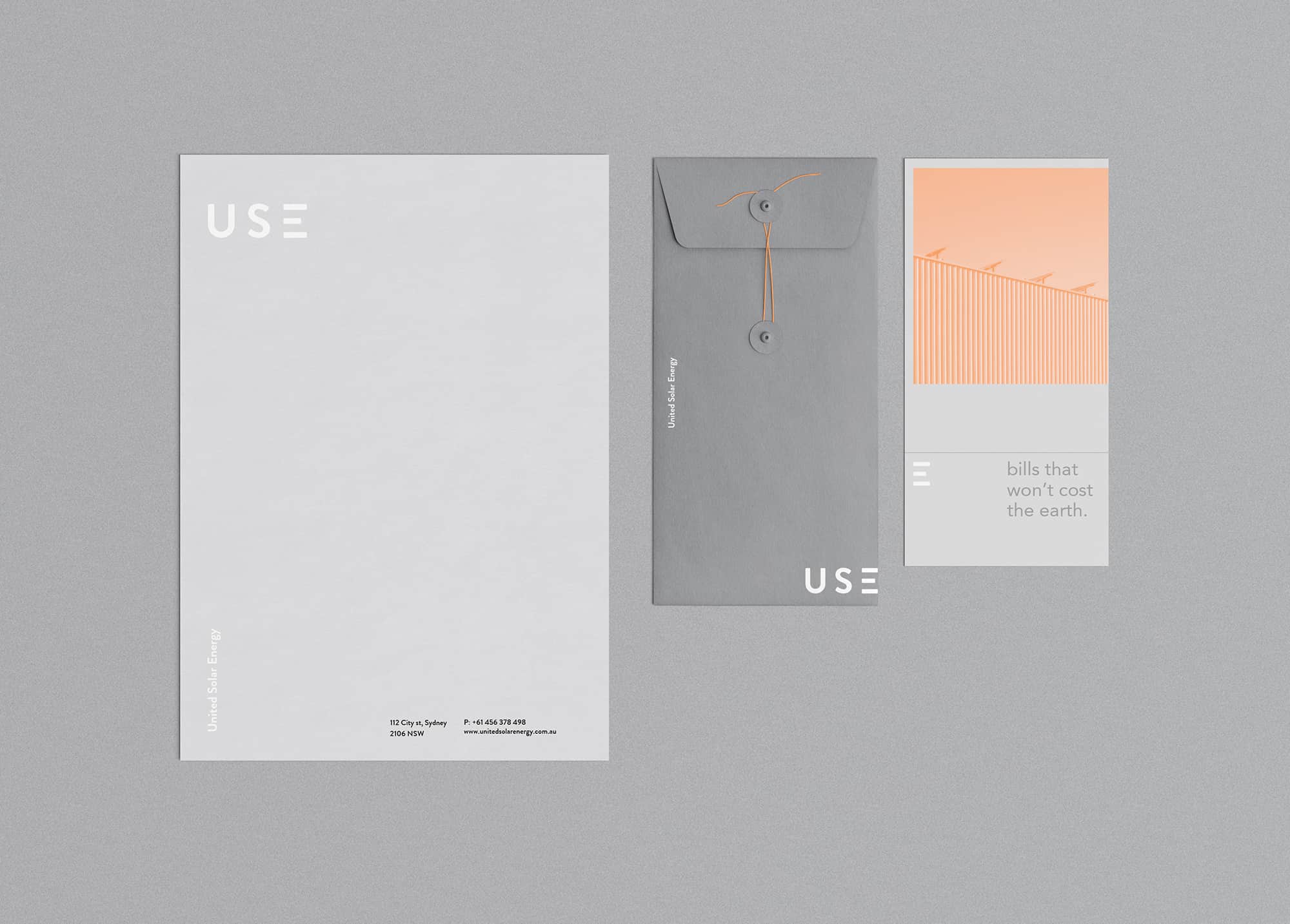
USE
United Solar Energy are suppliers of quality and affordable solar panels and installation – offering a cost effective solution today and for the future. I created a new brand identity, which highlights their cost effective beliefs and what they supply as a company.
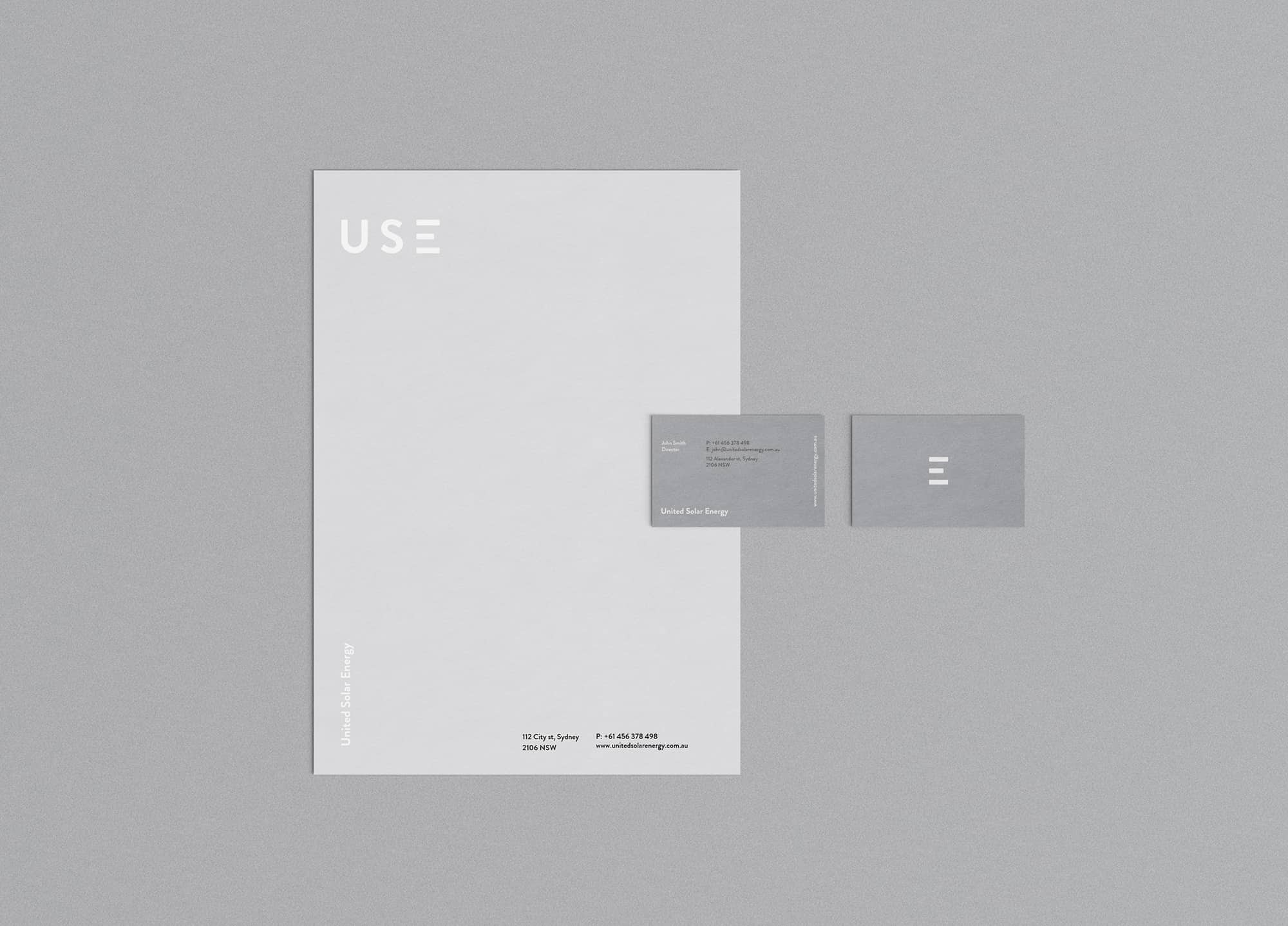
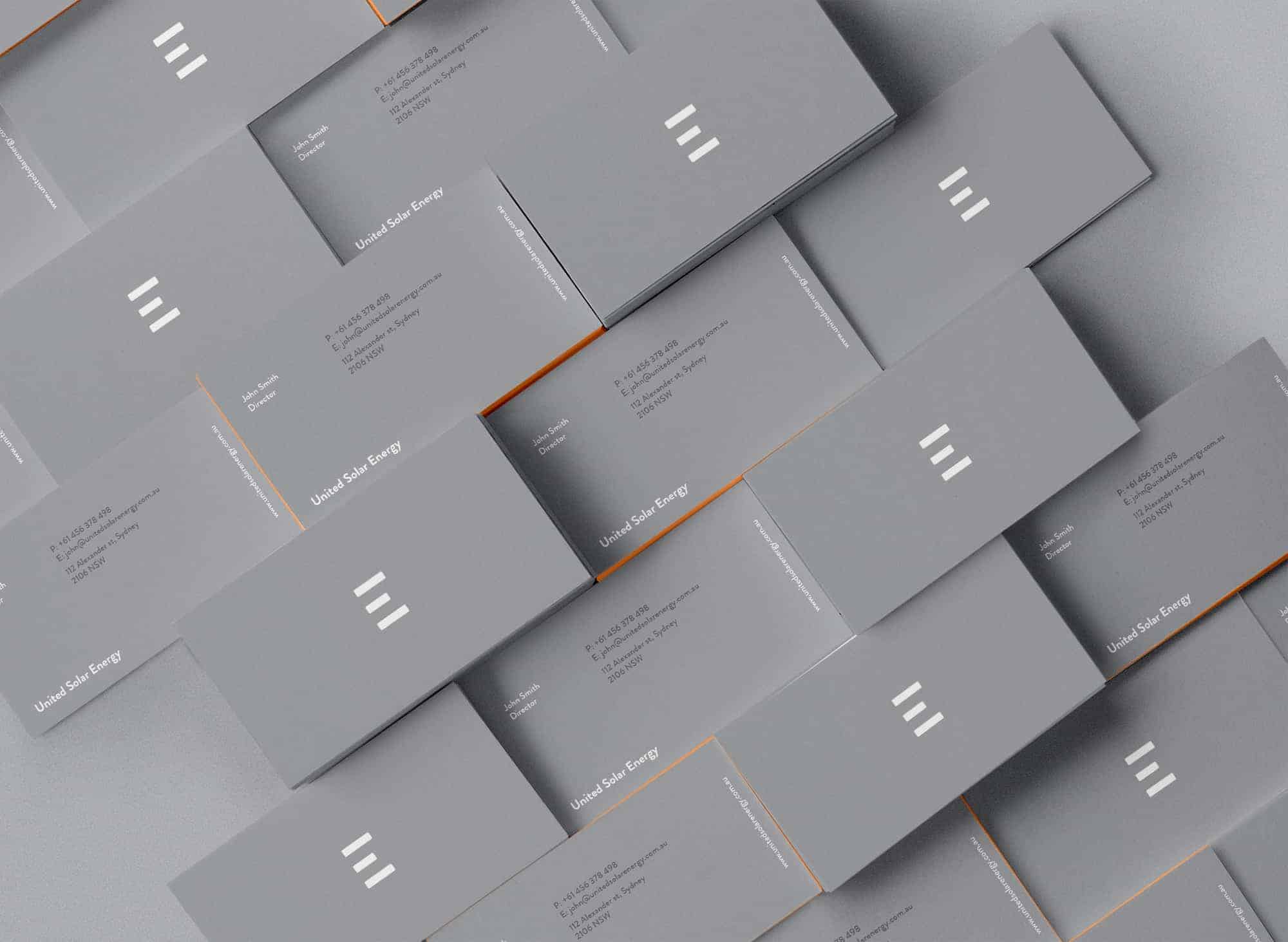
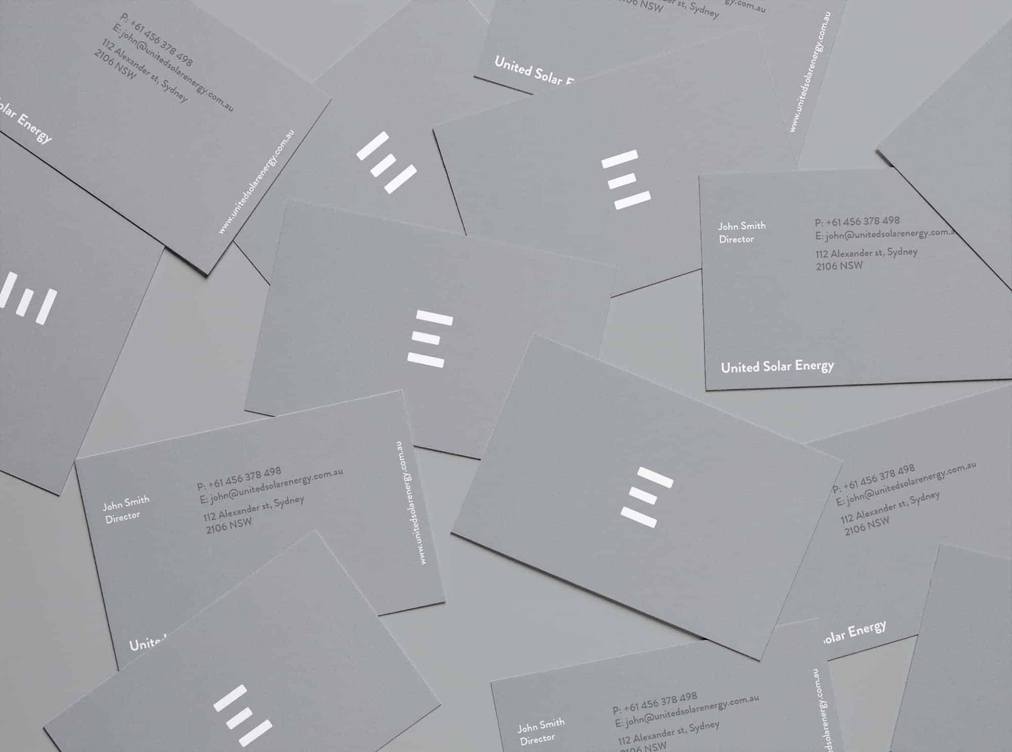
I stuck to a minimal, grey toned colour palette with hints of orange to bring light and vibrancy into the collateral and to indicate the power and electricity created. Both the logo and branding represent the solar panel product and the energy they supply. The ‘E’ in ‘USE’ acts as three panels and also a unique mark for the brand, displaying across all collateral items.
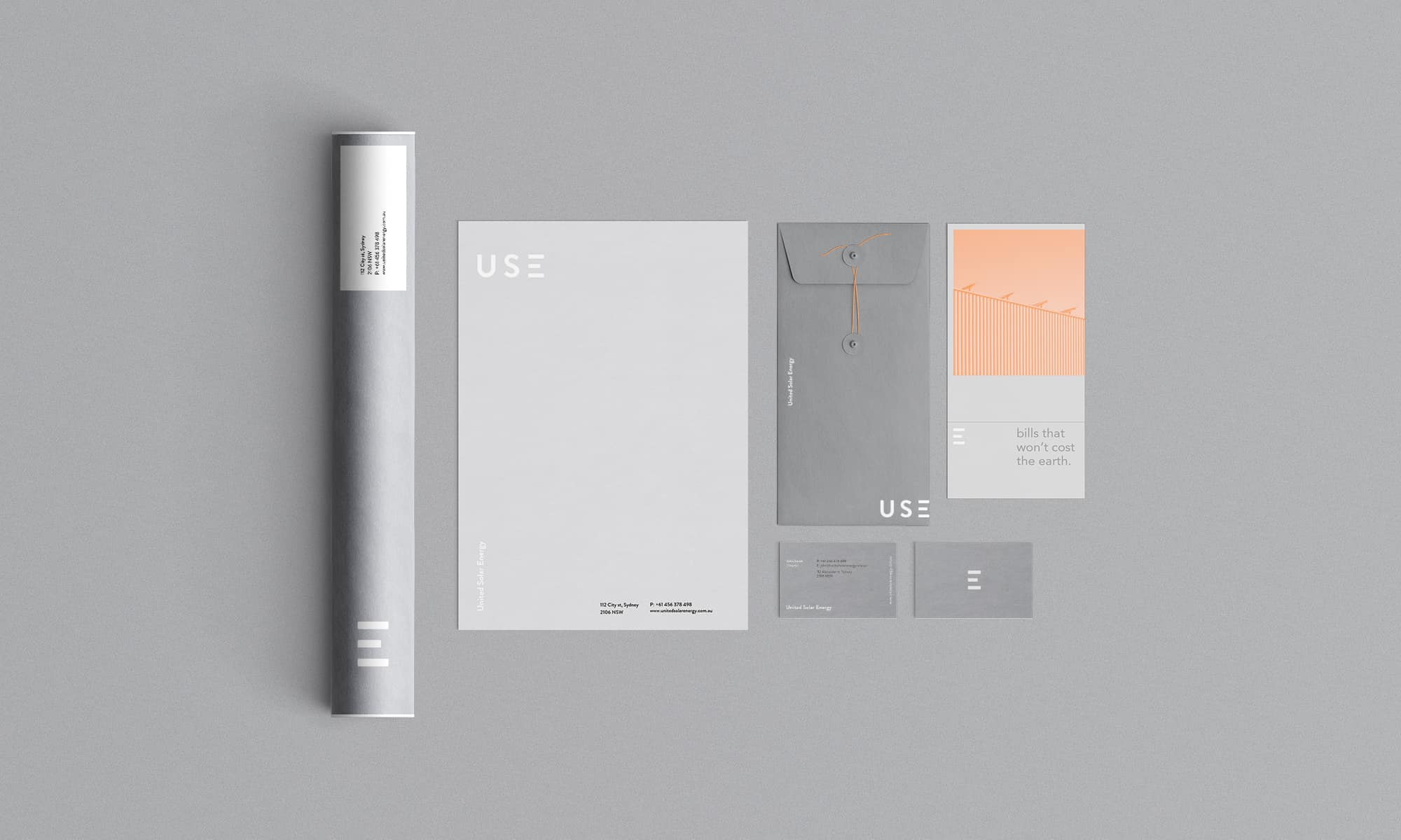
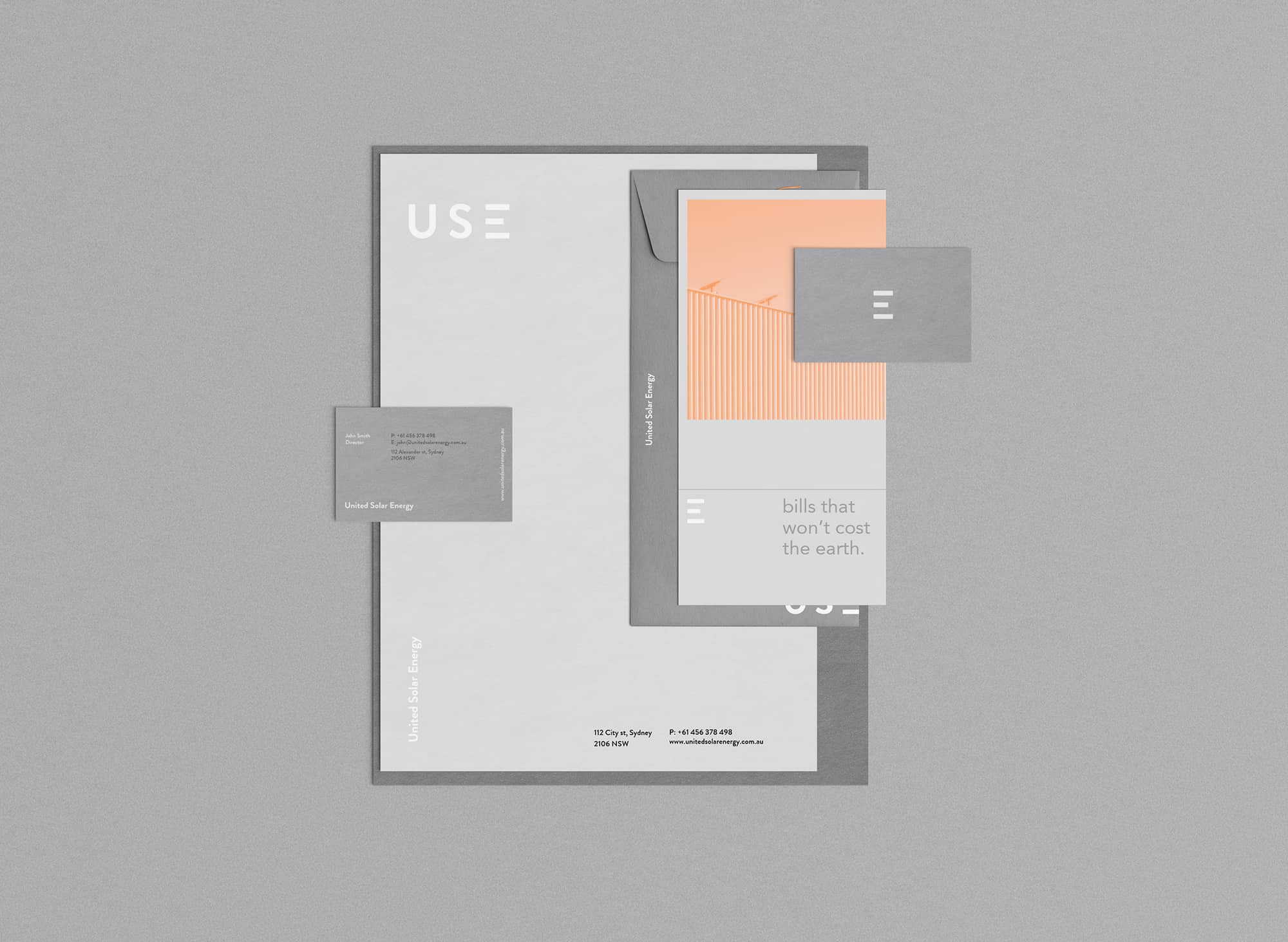
I used Adobe Illustrator, Photoshop and a little Indesign. I started with pen on paper, sketching ideas for the logo and brainstorming concepts until I felt it had developed enough, which I then jumped onto Adobe Illustrator to digitalise and refine. Photoshop was used to develop the collateral and touch up the images used on the flyer's.
![]()
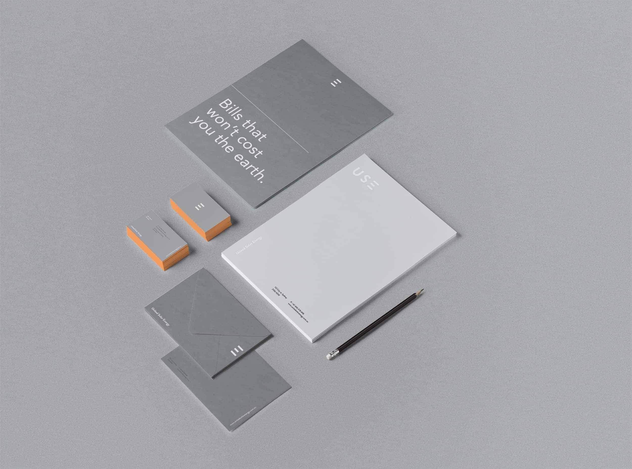
This project has had a significant amount of attention and feedback (the good kind), which is awesome and motivating. I think I learnt to take extra time and care when attending to the collateral of a brand identity. It's all to easy to place the same design elements on each piece in the same position, but making each one its own project and making sure they're all unique (while managing the consistency of the brand) makes the project so much more powerful.