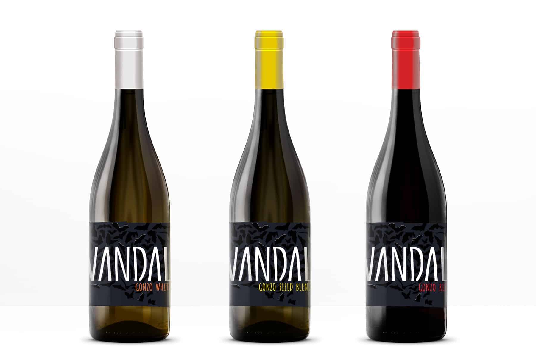
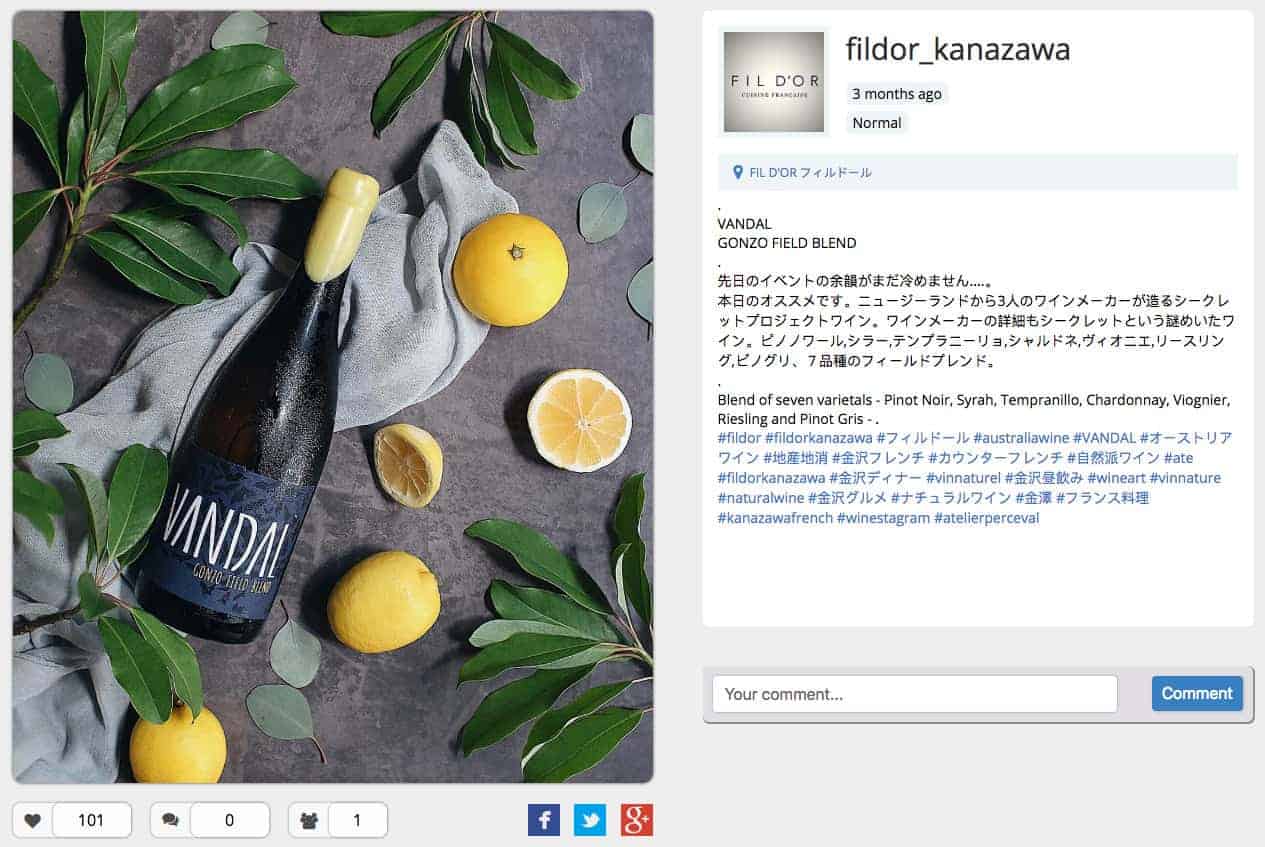
VANDAL wine label design

Three kiwi winemakers from New Zealand have decided to collaborate and make the “side project” together. It involves making wines that are less conventional in style, therefore, they were looked for less conventional branding but also free of gimmicks and has longevity. The wines made in very small quantities and targeted at fine wine retail outlets and fine dining restaurants for experienced consumers looking for something special. In crude terms these are “craft wines” that are a bit more challenging to taste but infinitely more interesting, aiming for a ”wholly shit, that’s different, but I like it!” reaction.
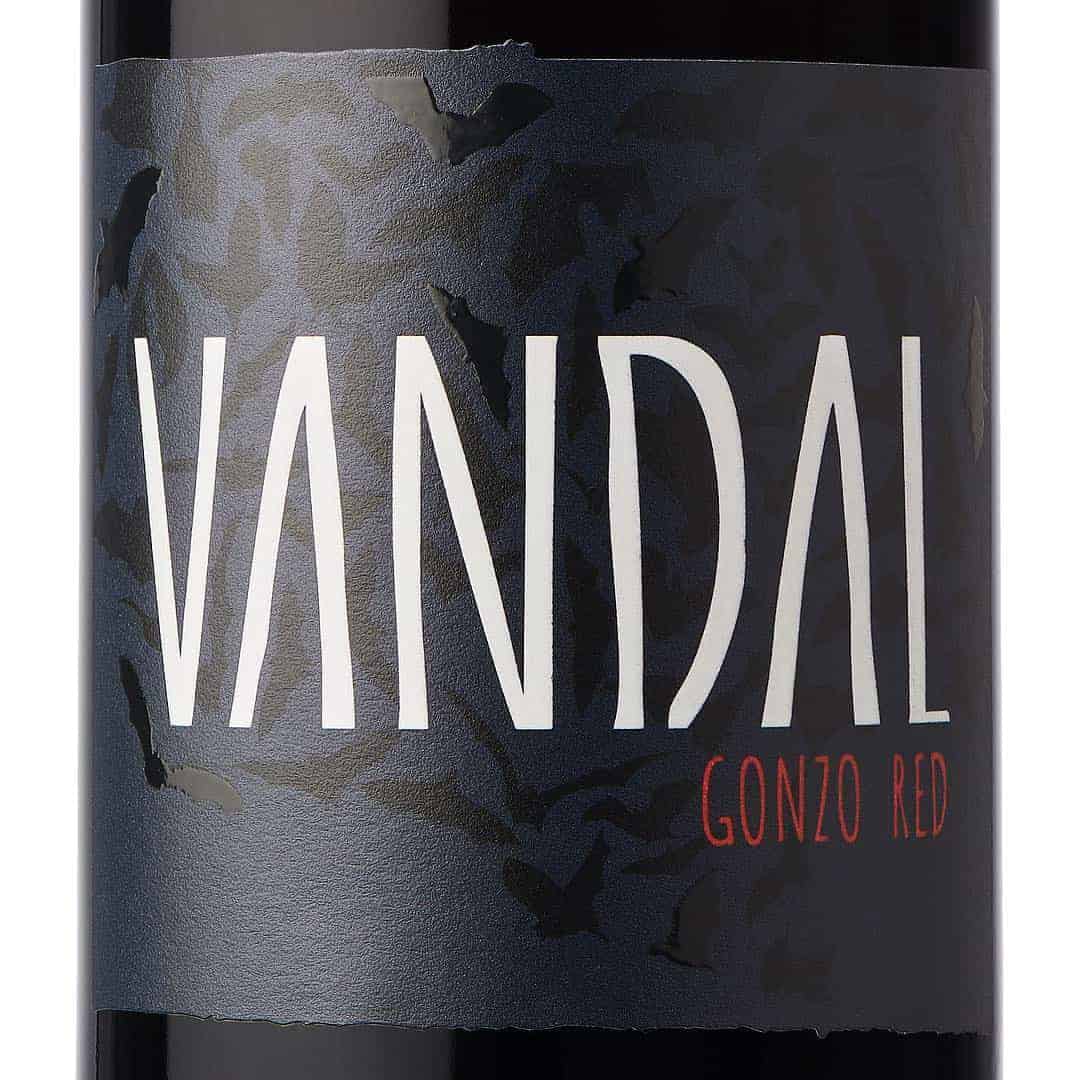
The brand name based on the word 'Vandal'. Historically vandal tribes were displaced from eastern Europe and forged their place in history by going against the grain or the Roman Empire... Described as a uniquely destructive people, the term Vandalism was born from their actions in history. Modern Vandal imagery is associated with graffiti which also gave us some inspiration from. Vandal as a word sits in line with the product ethos: unconventional, against the status-quo, anti-establishment.
Another idea that had an impact on brand visuality was associated with Hunter S Thompson the Gonzo journalist of 'Fear and Loathing Leaving Las Vegas' fame (I'm talking about illustrations by Ralph Steadman). In fact 'Gonzo Wine Co' could be another name of the brand at one moment. Afterwards the word 'Gonzo' was included in the name of wine variety.
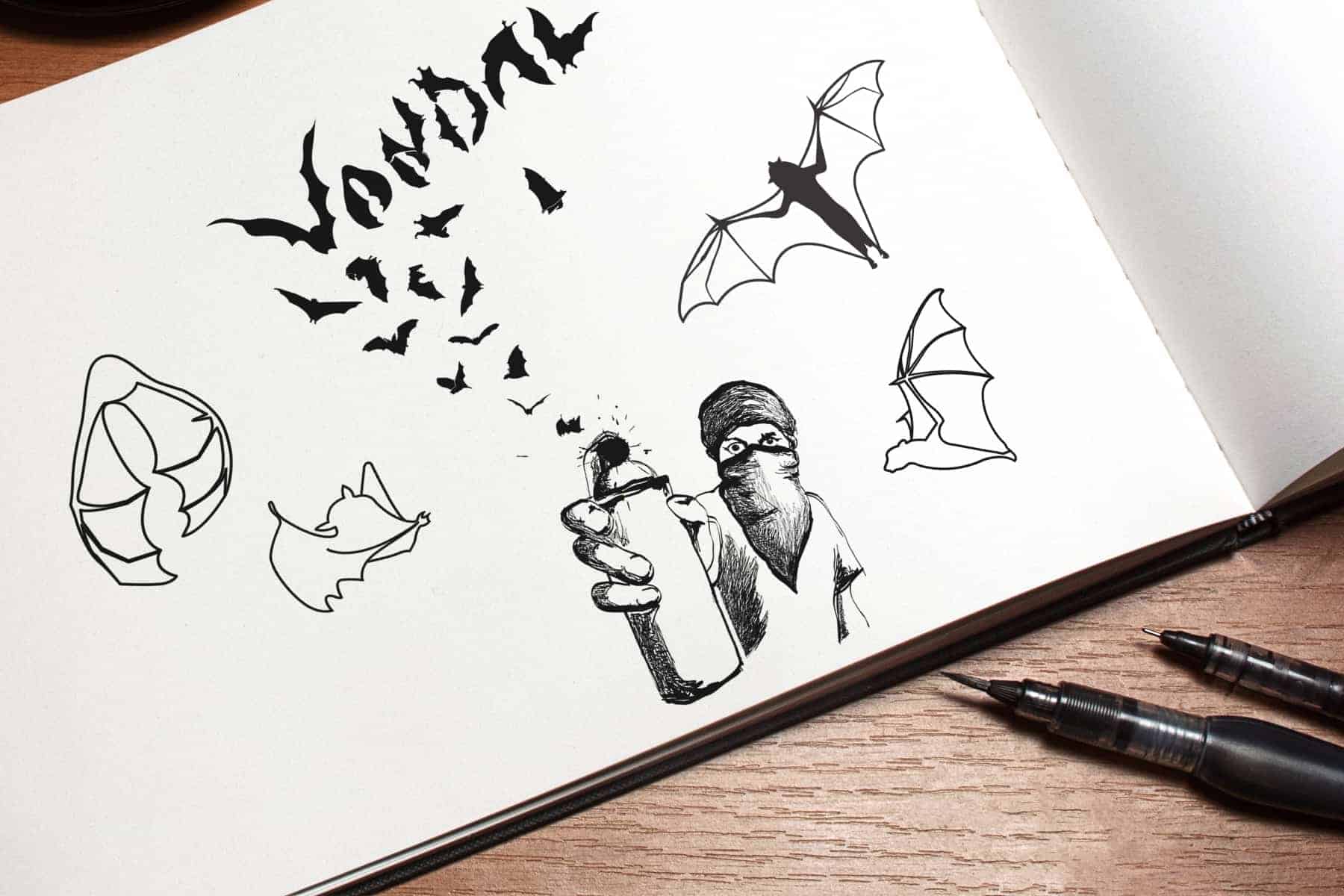
One more important point to note, two of the winemakers still have active conflicts of interest as they currently work for large corporate wine producers. Because of this, they are not permitted to disclose their identities or actively have any association with this brand in the market place as this breeches their (dis)respective contracts. Winemakers wear masks to conceal their identities in any promotional material, so this fact was also a tangent to exploit within the branding/labels.
Finally we had one thing that combined all three concepts together — rebellion. But it was not bright riot show, mostly it was a revolt of a secret society — invisible at first sight, dark and mysterious. On the first drafts I based on the image of graffiti artist who releases bats from spray paint can. But as we wanted to strive minimal style and bring more mystery to the label in final we decided to focus on bats only. Here I gained invaluable insight — for reflecting the real nature of covert resistance I have to play with textures, using black on black. So while the bottle is on the shelf you see very simple label - just brand name, that's all. But when you take the bottle in your hands you surprised to discover the bats — the same way you will be surprised by unusual taste of this wine. At the end I used mate black paper (Pantone 532C) and deep black ink (CMYK 50/50/50/100) with selective highlighting of UV varnish.
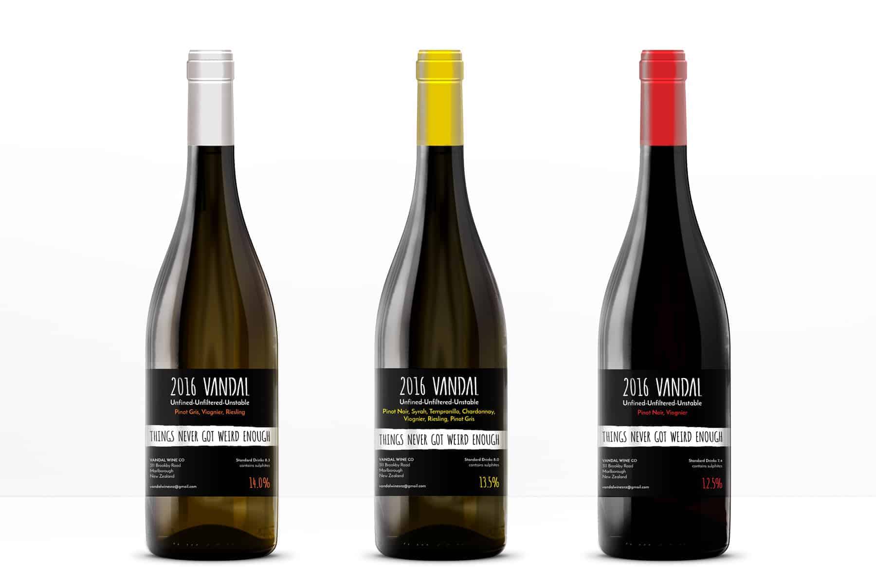
I started with drafts some of which were drawn by hands on paper and another by using a graphic tablet. Finally first drafts by hand were traced. For all of this I used Adobe Illustrator. The final labels was created in Adobe Illustrator too. In my work I used Amatic SC and Josefin Sans fonts.

It was wonderful and qualifying project. I have worked with people who know the marketing and their target audience well and have a rich business experience, but we almost were not limited by any frameworks. We have experimented, tried different materials, made prototypes before reaching the final results. And it was hard, but fun and pleasant process. The ending work was positively rated by the community. Wine has been a resounding success at the first presentation and later as well as label design. My clients were very satisfied by the whole process and thanked me for I was able to shape their concepts which we were starting from scratch into a brand they are now very proud of.