WealthKeepr

WealthKeepr app helps user track his/her finance, set up financial goals, and project investment returns.
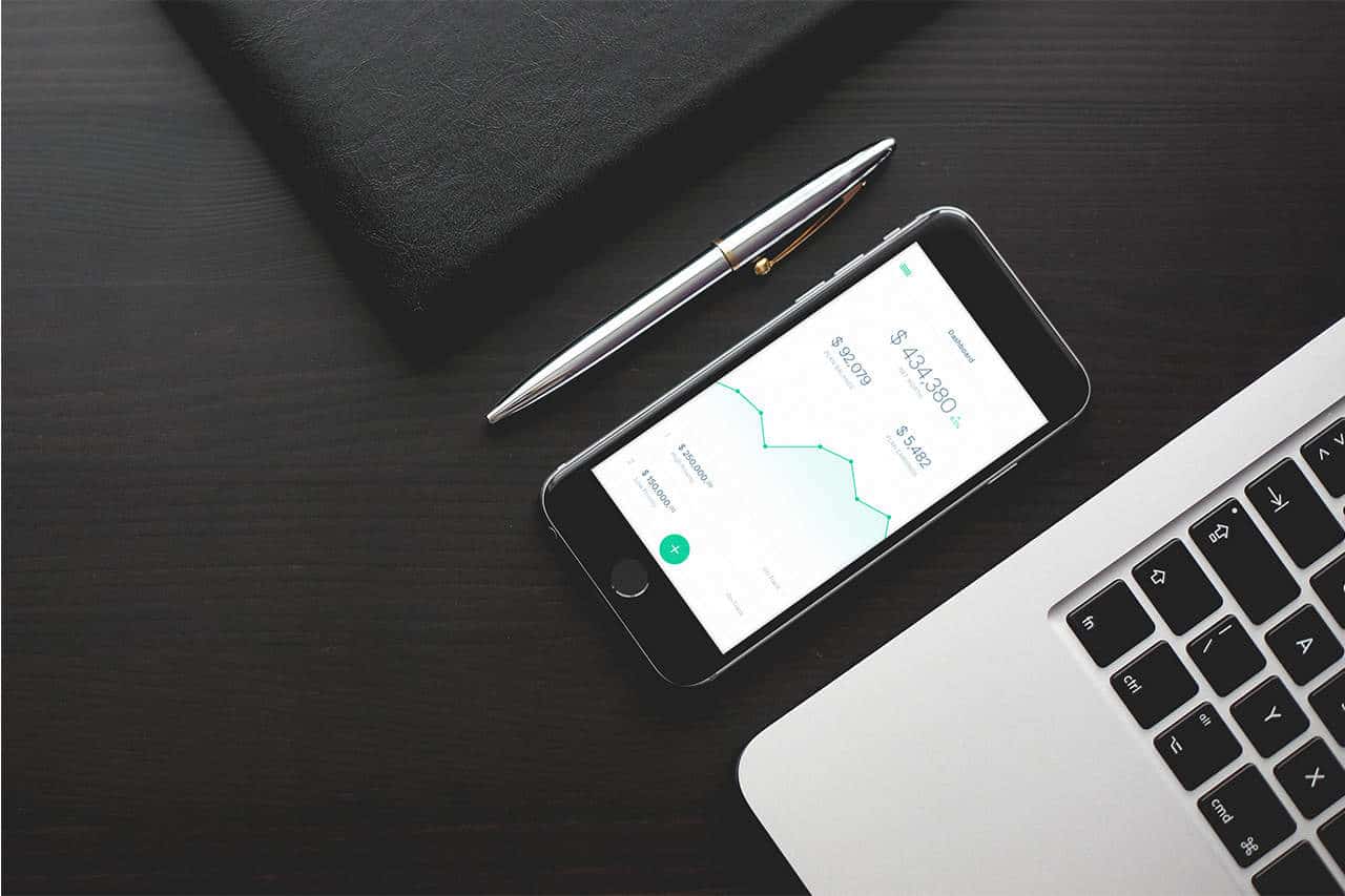
Dashboard- shows the current Net Worth, Plan Finance, and Plan Earnings. It also shows the listed Goals of the user.
Investment Projection- This screen shows the projection of investment by dragging the vertical bar across the graph.
Finance Screen- This shows the graphs for Cash, Investments, and Liabilities.
Deposit Screen- Allows user to record deposits/transactions made for a bank.

I've work for a client for this project. Basically, the specs where given and I was the one to design the UI for this app. My primary inspiration of the style came from the app called: Robinhood. This app is so intuitive that users without finance/stocks knowledge can use this app. The primary color is GREEN which can be easily related to finance/money. The style is we like to minimize unnecessary design elements and make it as simple as possible.


I start my process by discussing the details of every screen with the client. Then, I submit wireframes based on our initial discussion. We do iterations mostly on wireframes because it's the foundation of the overall UI. I've used Adobe Photoshop for the UI design. For the animation, I've used Adobe After Effects and Principle for Mac.

I didn't expect people to give positive feedback on my project because it's really simple. However, I guess people really like to see simple interfaces. I learned a lot from this project because it also forces me to research on investments, stocks, and other finance-related topics so I can fully understand how the UI/UX should work.