Wes Anderson Posters

The Wes Anderson posters are a series I illustrated based on Mr. Anderson's films. I'm a big fan of his work and enjoy illustration and thought what better than to combine two of my favorite things. The series is cohesive in style while showcasing the unique story and personality of each film.
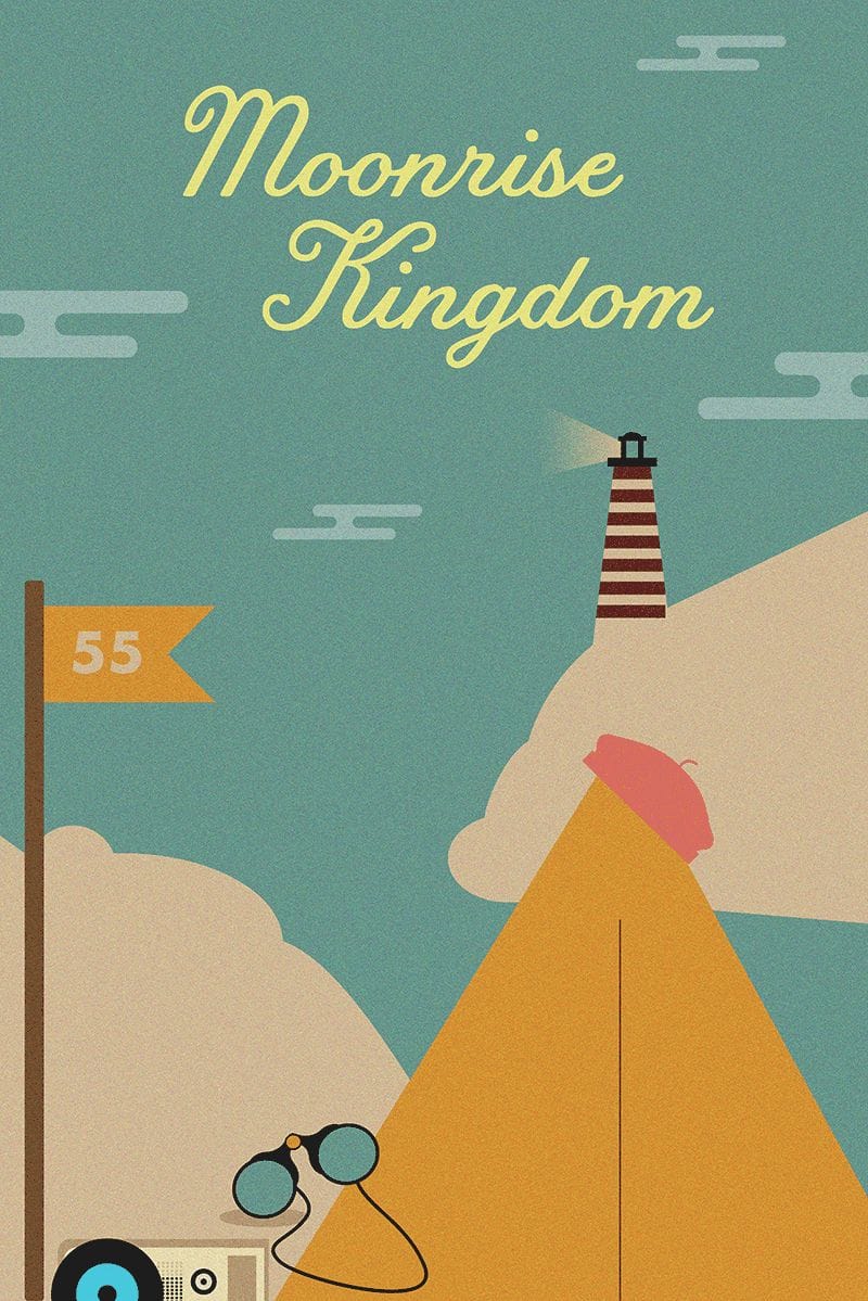
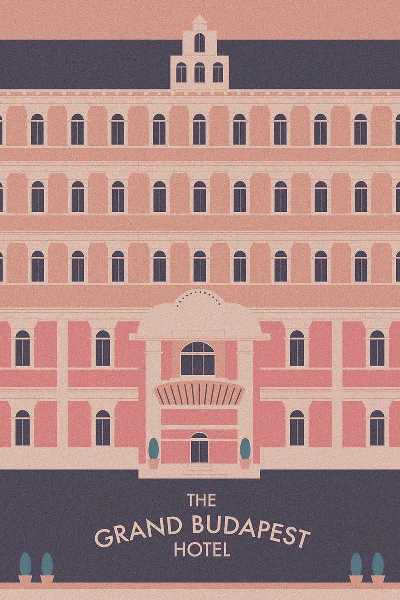
Wes Anderson is releasing a new film in April so I wanted to re-watch his old movies before it comes out. While I was watching them I realized the color palettes, typography, symmetry, etc, are the reasons I so drawn to his films. Essentially the design is what I fell in love with so I wanted to take my spin on his design.
I knew I wanted these to be fun so I chose to illustrate them in adobe illustrator. The color palettes are from the films themselves. And for the typography I wanted to mimic the real movie posters so that they would feel familiar to viewers.
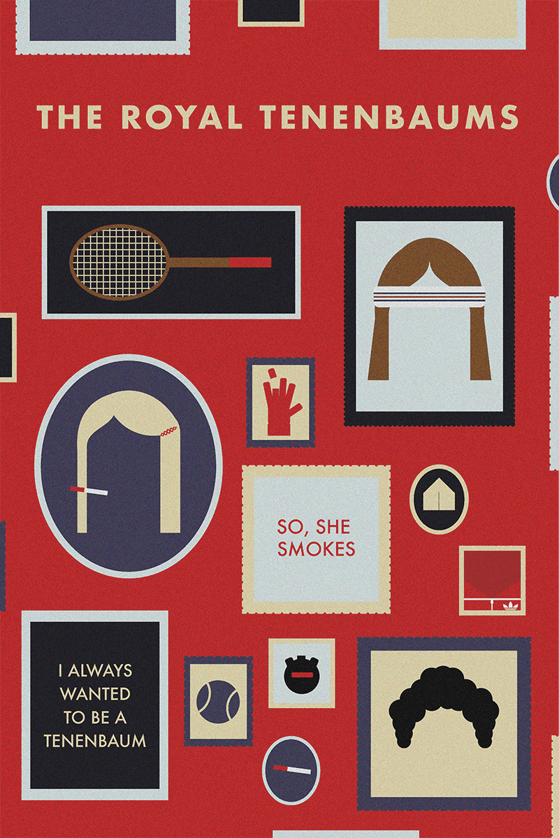
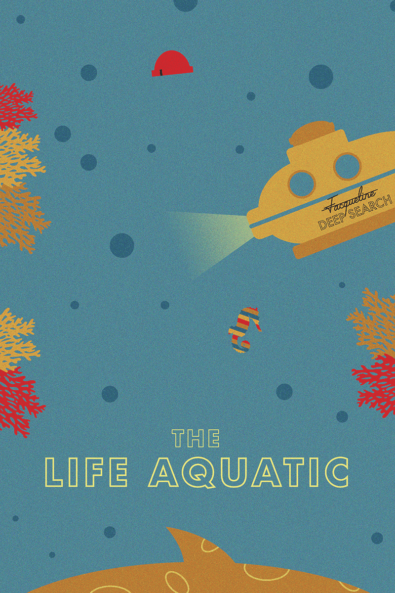
I created everything in Adobe illustrator. I watched each movie first for research to take note of the colors, style, and key moments. From there I created moodboards with movie stills, color palettes, and design elements from the films. From there I just dived right into illustrator. For most of them I started with the titles and then built the scene around that. I tried to limit each scene to 5 colors. Once I completed the illustrations I added a grain to evoke a sense of "time" since most of the films take place in the past.
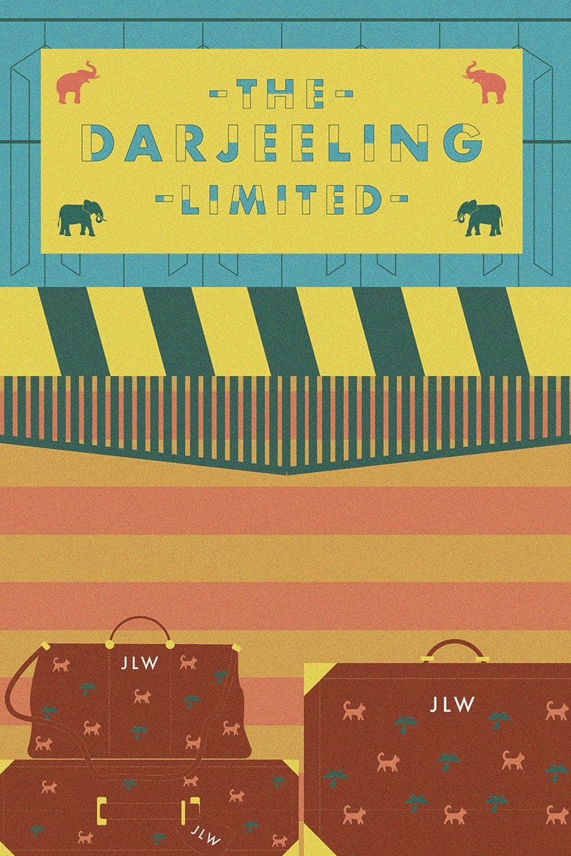
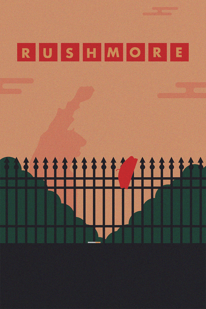
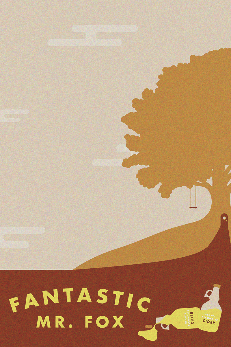
People seem to enjoy them! They're fun and a little whimsical. The response has been really positive. I learned that a lot of my non-designer friends had never heard of Wes Anderson before and a lot of them have watched his films since which is really cool.
Good luck
These are awesome! so simple! I love the vintage look, intentional or not
Your style is really great! I like it