Photographer Branding

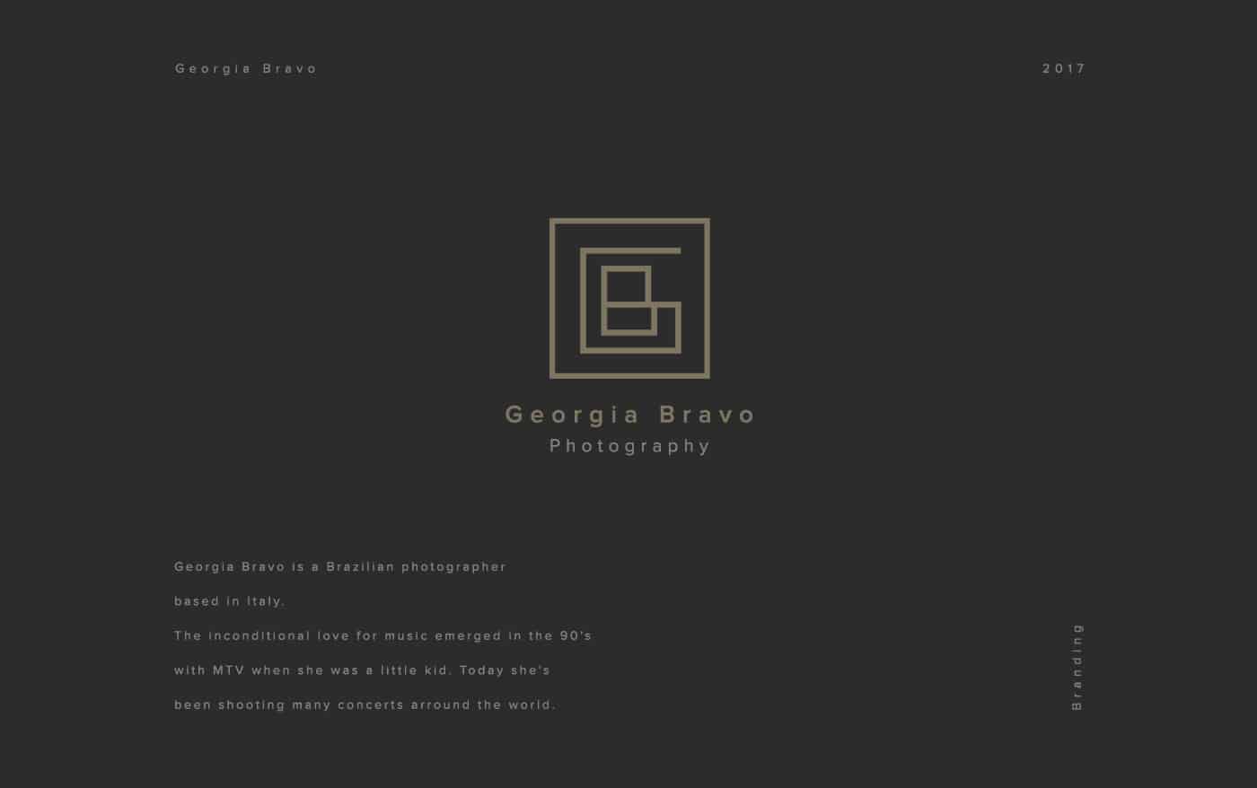
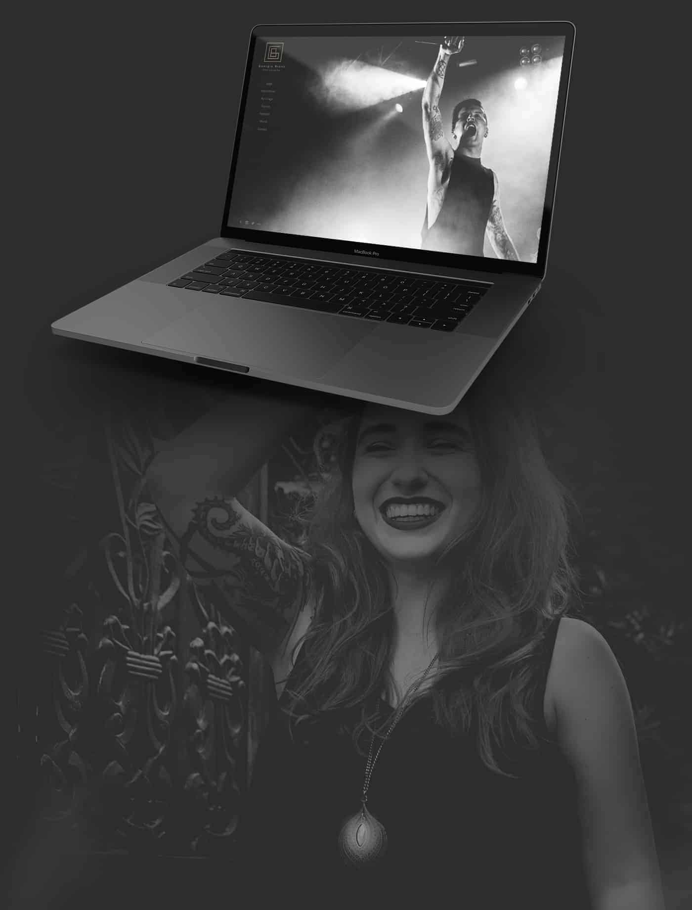
Georgia Bravo is a Brazilian photographer based in Italy. The unconditional love for music emerged in the 90's with MTV when she was a little kid. Today she's been shooting many concerts around the world.
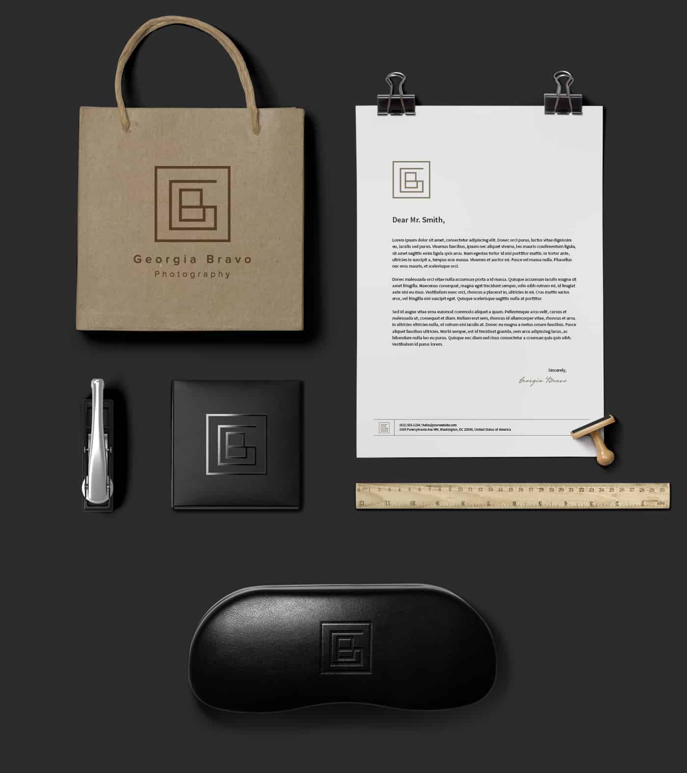
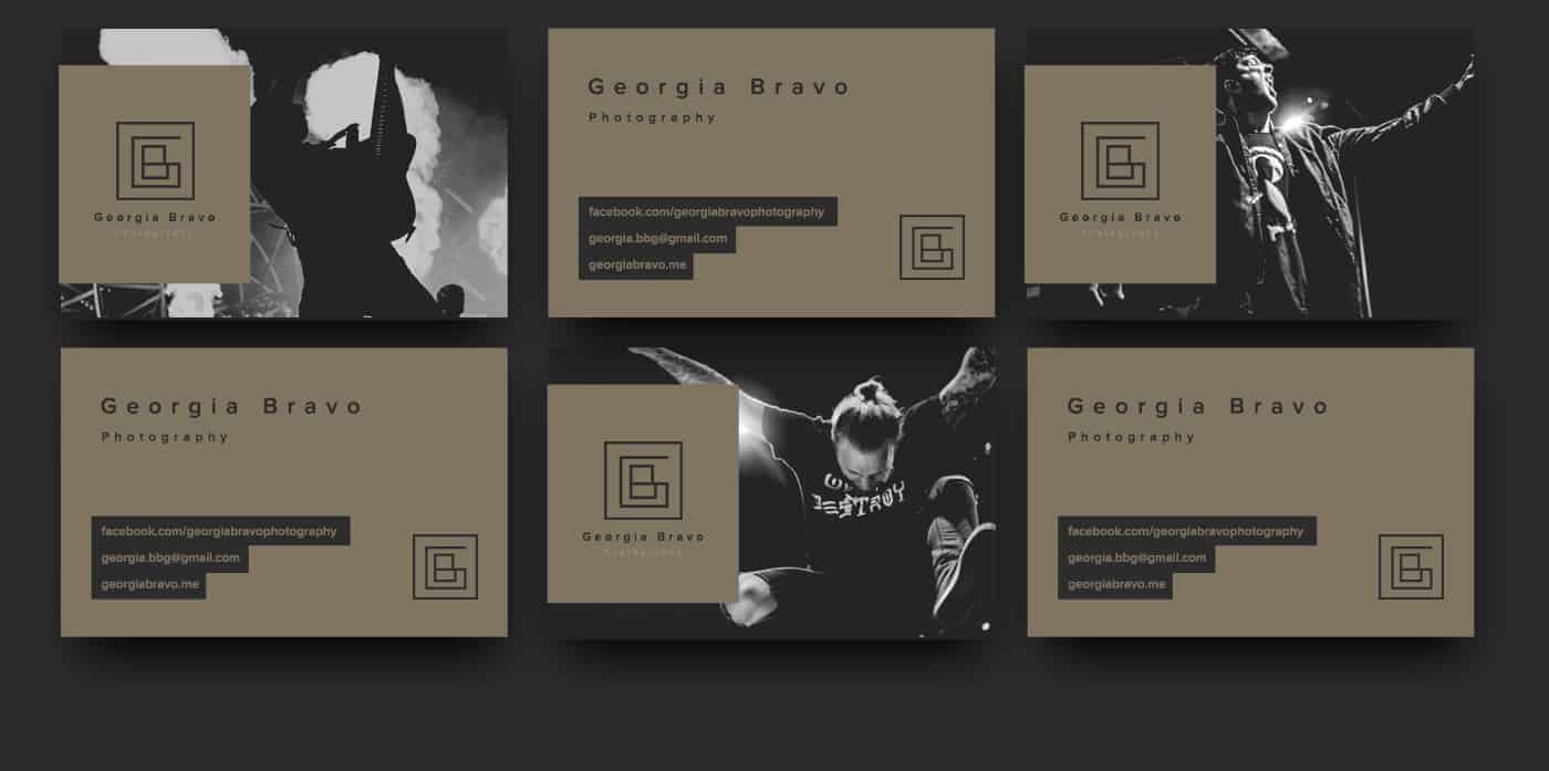
So my challenge was to make a branding that involves all these things: heavy metal, Georgia Bravo, Photograph, dark colors, clean design.
I Created the logo based in her name, so I used the "G" and "B" to make a symbol for her name: Georgia Bravo.
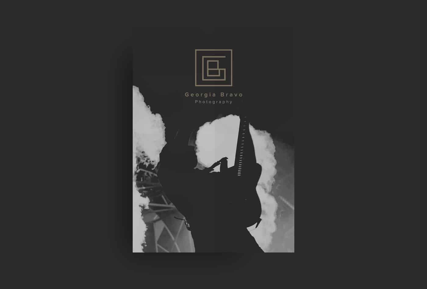
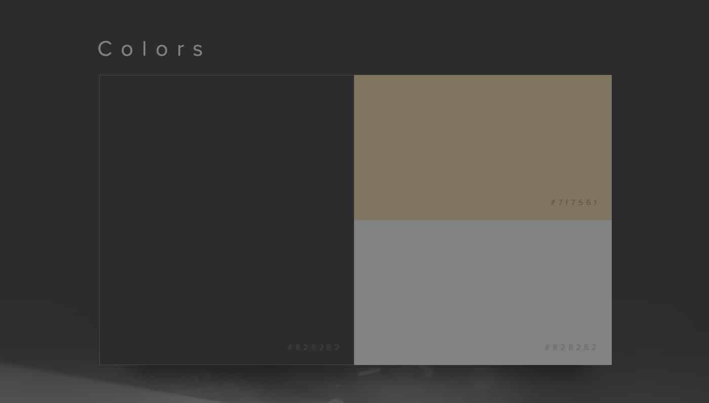
Georgia LOVES dark colors, and her job is take photos metal bands around the world, and heavy metal is not a colorful thing right? So I choose just three dark colors to do this job.
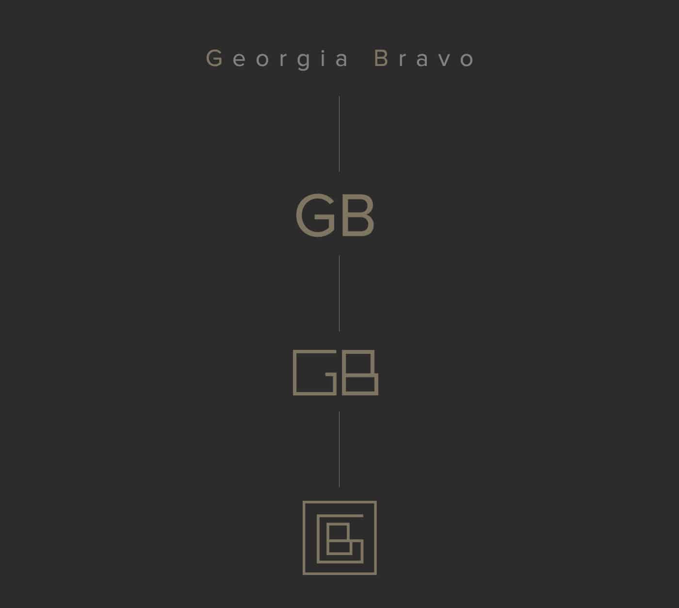
I started making rafts with the letters, I did a lot of tests with the "GB" I expended two weeks to find a composition that I like, and more important than that, a composition that Goergia likes.
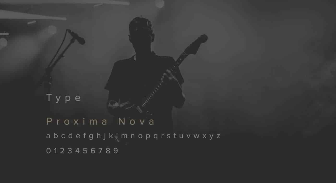
So after that I used Adobe Photoshop and Illustrator to finalize the logo.
People loved, and gave me good feedbacks, because Georgia Bravo is a strong name, and I did the "GB" because of that.
Georgia wanted a simple branding, and awesome that people looks and remember her with the dark colors and her symbol, I did mor ou less ten tests until make the final logo that I liked and her too.
I really believe that logo design doesn't need to be a complicated thing, everything I do, I try to do simple, for me more is less, not aways but in the most part of the time.
Parabens